E&E News did a series of stories on a team of its reporters taking a 6,000-mile road trip in an electric vehicle to document how the switch from gas to electric transportation impacts the environment and economy.
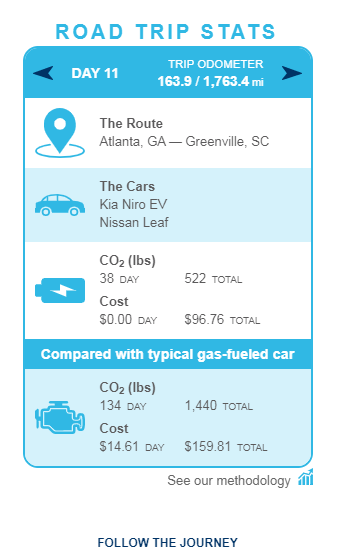
One story captured the road trip statistics for each leg, electric car compared with typical gas-fueled car, in an interactive chart allowing users to thumb through day by day,
I know the Deconstructing Data Viz reading said "interactivity should only be used when absolutely necessary to convey important information to the reader." I think in this case it does. I would have been overwhelmed with the data in narrative form. This way I can advance to the legs of the trip I want to see.
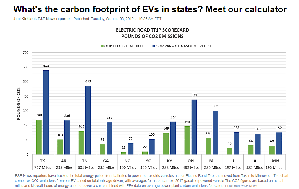
In one another story in the series, the reporters compared the carbon (CO2) emissions of a gas-powered car and an electric car and showed how the emissions of an electric car change from state to state in a bar chart. The chart makes the data easier to digest state by state and is color coded for easy delineation. The chart tells the story.