Nifty labels in graph used as short example

Nifty labels in graph used as short example

par Utilisateur supprimé,
Nombre de réponses : 1

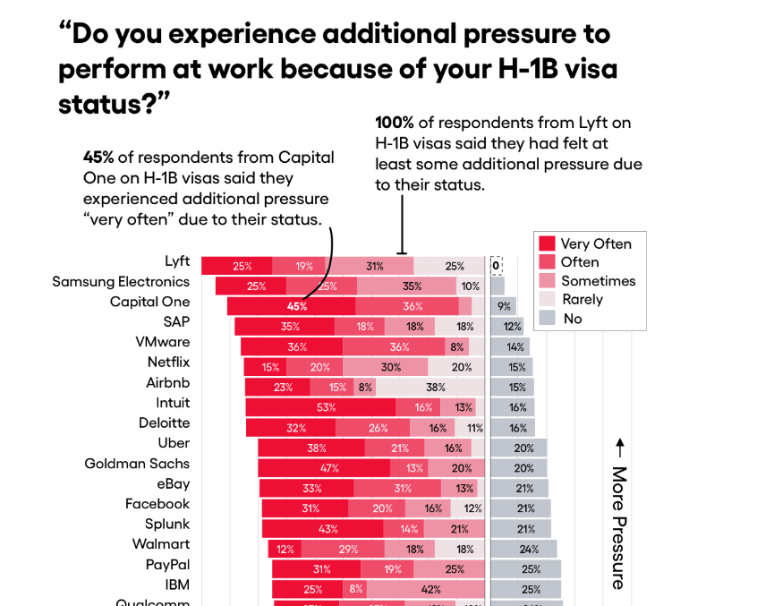
I really appreciated the way information was laid out in the bar graph in this story I came across in One Zero, which is about discrimination against tech workers on visas.

The story uses lots of data, but this example was especially good. It does precisely what a bar graph should do according to our reading this week. 

The short text labels above the graph are particularly handy, serving as a short example to explain what I'm looking at.

Full story: https://onezero.medium.com/visa-workers-at-techs-biggest-companies-speak-out-about-discrimination-298c9fa686b6

Annexe Screen Shot 2020-02-26 at 17.57.29.png
En réponse à Utilisateur supprimé

Re: Nifty labels in graph used as short example

par Utilisateur supprimé,

I ran across this story while doing research for a friend of a friend who is on an H-1B visa and couldn't get back into the U.S. after returning home to visit family. It made me wish there were more visualizations accompanying news coverage of surveys, including political polls. I think there were a little too many of them in this piece, however.