Last year, Inês Rocha and Rui Barros from ‘Rádio Renascença’ analyzed large amounts of data concerning temporarily hired doctors in public hospitals, available in a Government website dedicated to the national health service. What I liked about it was the fact that they gathered the main conclusions of the (big) investigation in an article in which each subheading redirects us to a more in-depth article on that particular subject. It’s called ‘Seven thing we learned about temporarily hired doctors in the national health service’: https://rr.sapo.pt/2019/06/19/pais/sete-coisas-que-aprendemos-sobre-os-medicos-tarefeiros-no-sns/especial/154922/
The seven main conclusions concerned public spending, average worked hours, selection/hiring process, effectiveness, profit for companies that sell temporary work and errors/lack of information in the data available (I also did a small investigation as a college assignment about a different subject using data from the same website and concluded the exact same thing – errors, numbers that don’t add up, lack of data in some cases, etc.).
They used the data as a starting point, analyzing thoroughly not only numbers but thousands of work contracts. With their conclusions, they confronted politicians and hospital administrations. They also talked to doctors in this situation and crossed the data with their testimonies, trying to understand how the doctors in which many emergency rooms rely on to stay open are selected and payed for. They also described how overall expense with these hirings rose despite the fall of the number of doctors hired in these conditions, and contradicting the belief/discourse that this solution is cheaper to the national health system and showing that the companies that sell temporary work have been increasing their profit (the State actually pays a lot more to a temporary doctor than other doctors, and above the limit stipulated in the law). In sum, they showed how the Government’s solution to the lack of doctors in some hospitals and regions is not a sustainable one.
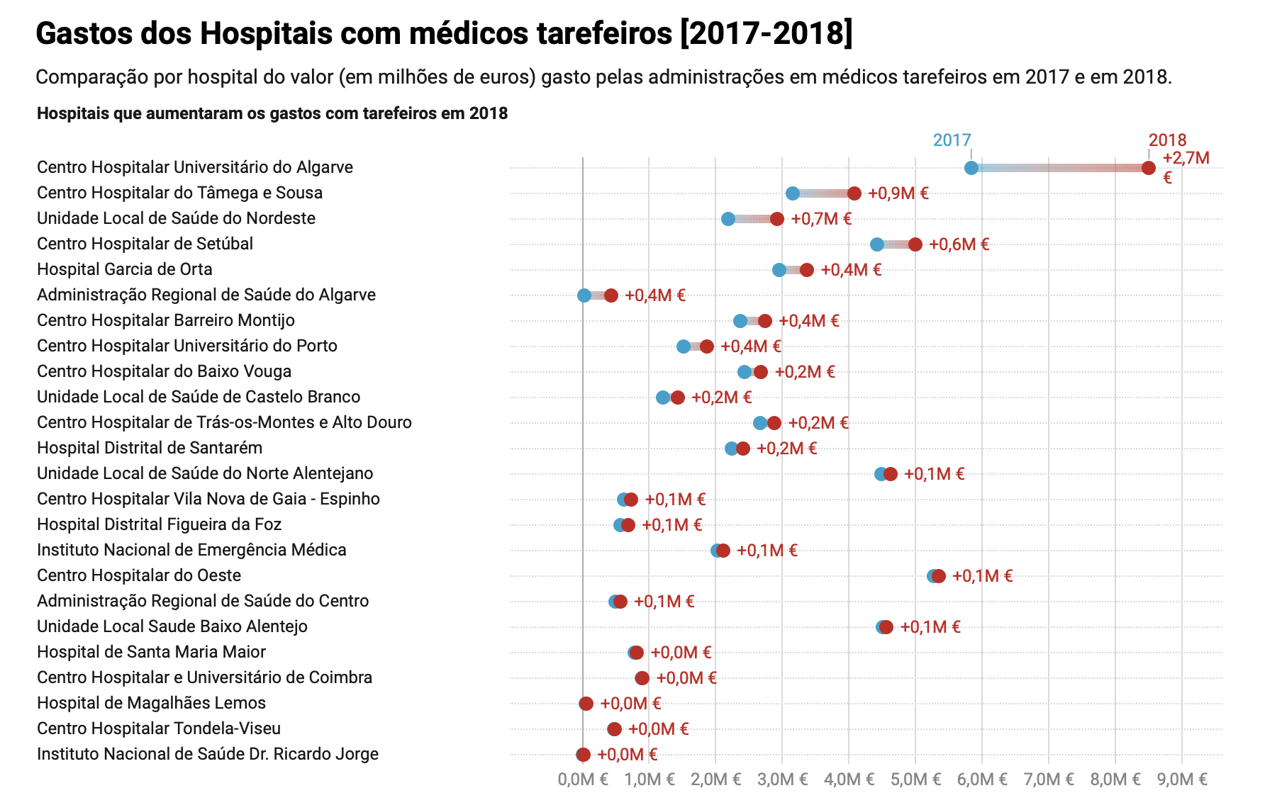
They built some graphics, although they didn't rely heavily on them (just a few, and, in my opinion, the absolutely necessary ones - sometimes journalists overdo in the graphics/infographics department) the one showing the evolution in cost with these doctors is the one I find the most interesting. A ‘time series’ kind of graphic, but with a configuration I personally had never seen and found very well conceived (see image attached).
Also, I think it was great that they explained exactly how they used the data: how they found it, organized, analyzed it, and even the tools they used! And everything is available in a portal ‘Rádio Renascença’ created for the data they use in their stories.
