Data visualization is a powerful tool in investigative journalism. It adds beauty to a story and also gives vivid and detail description of the story.
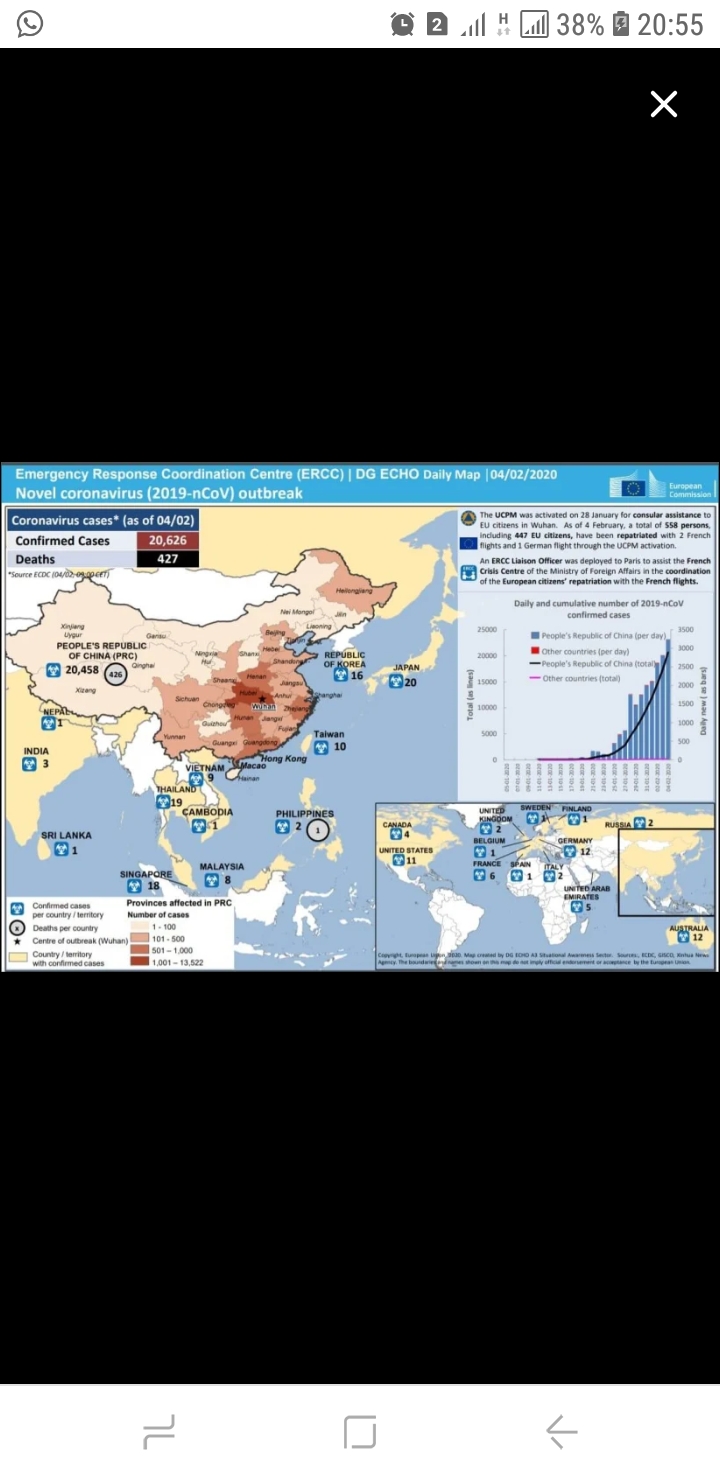
From the visual, it can be realized that the outbreak of convid -19 is represented using data. The data is the map of affected countries having this dreadful disease.
Using the Deconstructing data viz as a framework, the attached data has the following features.
Comparison, Distribution, Geographical representation of data and lastly has design.
In comparison, the chart has a line graph tracing times in changes of reporting. The reported case from 11-01-2020 and 04-02-2020 varies in that the former had least reported cases in China as compared to the latter.
With the distribution, it has a histogram because the data set is large. Cases of convid is examined across the globe.
Geographically, the map gives a clear reportage of cases with the disease. The map is a choropleth, meaning it uses differences in colour of countries to visualize the information.
Lastly, design. The colours used in the chart blend harmoniously. Information retrieval is not difficult. It also makes interacting with the chart easy. It is devoid of over-embellishment and unnecessary artwork.
On a whole the chart is a great masterpiece. Nonetheless it lacks pie chart in the distribution giving a percentage of the alarming rate the disease is increasing to alert people on the dreadfulness of the disease.
It was a good job.
Thank you.