Coronavirus on jet fuel demand

por Mery Mogollon -

Hi all

In this story, the data was used to explain the impact of the Coronavirus on jet fuel demand due to the suspension of flights to China.  The presentation of the data made specialized information more understandable to a wider audience and gave magnitude to the economics consequences of the virus spread worldwide.

Infographic: Jet fuel cracks crash in Asia as airlines drastically cut back China routes amid COVID-19 outbreak

https://www.spglobal.com/platts/plattscontent/_assets/_images/latest-news/20200226-infographic-coronavirus-jet-fuel-airlines-covid-19.jpg

Infographic: Jet fuel cracks crash in Asia as airlines drastically cut back China routes amid COVID-19 outbreak http://www.spglobal.com/platts/en/market-insights/latest-news/oil/022620-infographic-coronavirus-jet-fuel-airlines-covid-19?

Spread of corona virus

por Usuário excluído -

Here’s a very recent example of how data journalism has been used, both for gathering the information and the visualization to show how the corona virus covid-19 is spreading: https://www.svt.se/datajournalistik/har-sprider-sig-coronaviruset/ I think the graphs tell quite a lot even if you don’t know the language which can be another advantage with data visualizations.


The 'Unsmoke' Screen

por Usuário excluído -


Include a link of a story that has interested me. Did the reporter use any data, hold a party accountable, or to try to make the story more interactive in some way?

In this story, the reporter attempted the uncover the alleged claim made by Phillip Morris International (PMI), the world's largest tobacco corporation, about three years ago centering on developing it's campaign, 'Unsmoke Your World', to undermine the prevailing use of cigarettes in today's world and put an end to smoking. 

However, it has been discovered that, after sifting through numbers of internal documents, quite recently this year PMI has been illegally and secretly marketing tobacco in a hidden hub at an event The Malboro Penthouse during one of Asia's biggest music festivals, Djakarta Warehouse Project. 

The reporter gathered and included a wide range of data sources to help prove that this was indeed a true phenomenon. Such sources include Instagram posts pertaining to different users on the site who have visited the penthouse themselves.

It was later found out that PMI was not planning to put an end to smoking; it's executive introduced a healthier version in their line of cigarettes, where smokers would gain "a satisfying kick of nicotene while inhaling fewer carcinogens." This new version of cigarettes was called 'Iqos', where it neither looks like vape or cigarette. Instead, PMI developed a new device called 'Heatsticks' or 'Heats', which contain sticks of tobacco and warmed to 350 degrees Celsius (much lower than a normal cigarette).

In spite of such a life-altering proposal that in many ways has helped to adversely reverse people's smoking habits to a maximum, PMI has still been criticized for marketing their brand image of selling the use of smoking on to it's customers, with health experts arguing that by enforcing the habits of smoking would still expose people to the use of cigarettes. 

And the reporter proves this to be true with a statistical graph showing that while tobacco has barely picked up steam in the past four years lasting from 2013 leading up to 2017, the continuous usage of cigarettes has risen and evaporated. A map also shows the number of countries that have been exposed to Iqos only includes a few, while the introduction of new trademarked brands and flavors of cigarettes exists in many all around the world.

https://www.thebureauinvestigates.com/stories/2020-02-24/the-unsmoke-screen-the-truth-behind-pmis-cigarette-free-future

Nike Story

por Usuário excluído -

Recently I heard the news about the Nike running shoe which makes you run faster, Nike Vapor 4 fly, expensive but makes you run fast which Nike claims makes you run faster.

NewYork Times published a news using data elements. 

https://www.nytimes.com/interactive/2018/07/18/upshot/nike-vaporfly-shoe-strava.html


Enjoy !

Fight in mexican customs

por Usuário excluído -

https://www.eluniversal.com.mx/opinion/salvador-garcia-soto/militares-contra-el-monstruo-de-las-aduanas


The data was used to demonstrate why the Mexican military is dealing with people crossing goods through customs, in addition to the amounts that make such a fight plausible.


Subnotification of dead by coronavirus

por Usuário excluído -

This BBC News Brasil piece (https://www.bbc.com/portuguese/brasil-52406404) use official data, from the government, to raise awareness about subnotification of coronavirus cases in Manaus, capital city of Amazonas, in Brazil. The data are presented in a way to give context to the dramatic situation in the city, when in a single day this week 120 people were buried, a number four times higher than the average before the Covid-19 outbreak. The data are also used in a certain way to hold the government accountable.

COVID Tracking

por Usuário excluído -

In California we saw a very quick increase of COVID 19 cases, partly because we have such a high population. In my efforts to monitor the situation in my home state I have been following this Los Angeles Times article where they try to track the known cases and deaths. 

https://www.latimes.com/projects/california-coronavirus-cases-tracking-outbreak/

One of my personal favorite sections is the 'cumulative cases by county' where they created an interactive data table that highlights different counties in the state. This in-depth research helps residents understand how all areas, including their own, are being affected.

Data and the coronavirus

por Usuário excluído -

The raw data for the coronavirus is shocking stuff-  but raw data doesn't provide the bigger picture.

Donald Trump was correct when he countered a question about the USA death toll with we are a bigger population than  XXX, if you look at the per capita rate we are still lower.

To that end, i am really appreciating the way the FT is providing the rolling coverage of this crisis.

Their use of data and graphics is exemplary

https://www.ft.com/coronavirus-latest

Mapping the worldwide spread of the coronavirus

por Usuário excluído -

I've been using this story from The Washington Post in my Multimedia Reporting class since March 31. The story and graphics continue to be updated. The data is powerful and the graphics make the numbers easily understandable. 

https://www.washingtonpost.com/graphics/2020/world/mapping-spread-new-coronavirus/?fbclid=IwAR20aoN3fD3SJGpMYSM5jbcV99OEE9BwcP7hEAerh_rqPuwqfMfy8ziANkU&utm_campaign=wp_main&utm_medium=social&utm_source=facebook

Data story

por Usuário excluído -

Hi all, I am extremely sorry for sending the responses at the last minuted as I was in self quarantine for some time after exposed ti the naval virus. Now feel ok. Here is my response 

https://twitter.com/shiharaneez/status/1251536170585952261

This is a local story about the covid19 threat in Sri Lanka. This local private channel backed the newly elected president in his presidential campaign last November. The situation in Sri Lanka is such that coronavirus spreading forced the new president’s ruling party to postpone the parliamentary election scheduled for April 25. The pr5esident’s party was aiming for a two-third majority and he still has a massive support. However, with the covid19 spreading, the sentiment has changed drastically and economic hardships are expected to dent the current government popularity. So many legislators of the ruling party had been stating the election should go ahead sooner than later citing many examples including South Korea, which had an election last week amid the pandemic.


This local TV channel showed a graph (link is given) in a way to convince the people that the coronavirus threat was diminishing. They choose a wrong measurement to do that. They select total covid19 detected people on a weekly basis in the first five weeks up until April 14 (which were 42, 59, 41, 43 & 48) and then they showed the number of detected people on a daily basis for April 15, 15, 17, and 18 (which were 5,0,6,4). This gave a perception that the government had succeeded in the prevention of covid19 spreading strategies. Before this TV channel came up with the graph, the government health minister’s statement on “coronavirus will be controlled by April 19” was given wide publicity in all the media. However, we explained the public this was wrong and next five days, there 120 patients detected. Later the owner of the channel apologized and promised to correct the error,


The graph really damaged the public perception of the TV channel as well as the government’s strategies in covid19 spreading control. More people started to see the numbers and realized that it was not over and in fact it was worsening. People started to criticize the positive media coverage in public.

https://twitter.com/shiharaneez/status/1253451520164708352

Shihar

Tracking the True Toll of the Coronavirus Crisis

por Gordon Bolduan -

I have chosen  the article “36,000 Missing Deaths: Tracking the True Toll of the Coronavirus Crisis” published by Jin Wu, Allison McCann, Josh Katz and Elian Petier in the New York Times. The article was updated on April 23, 2020, 10 PM.  

Link:
https://www.nytimes.com/interactive/2020/04/21/world/coronavirus-missing-deaths.html

The author team uses several multi-line graphs, each for a different country, to describe the death toll caused by the coronavirus. They do that, to “undermine the notion that many people who have died from the virus may soon have died anyway”. It is not a fancy story as it does neither use fancy graphics nor interactive elements. It also is a simple one as does not find additional characters, except a scientist from Germany, and does not accuse governments directly. But is uses data to add context.

And by doing so, and by building up a short chain of evidence with one or two arguments, the article makes it clear to the readers in an impressive and especially comprehensible way that COVID-19 is a really dangerous disease and therefore the restrictions are all the more important. So I think this article is good data journalism.


Data

por Usuário excluído -

This Detroit News story broke down data that highlights racial disparities in coronavirus deaths and cases. In addition to the graphs reporters used to visualize data, there were interviews with the mayor, health officials and other people involved in local government. I thought the story was effective, but a bit tone deaf as there weren't any regular people interviewed. I think data needs people - not necessarily government reps - to humanize it.  

https://www.detroitnews.com/story/news/local/michigan/2020/04/02/michigans-covid-19-deaths-hit-417-cases-exceed-10-700/5113221002/ 

Sex Trafficking Milwaukee

por Joseph Solis -

https://www.jsonline.com/story/news/crime/2020/04/07/sex-trafficking-milwaukee-where-happens-who-happens/2939359001/


Data visualization techniques were used in this story to illustrate historical data on sex trafficking and make it easy for the reader to examine where these reports took place. 

Moreover, gathering historical data and allowed them to understand relationships between different factors in the cases that they originally ignored.

Giving a face to a city

por Usuário excluído -
http://selfiecity.net/ 


Although it is not a recently published story, I think it is very interesting as a case study. Gathering people's faces to tell a city and above all analyzing the ways they tell themselves as citizens. I see it as an in-depth and precise analysis that uses new media in a clear and open way. 

The data are obviously the heart of the project, in particular the photo-data, because often the photos themselves are data and I think that in this project they are self-explanatory. The story is more than interactive, the faces can be looked at but also analysed at the same time. Probably it is not a way to make a critical analysis of the government or of possible lies, but it certainly allows the user to look at other perspectives of a place.

“Is There Racial Inequality at Your School?”

por Usuário excluído -

When I got to my first NAHJ International Job Affair and Convention, in 2018, they talk about this cool project: “Is There Racial Inequality at Your School?”. (Link: https://projects.propublica.org/miseducation/) In this project, they showed how likely blacks students were successful in advanced placement class or gifted and talented programs. The first thing I liked a lot was that they showed the places where there was no data available. At least, that is not that usual. The use of the map was also necessary because you can make patterns with the colors and the forms. For example: why almost all places in which almost all white students were likely to get involved wherein the East coast of the US?


Corona virus growth graph

por Usuário excluído -

This graph, which was first published at the end of March, was one of the ones that really cut through in the Coronavirus story in Australia, in my opinion. https://www.abc.net.au/news/2020-03-25/coronavirus-covid-19-modelling-stay-home-chart/12084144

There has been a huge amount of data and numbers published throughout this crisis, but I think this one was particularly strong because it compared spread predictions under different levels of compliance with social distancing rules. It illustrated very starkly why we should comply with social distancing as much as possible. 

I also like the animation further down that shows how social distancing curbs the spread, and I think that gave good context as to why social distancing works and why it's important to adhere to it. To push this message was very important, because Australians often have a 'she'll be right' attitude, and there was a real push for people to take personal responsibility in the efforts to curb the spread. 

In Australia, these messages seem to have cut through, as our transmission rate has stabilised a lot, and there's a general sense that we're winning the battle here (at least at the moment), because rates of transmission have plateaued. 

Discussion Forum 4: Use of data in a story

por Timothy Gachanga -

9 Charts showing what Coronavirus is doing to the economy

https://www.vox.com/future-perfect/2020/3/30/21184401/coronavirus-covid-19-economy-charts

The reporter is using various data sources to show the impact of COVID-19 on joblessness in the US.

Johns Hopkins COVID-19 Dashboard

por Usuário excluído -

Through my readings, I came across this dashboard from Johns Hopkins University's Coronavirus Resource Center (LINK). 

Using different data viz elements (line charts, infographic maps and lists), this dashboard is able to track confirmed cases, total deaths, total tested and other values in real-time. Provided this information is accurate, I don't think I've seen a more useful tool for tracking the spread of this novel virus yet. 

Sources for the map include the WHO, the CDC, and the European Center for Disease Prevention and Control, just to name a few.  


Cocainomics

por Usuário excluído -

The WSJ a few years ago, using data analysis, started a webpage with different kind of reports around the drugdealer Pablo Escobar Gaviria. 

For those reports they research files government agencies and they tried to draw the best trying to take a picture of the early begin of Escobar and his colleagues.

The WSJ used maps and infograms really similar to the examples exposed by Universidad del Rosario covering the colombian conflict.

https://www.wsj.com/ad/cocainenomics-es

Coronavirus’ impact on financial markets

por Usuário excluído -
https://www.refinitiv.com/perspectives/market-insights/coronavirus-impact-on-financial-markets/

in this story,writer used data to explain the impact of coronavirus on financial market , he used data in context , make the story more interactive for audience, and make specialized information more understand to audience.

Coronavirus spread in Texas cities

por Usuário excluído -

Hi everyone,

I admire the set of charts recently published by the Texas Tribune in "Coronavirus in Texas cities: See how social distancing could reduce stress on hospitals." The presentation provides a lineup of clean, easy-to-read charts for each major Texas city, showing the projected rate of coronavirus cases under different scenarios. The presentation allows readers to very quickly see how reducing social interactions leads to "flattening the curve." The reporters kept the charts clean but still accurate by using colored bands to show the range of uncertainty for each scenario -- a touch I thought was especially important, given how much scrutiny these projections face. Ultimately this package helps readers understand the projections guiding officials' decisions on stay-at-home orders, and helps them to see how their own actions can play into different outcomes for the community. 

Comparable Data Uses

por Usuário excluído -

I found this article recently that looks at the various ways news organizations are displaying data about coronavirus. I like this article because it looks at multiple methods discussed in our lectures including tables, charts, and graphs.

https://www.fastcompany.com/90474434/the-best-charts-for-tracking-coronavirus-according-to-mapping-experts


It not only adds context to the coronavirus data being displayed, but also interacts with people in showing the different methods visuals can be used to give attention to a topic.

The Intertecpt's Brasil report about Boolnaro deciding federal colleges principals, which is not recommended by law

por Usuário excluído -


On this text, the journalists from Glen Greenwald's newspaper used data to make the reader visualize the abundance of Bolsonaro's inteferences at federal colleges through a Brazil's map. A thing that I thought very interesting and clarifying. 

In case you are curious, that's the link of it: https://theintercept.com/2019/10/02/bolsonaro-universidades-reitores/

Arsenal Global

por Usuário excluído -

I think that one of the most amazing reports that used data is the "Arsenal Global" from The Intercept Brasil. In this work, the journalists walked around the Rio de Janeiro's streets to find lost bullets and find out where they came from. They found bullets that came from another countries and in some cases the bullets were from prohibiten lots in Brazil. The places where they walked to collect the bullets were shooting zones, so it means that what they found could say something about the origin of the shoots that killed many people,could be from police or drug ealers.

I like this report because besides they building the data, the journalists also searched for official sources using the LAI, so it has quality. I think it's a great report for study data journalism.

"The math behind social distancing amid coronavirus."

por Usuário excluído -

https://www.google.com/amp/s/globalnews.ca/news/6709071/coronavirus-social-distancing-math/amp/

In efforts to stem the global corona virus pandemic, most countries have urged citizens to practice social distancing. Cited in the story is an infographic by Robert A. J. Signer, an Assistant Professor of Medicine at the University of California San Diego. The infographic contains calculations that illustrate the impact social isolation has on the slowing down of the spread of the coronavirus, and it also outlines how a single person's ignorance to this call for restriction contributes to the vulnerability of large groups of people.

Corona spread

por Usuário excluído -

https://www.nytimes.com/interactive/2020/03/22/world/coronavirus-spread.html

An amazing strategy of data viz to explain how the virus spread.

U.S. Census/Discrimination Story

por Usuário excluído -

Story Link: https://www.sciencenews.org/article/census-2020-race-ethnicity-questions

I really liked the way reporter, Sujata Gupta used data visuals in this story. Gupta used a variety of elements including a bar chart and an interactive timeline. The elements added context to the story by providing a visual representation of the impact of how the U.S. handles race with the U.S. Census. The story shares a variety of viewpoints from people of different backgrounds and how they not only view their race but how they're also represented in the country. These elements affect how much money is distributed in certain parts of the U.S. and it also sheds light on discrimination as well.

Basic cost of living infographic

por Usuário excluído -

This is an article from Business Insider, which is fairly basic and includes data collected from a brand/company on necessary income to rent an apartment in various popular cities across the world. The article explains what factors the data is based on and rudimentary reference to other considerations. Such a basic data project would be really effective if it was developed, for more involved stories around zoning and real cost of living and rising homelessness. 

https://www.businessinsider.com/salary-rent-apartment-major-cities-2019-1?r=US&IR=T

Data Visualization

por Usuário excluído -

Thank you very much for sharing the "Rutas del Conflicto" project. This gives great inspirations for similiar projects. I am following Kivu Security Tracker for a while, a joint project of Human Rights Watch and The Congo Research Group at New York University. https://kivusecurity.org/

They are also using latest data on violence in Eastern Congo, include them in their data bases and provide long term visualization. It seems to be a great means to "connect the dots". Single fatalities, as tragic as they might be, don't provide much information beyond short headlines. Long term patterns and trends are much more relevent to identify bigger stories. In this case, the researchers reveal information on the strenghts and movements of the many local militias. 

I guess this is a great example showing that data visualisation ist a powerful tool beyond journalism and very useful for academic, non-governmental and civil society organisations.

Wichita manufacturing

por Ian Tennant -

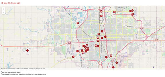
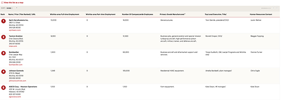
Thanks to my department, I was able to buy a subscription to the Wichita (Kansas) Business Journal. This has come in handy for one of my classes where students are working on a series about the impact of the grounding of the Boeing 737 Max on Wichita's airline manufacturing industry. The WBJ has a weekly newspaper and a website behind a paywall. It occasionally uses graphics to explain data. They are much better at data visualization than I am, but their work still seems rudimentary. Keep in mind though that this publication has a small staff, just six people listed on its masthead.

The March 6 print edition included a list of Wichita-based manufacturers. The link is here, but likely behind a paywall: https://www.bizjournals.com/wichita/subscriber-only/2020/03/05/largest-manufacturing-firms-in-the.html?iana=hpt_hp2018_01_promo_list

Attached are two screen shots of the WBJ's list, as a list and as a map. The list is helpful and the map is okay. What I can't find online, but it is in the print edition, is two half-pie graphics that show results of a survey. But they don't provide any information on how the survey was conducted, which is troubling.

Anexo WBJ 1.jpg
Anexo WBJ 2.jpg

Preacher appointed to a position on Brazil's National Indian Foundation, aims to convert Indians

por Usuário excluído -

https://theintercept.com/2020/02/13/audios-missionarios-converter-indios-amazonia/ 

The Intercept Brasil (TIB) received audios, from an anonymous source, which reveals that the newly appointed general coordinator of isolated Indians, has the function of converting Indians to Christianity, a practice prohibited in Brazil.

Silvana Lisboa and Felipe Milanez, the journalists that report this news, embed the audios in the middle of the storytelling to to prove that the TIB has possession of audio and for the reader to see that they exist. Of course, it also have the transcript of the audio, for those who can't listen. 

On the text they also use a lot of links to other news that complete the story. Public records from Brazil's Public Ministry, law articles, public sentences, twitter comments are used too.

Use of data

por Usuário excluído -

this is the article that I enjoyed reading: 

https://townofpalmbeach.com/931/Prohibition-of-Single-Use-Plastic-Bags  

I enjoyed reading this as I am working on a solution journalism story about single-use plastic bags. As Palm Beach is where I go to school, I was happy to find an article that covers this material locally. The data they use in the article is effective and informative enough for everyone to understand the message. The article is trying to persuade people to sign a petition for the single-use plastic bags ban. The article is also trying to create an emotion for the reader for the animals in the sea and for a healthy environment. The picture that they added shows how a fish is caught in a plastic bag. They also give the readers the option to email people from the government about this. This is because palm beach and many other counties would like to start a ban again plastic bags, but the government doesn't allow it. This is also to create more awareness and to attract the attention of the government. 

Washington Post piece on how epidemics end

por Usuário excluído -

https://www.washingtonpost.com/graphics/2020/health/coronavirus-how-epidemics-spread-and-end/?fbclid=IwAR1etJCXmdWjHyB1ypD_-7cSwV1RjJ224gi_WIRvgZMirKcpazArRLU7mjM

This data visualization does a great job in adding context through animation that is activated as the user advances through the story. It helps explain the basic reproductive number of the virus (and other viruses) and how it spreads and shows various models that employ variables like utilizing masks and gloves and quarantines to help end the spread.

Public service wages

por Usuário excluído -

Last month the Piaui published a story telling the wage differences in public service. They used different arts to show the data. Bar graph was used during all the text too. 

I loved the way they put data in the story because it's easy to visualize and understand. Often the data gets confused in the text, so having different ways of visualizing it helps. 

https://piaui.folha.uol.com.br/quem-ganha-mais-no-servico-publico/  

“Dengue, doctors, hospital beds: Ne'er the twain shall meet?”

por Usuário excluído -

A national dengue epidemic was declared in the Philippines in 2019, with 271,480 dengue cases, including 1,107 deaths, reported from 1 January to 31 August 2019. The Philippine Center for Investigative Journalism used data to show how horribly unprepared the public health system is to handle dengue cases. The ratio of government-owned hospitals to the Philippine population is appalling 1: 229,306.

PCIJ also presented data on the ratio of government-owned hospital beds to population, the ratio of rural health care units or urban health centers to population, and the ratio of government physicians to population. In so doing, the center went beyond counting the number of sick people and pointing out where they were. PCIJ used data to add context and paint a fuller picture of the country’s dismal health care infrastructure, hold the government accountable by pointing out where targets were unmet, and make the story more interactive.

Here's the link: https://pcij.org/data/203/public-healthcare-in-the-philippines

Puerto Rico's dead after Hurricane Maria

por Usuário excluído -

The CPI https://hurricanemariasdead.com/index.html really took on a huge task on revealing the true count of deaths in the aftermath of Hurricane Maria, as authorities released low official numbers and as people continued to die throughout the months after the disaster.

They gathered data through surveys among the families with hurricane victims, compiled death certificates, funerary home notices and obtained official data from Puerto Rico authorities by suing the state to release the information. In this case the data served to find the characters in the story, to add context - by linking the hurricane to the causes of deaths - as well as to hold the government accountable - for its incorrect official statements, lack of inaction with regard to disaster response. 

Propublica Creates a Database

por Usuário excluído -

In this investigative story  https://www.propublica.org/article/catholic-leaders-promised-transparency-about-child-abuse-they-havent-delivered   Propublica uses raw data to create a user-friendly, searchable database that goes beyond reportage for an investigative story.  The database will help victims of abuse by Catholic clergy in the U.S.    Currently, Roman Catholic dioceses in the U.S. are supposed to publish lists of clergy who are "credibly accused" of sexual abuse.  That means finding information about individual priests would be time-consuming and difficult to uncover.   Propublica's database allows users to search by name, or diocese.  The collection of this data served the story in two ways:  first, it uncovered the inconsistencies contained within the raw data itself and secondly, it provided a public service, in assisting abuse victims to use the information for healing, or confirmation or to assist in lawsuits.  

Australian wildfires and disinformation

por Usuário excluído -

Hi Everyone,

As you may have heard, Australia had a terrible wildfire season in late 2019 and early 2020. 

What we call bushfires burned out an 18.6 million hectares (46 million acres) causing 34 human deaths, the destruction of thousands of homes and the loss of an estimated 1 billion native animals.

During the crisis, many conservative politicians and commentators claimed that many of fires were caused by arsonists, rather than climate change and related matters.

I was intrigued by this article from two IT academics, who identified a misinformation campaign that by bots and trolls during the fires (see https://theconversation.com/bushfires-bots-and-arson-claims-australia-flung-in-the-global-disinformation-spotlight-129556 ).

They found the hashtag #ArsonEmergency was only tweeted a few times in 2019 but "gained traction this year in a sustained effort by about 300 accounts".

 Their findings are well illustrated in an accompanying graph reprinted which shows that 4,726 #ArsonEmergency tweets on January 7 at the height of the fires.

 Their work helped add context to the coverage of the fires. They held the government and elements of the media to account for running a largely anecdotal line about arson. (Note: some media outlets gathered detail from state police and fire services, forces which showed a limited number of fires being started by arson rather than lightning strikes.)

 The article used software tools that I have never used - including tweetbotornotBotometer, and Bot Sentinel – and the authors said it was difficult to get behind the bot accounts.

Perhaps this made it more difficult tofind characters in the data. It could also have been made more interactive, through having a location breakdown.  


Mark Skulley

KHN is a great source for stories... and data

por Usuário excluído -

I'd like to start off saying I love numbers. I often use a phrase I came up with. "Numbers do not lie, people and politicians do." My military nuclear power background has refined my analytical mind and my ability to understand numbers. Obtaining those numbers I need to back up my ideas can sometimes be difficult to obtain and visualize for others to understand. Visualization tools are something I need more work on to understand how to use them and this course pointed me in the right direction to accomplish that. Thank You. 

Anyway, off to the point of the forum post.

"Choose a recently published story that interests you that includes data elements." 

IDK how recent is recent, but here is a story from August of last year:
https://khn.org/news/pharma-cash-rolls-into-congress-to-defend-an-embattled-industry/

"Discuss how the reporter or team used data in the story. Did they use data add context, find characters, hold the government accountable, make the story more interactive, or in some other way?"

In this story, the reporter(s) used the data to contextualize and demonstrate: "The number of big contributions and the lawmakers receiving them signal the industry is building loyalty as voters push candidates to talk about drug prices in the 2020 elections." Obviously, the intent is to hold the government accountable --- or at least transparent. 

While the data "visualizations" are not contained directly in the story, they are linked to inside of it. 

Link to data here: https://khn.org/news/campaign/ 

I use the term visualizations lightly, as it's more of a table layout than actual graphs and maps. The tables, however, are easily read and are separated by subject matter.

I love KHN as a source. They routinely use numbers to back up their stories. The other plus is, the stories are published under a creative commons license. Which means, other sources can republish easily. They often use Datawrapper to present their visualizations. Doing so, allows other news sources to easily embed their visualizations. If you are looking for health-related data, this is one of the best sources I know of.

Feminicidas Libres

por Lidia Rita Bonilla Delgado -


Hola a todos

En esta historia, los datos se utilizarán para explicar la impunidad que existe en el torno de los asesinatos de mujeres por un Sistema de justicia negligente que los encubre y permite el feminicidio

La presentación documentada a través de gráficas sencillas señalan los más de tres mil feminicidios oficiales y la realidad de los números representados que ascienden cuatro veces la cantidad registrada

https://www.connectas.org/especiales/feminicidas-libres/

Illinois Online Gaming

por Usuário excluído -

This piece from ProPublica Illinois, WBEZ and the Sun-Times highlights how one company improperly used connections to dominate the newly created market of online video gaming in Illinois. Every paragraph is a revelation of data. I'll summarize.

First, ProPublica obtained records, specifically email records between the head of the company - who came from a wealthy Chicago family - and an attorney for the Illinois gaming board. The attorney created a private email for the exchange.

The company, Accel Entertainment, also obtained documents from the gaming board with details about its competitors - details that helped the company gain market share. It's not clear if ProPublica has these documents or if they learned of them through interviews with former and current employees of the company, whom they interviewed.

ProPublica also noted how much Accel has donated to Illinois politicians, which can be found in various campaign databases.

ProPublica also analyzed the timing and amount of video gaming installations by Accel - and compared them to the timing and amount of video installations by competitors. But the publication also looked at the online video gaming law, itself, and the unfunded mandate that prevented regulatory enforcement.

ProPublica was also able to obtain Accel's licensing application - which is not public information. The team also looked at investor updates; looked at corporate and legal records associated with the denial of a gaming license to an Accel competitor; and detailed Accel's yearly finances.

It also used a visual pleasing graph that shows how far ahead Accel is in terms of revenue than its competitors.

And, since it's ProPublica, the story included a "how we did this" section:

How We Analyzed Accel’s Business

To better understand the Illinois video gambling market and how much of it Accel Entertainment controlled, ProPublica Illinois used three datasets from the Illinois Gaming Board, the state agency that oversees the industry.

The first showed the amount of revenue each operator earned in total each day since video gambling went live in September 2012 through the end of 2018. This allowed us to track Accel’s market share over time. Each operator took home 35% of the money lost on its machines during that period.

To count the number of machines and locations each operator controlled, we combined two additional datasets obtained from the gaming board. The first consisted of monthly revenue reports available on the board’s website. The reports show the number of machines at each gambling location and the income they generated, though they do not identify the operators that provided the devices to the locations.

So ProPublica Illinois requested from the board a second database that lists the operators. By combining the two databases, we were able to track the number of machines and locations each operator controlled over time. We also used this data to estimate how many locations controlled by each operator had gone live, meaning the machines had been turned on and started making money.

Tracking every Coronavirus Case in the U.S.

por Usuário excluído -

Here's the link: 

https://www.nytimes.com/interactive/2020/us/coronavirus-us-cases.html?action=click&module=RelatedLinks&pgtype=Article


What I liked about this article is the use of several different charts to help understand different aspects of the  Coronavirus spread. They used it to make the story more interactive, to make it easy to understand, and easy to get the information some are looking for quickly. 


There's a map to understand the spread, and concentration of cases, as well as a bar graph to compare how quickly the virus is spreading on a day to day basis, and an excel type sheet to quantify which places have the most cases and deaths. There's one more excel type sheet to explain how cases were first contracted. 


Interactive maps provide visual understanding of health data

por Usuário excluído -

I came across this story when I was starting to do some pre-reporting for a pitch on the social determinants of health. I liked the use of data in this story, because I thought it was presented in easy to understand graphics. I especially liked the interactive maps, which gives readers the opportunity to explore data specific to each zip code. Readers can begin to understand the clustering of zip codes with less positive health outcomes, as well as some of the specific health and behavioral issues that present unique challenges to achieving longer life expectancy.


When combined with the information in the text and the other graphic elements, the readers can understand the demographics - racial, economic, and other - that are contributing to lower than desired life expectancy for any given zip code.


https://time.com/5608268/zip-code-health/

Implant Files -ICIJ, Sueddeutsche Zeitung

por Usuário excluído -

I love the way data is presented here: https://projekte.sueddeutsche.de/implantfiles/politik/implant-files-english-version-the-sick-system-e167322/

It supports the story without taking away from it. Graphs are easy and fast to read and flow well with the whole story.

Sample size for data collection

por Swati Sanyal Tarafdar -

If I have to collect my own data, say on the incidences  of TB in a district, what will be an acceptable sample size for this data? Would collecting information from one particular administrative block do?  

Use of data in a story

por Usuário excluído -
https://thefern.us11.list-manage.com/track/click?u=0ba3f2fbf2ffd3ce787b33187&id=ea62e7a131&e=b773ac6203 The investigative story by Leah Douglas traces the loss of family farmland of African Americans - many descendants of freed slave - to doddy lawyers and unscrupulous white investors and land developers using a legal loophole of an obscure law on " heir property'. This law allowed the sale of ancestral land without seeking the permission of the land owners who in many cases stretched for generations and title was not documented in wills to prove ownership. Using public records on land holdings and ownership the journalist used the data to show how black americans had been dispossed. For example, in 1920 there were 925000 black landowners in the US mostly in the South and this fell to 45000 in 1975 and has declined in the last century to just 2 percent of the national land ownership to day. The writer identifies most of the characters after tracking descendants still on the farms and a revision of the law on heir properties eventually led to the pdotection of the land rights of the black american landowners. Today there is a steady rise in farmland ownership by black americans in the States.

Coronavirus spread in US

por Usuário excluído -


https://www.nytimes.com/interactive/2020/us/coronavirus-us-cases.html

This NY Times map shows the current status of the coronavirus spread in the US and is accompanied by a bar chart of new reported cases that shows how quickly the spread of the virus has escalated. This adds context and provides an interactive way to view the data.  Multiple other charts are included to explore the data in other ways.

How New Zealand was built on stolen indigenous land

por Usuário excluído -

This project involved a core team and a range of journalists across our organisation. It's focus was on one of the most contentious issues in New Zealand, the treaty settlement process between Māori (the indigenous people) and the Crown (government acting on behalf of Queen Elizabeth). 

Our data team pulled a vast amount of data together to develop interactive maps and tables of every tribe that had settled its claim. It also had an interactive of Māori land ownership over time.

These graphics had a really strong visual impact on readers. The data was also used to write a number of stories in this project. Academic institutions and researchers took our data for their own work.

https://interactives.stuff.co.nz/2018/07/na-niu-tireni-new-zealand-made/

my investigations

por Olena Orlova -

I did a lot of investigations. Worked a lot with various registries.


https://www.youtube.com/channel/UCU6P8SdTw6sZaXaaFkA2kfQ?view_as=subscriber

Received a finalist diploma for one of my investigations.

https://youcontrol.com.ua/en/news/krashchykh-rozsliduvachiv-obrano-khto-peremih-v-konkursi-%E2%80%9Cvykryvay-z-youcontrol%E2%80%9D/

I was taught to visualize big data using graphs in a previous course. And I am very grateful for that. 

https://public.flourish.studio/story/132548/?fbclid=IwAR1EVglV0jPwFs-dvEIkl6bYG3krrzhTFIXtQEjXPI7CQ3A8KHkfg38zl8Q

Also grateful for this course. This will give me the opportunity to make my investigations even better.


What would a powerful earthquake feel like where you live?

por Usuário excluído -

This story by the LA Times uses earthquake scenario data from the US Geological Survey to allow people to search for an address in Los Angeles and see how different earthquake scenarios would be felt at that particular place: https://www.latimes.com/projects/california-earthquake-fault-map/

It allows readers to interact with the data in a way that is meaningful to their lives. They can see how their homes and workplaces would fare in response to different kinds of earthquakes. I think it's a fantastic resource (especially for myself as a Los Angeles local).


Health Care Cost

por naOmi richardson -

https://www.investopedia.com/insurance/why-do-healthcare-costs-keep-rising/

Morning routines can turn up some interesting conversations.  Health care became the focus today as the conversation turn to what the personal cost for 2018 was in comparison to 2019.  So curious about what was being reported in the media I did a search and came a across an article by Jim Probasco.  Fortunately, Probasco did make use of line charts to show what percentage of the GDP (1970-2016) accounts for rising cost in U.S. health spending and the what amount is paid through insurance vs what is paid through deductibles. The charts allow the reader to see the rise over the years visually and they are also interactive when scrolled over. 

Lava Jato

por Usuário excluído -

In this report there was a large collection of data and information, both in the Lava Jato operation and in the Clean Hands operation. Making it possible to make a comparison between the two. In addition, the subject was also contextualized with other vehicles, such as Umberto Eco's latest novel and the French newspaper L´Humanité, which granted an interview.

These relationships and interconnections are relevant to history. As well as a chronology with information about events.
https://www.ocafezinho.com/2015/11/24/lava-jato-e-maos-limpas-diferencas-e-semelhancas/

Why some Filipinos do not marry

por Usuário excluído -

So this story is at least 3 years old but I can't think of a cuter example....

https://news.abs-cbn.com/focus/02/09/17/i-dont-why-some-filipinos-do-not-marry

This story was produced in our data journalism class here in our newsroom (ABS-CBN News) in the Philippines and I understand why our instructors lauded it. More than showing declining marriage data, the reporter looked for case studies and talking heads to illustrate the problem. The data, in a way, could be said to have enhanced the story, but it wasn't a bare-bones numbers story that people wouldn't know how to deal with. IT isn't earth-shattering or something that would induce the government to act; it's a feature story made more substantial with the use of data without losing its entertainment or 'tickle' value. 


Deal of the Century

por Usuário excluído -

Many attempts have been made to bring peace to the Middle East. Many attempts have failed. 

In this article the author Herb Keinon shows the Map that has been presented by the Trump Administration with the hope that issues between Israelis and Arabs would be resolved. 

This is the first time, according to the author, that the US has proposed a Map to resolve the conflict. 

By using the data presented by the Trump Administration, the author was able to write an article that pointed in a hopeful direction toward peace in the Middle East. 

Take a look at the Link below:

https://www.jpost.com/Arab-Israeli-Conflict/This-peace-plan-comes-with-a-map-why-is-this-significant-analysis-615692


Revista Piauí's session "=Igualdades"

por Usuário excluído -

In Brazil we have a highest quality magazine called "Piauí". They have a session on website to publish data storys to compare differents social classes ("Igualdades" is "Equality"). 

So, recently they published "Quem ganha mais no serviço público" to compare what professions have the best wages on public service. Actually, Brazil's public service is in an attack situation. So, this story is very relevant in the national context.

I like the format because they used bar chart and dot plot with design to make it atractive and clear. 

https://piaui.folha.uol.com.br/quem-ganha-mais-no-servico-publico/ 

The Death of The Amazon Forest?

por miguel pinheiro -


the article: https://time.com/amazon-rainforest-disappearing/


This was the best piece of journalism I found in the last weeks.

It condenses data and visuals in a very clean way, making the overall experience quite stimulant without overthrowing with numbers, names or other data. There's also a big attention being paid to image, graphics and video, which makes it all much more 'edible' and comprehensible. Great work from the Time!

Protein consumption around the world

por Usuário excluído -

This news from the brasilian data journalism organisation Nexo shows the consumption of different kinds os protein around the world with very interesting graphics

https://www.nexojornal.com.br/grafico/2020/03/02/Qual-%C3%A9-o-consumo-de-prote%C3%ADnas-no-Brasil-e-no-mundo

Interesting Story

por Usuário excluído -


This is a link posted by CNN about the demonstrations taking place in Lebanon against the government who aren't taking the people's wants and needs into consideration. It shows how vial the situation is and the conflict between the army and the citizens. 

Citizens hold the government accountable for the situation they have reached regarding the country's economy, however, the government is divided into different sectarian groups which the Lebanese people are trying to end this division. 


Texas poll closures affect voter densities

por Usuário excluído -

https://www.theguardian.com/us-news/2020/mar/02/texas-polling-sites-closures-voting

Guardian did a quite nice job covering this election manipulation in Texas, where hundreds of polls have closed. In the articles, there is an interactive graphic (map) that allows the reader to slide the year from 2012 to the last year with available data to see the change in voter densities per district by county. It's simple but illustrates the changes rather starkly and well!

Coronavirus: World in "uncharted territory"

por Silvia Meave -

Hello everyone! I chose to analyze this BBC report, Coronavirus: World in "uncharted territory. I consider it manages a very clear data visualization, along with a text that plainly explains the necessary information about the COVID19 cases worldwide. It contains 3 charts, which allow readers to understand the illness situation. First: A world map is colored to help our eyes to immediately detect the number of cases in every affected country.  Second: A bar chart shows how COVID19 cases have grown in China. Third: A horizontal bar chart displays the dead patients' health condition before they got infected by COVID19.

From my point of view, it's a great use of data visualization.

The Troika Laundromat - OCCRP

por Usuário excluído -

Link: https://www.occrp.org/en/troikalaundromat/

I chose the project The Troika Laundromat, from the Organized Crime and Corruption Reporting Project (OCCRP) and its reporting partners. They won this year's edition (2020) of the Sigma Data Journalism Awards.

The Troika Laundromat is about a collection of 70 offshore shell companies whose controllers used them to move billions of dollars of private wealth from Russia to the west.

The datasets for this investigation is a large banking data leak that contains hundreds of bank account records. “Many with tens of thousands of transactions, form the core of the leak. All together, the transaction record exceeds 1.3 million transactions and $ 470 billion, writes the OCCRP on its website.

The OCCRP addressed the data leak, originated from several sources, and used existing data from its own database.

Through analysis and treatment of data on bank information and a lot of research work, OCCRP and its partners discovered who are the people behind the banking transactions (1.3 million leaked transactions from 238,000 companies).

Aleph, the global archive of research material for investigative reporting from OCCRP, was instrumental in processing document information.

Crowd-sourced data

por Usuário excluído -

This project "Who owns your city" aims to fill a huge knowledge gap: While real estate prizes are immensely increasing in Germany, the ownership of real estates is anything but transparent. Property records are not public, therefore there is no public data. A few years ago, the German research network correctiv.org shaped the idea to crowd-source data to answer the question "Who owns your city". Since then, the idea has been picked up by several major newspapers in different cities.

Journalists use readers and citizens to research data. This also leas to a high reader engagement and to public discourse on this topic. Through the data, journalists are trying to find patterns interesting for their own city, but also to find unique characters. In this project, you won't necessarily find interactive tools or maps - they use the data to find and tell stories and to held the government accountable to change certain laws and regulations concerning real estate. 

This is the link to one of the projects: "Who owns Lüneburg?" https://www.landeszeitung.de/wem-gehoert-lueneburg/ They were especially complimented about the way they interacted with users and citizens during the whole project. Unfortunately, it is all in German. In this article, one of the main campaigners talks about the value of conversation and crowd-sourcing to obtain data: https://medium.com/@FrauCsu/crowdsourcing-and-a-fundamental-need-for-debate-how-does-journalism-succeed-as-conversation-930287c89306

Death in custody

por Usuário excluído -

One of the best data-driven stories I have read is "Death in Custody" by Malaysiakini from Malaysia.

Using Tabula, Google Sheets, OpenRefine and some good old-fashioned Javascripting and HTML markup, the reporters were able to analyze 15 years of police-custody deaths and found that most go unreported (about one in four are even known)

Worth a look: https://pages.malaysiakini.com/deathincustody/interactive/


Data elements in a recent story

por Usuário excluído -

I think presidential elections are ripe for investigative stories. This one, recently, caught my eye:  https://www.nbcnews.com/politics/2020-election/bloomberg-says-he-nearly-eliminated-stop-frisk-mayor-he-fought-n1144266


Data is used to rebut Bloomberg's claims that he tried to end stop and frisk. The numbers under this transition: "After taking office in 2002, Bloomberg greatly expanded the program" are used to show to what extent Bloomberg expanded the program. I believe the numbers are used to hold Bloomberg accountable and to add context/details. 


I think it could have been improved by some kind of visualization of the expansion under Bloomberg--a bar graph or some kind of chart could have brought home the point.

EDUCATION DISPARITIES

por Usuário excluído -
https://www.education-inequalities.org  The idea was for UNESCO to reveal the education disparities in the world especially in the case of girl child education. I would say this was an add on context because it truely revealed the big picture of the future of education.

Data in breaking news

por Usuário excluído -

There's been a lot of COVID-19 coverage, and there a great deal of numbers related to the outbreak: #of infected, deaths, countries impacts, etc. This BBC piece really breaks it down and the simple visuals make it easy to follow. https://www.bbc.com/news/world-51235105 

Woman faces jail in UAE for using ‘strong language’ towards man who sent her unwanted sexual images, campaigners say

por Usuário excluído -

https://www.independent.co.uk/news/world/middle-east/melissa-mcburnie-arrest-uae-strong-language-explicit-messages-us-national-a9367381.html


. The reporter wrote the story about a lady (Melissa McBurnie) who wrote explicit language, and how she's going to be sentenced in two years in prison. They narrated the story in detail to explain what happened exactly thus, making it easier for the reader. The news story did have data and content, they added a picture of Melissa. In addition, they did hold the government accountable because they mentioned it because she went against the law. The story was more direct, rather than interactive. 

Corona Virus Spread in Graphic Depiction

por Usuário excluído -

https://graphics.reuters.com/CHINA-HEALTH-MAP/0100B59S39E/index.html


Reuters Graphics does a great job here with animated graphics to exemplify the epicenters and spread of the n-Coronavirus. The data is quite understandable in this way and as it is updated daily it is a good source of information and education. With 89,005 cases worldwide as of March 1st and 3,044 deaths it's possible to extrapolate the percentage of deaths to be expected from n--Coronavirus. 

The country list with a daily update of new cases also allows us to see where the next uptick in cases and deaths will be. Spain and Germany both had considerable increases from the previous day (52 new cases and 31respectively) which could signify where the next wave of infections will be seen to be spreading, or not! Having the data so visually accessible makes for quick apprehension of the scope of the outbreak. 

News Deserts And Pipelines

por Usuário excluído -

Here's a piece from a journalist I admire a lot, about how many of the places in the U.S. where fossil fuel companies choose to route oil & gas pipelines are also news deserts, and how this lack of local reporting enables pipelines to be built more smoothly. 

https://www.cjr.org/covering_climate_now/atlantic-coast-pipeline-news-deserts.php

I love the story, but I think some of the data viz tools mentioned in the module would really help drive home main takeaways.

The British #MeToo scandal

por Usuário excluído -

This particular story was published a year or two ago but used a simple data visual that I thought was very clever. The story is about a businessman who cannot be named due to NDAs protecting him. However, he is being accused of multiple sexual assaults and other allegations. The story used a easy-to-read, bullet point list of sexual harassment and what it is. It is meant to inform readers so that they understand that even the smallest occurrence could be sexual harassment. It also gives advice on what to do if you are being sexually harassed. I think this will be helpful to readers because it is a simple graphic with bullet points and not too many so readers won't be deterred from reading it. 

https://www.telegraph.co.uk/news/2018/10/23/british-metoo-scandal-cannot-revealed/

A New Mini-Moon Was Found Orbiting Earth. There Will Be More.

por Usuário excluído -

A New Mini-Moon Was Found Orbiting Earth. There Will Be More.

I really liked how the NY Times reporter, Rebecca Boyle, carefully unpacked all the scientific data here and told a good narrative story without overloading the reader with impressive-sounding but confusing statistics.  She was also able to provide useful data links about meteor showers, "Meteor Showers in 2020 That Will Light Up Night Skies," plus a handy tool to keep track of events that will occur throughout our solar system this year,  "Sync your calendar with the solar system."

Using campaign contribution data

por Usuário excluído -
https://projects.sfchronicle.com/2020/mapping-money/


The reporting team at the San Francisco Chronicle used data from reported campaign contributions from the Federal Election Commission alongside reports from ActBlue and WinRed, with duplicates deleted, to find some fascinating patterns about how people throughout the San Francisco Bay Area have donated to presidential campaigns in advance of Super Tuesday. 

They used the data to add context and make the story more interactive. 

People were able to see, for instance, which candidate was most popular and who raised what in their zip code, as well as who was the leader in the region overall. 

Mapping auto emissions data

por Usuário excluído -

I think the New York Times did a fabulous job mapping changes in U.S. auto emissions over time. https://www.nytimes.com/interactive/2019/10/10/climate/driving-emissions-map.html

The data comes from Boston University’s Database of Road Transportation Emissions. The Times presented it in a way that allows readers to look at different metro areas across the country and examine trends in total emissions as well as per-person emissions.

The worsening levels of car emissions in many areas represent an important piece of the carbon pollution that is contributing to climate change.  

Cost of religious texts in county jails

por Usuário excluído -

This story (https://papost.org/2020/01/07/christians-pray-at-a-discount-muslim-inmates-charged-more-for-religious-texts/) aims to hold state and county governments accountable for the cost of items inside county jails. The reporter created the data by calling each jail and gathering prices from their commissary lists. He then compared the prices to other items on the list, in the case of Bibles and Qurans, as well as to prices of items outside the jails. The article grabs some attention with a data visualization showing how costs vary and includes a submission form to give readers an opportunity to interact, and which could lead to future stories centered around a character.

Denied: Houston Chronicle

por Usuário excluído -

A story looking at the "cap" placed on assessing and serving special education students in Texas. Tableau to do some rather simple charts, but I like the easy interactivity of more detail in the mouseovers.

Sunday live update

por Usuário excluído -

https://www.cnbc.com/2020/03/01/markets-sunday-live-updates-awaiting-stock-futures-open.html

The team has used data to add context and to show results. In my opinion, data does make the story more interactive: Although this is a time-updated article and therefore it is much needed with data elements to inform the reader.