Explosive increase in mining requests in Indian reservations in Brazil after Bolsonaro came to power in 2019

by Deleted user -

Since Jair Bolsonaro became president of Brazil the number of processes that were opened in order to mine on the territories of Indian reservations have grown tremendously as shown in the article below.

It contains charts showing how it has increased and also a map showing the locations of the processes against the location of the reservations.

https://apublica.org/2020/02/a-mineracao-em-terra-indigena-com-nome-sobrenome-e-cnpj

About coronavirus

by Deleted user -

Hi,
following the coronavirus news I found this one:
https://www.washingtonpost.com/world/2020/01/22/mapping-spread-new-coronavirus/?arc404=true

It uses data and some graphics but some of the data does not have a graphic at all. The first
table with the number of affected by country, in my opinion could have use of a bar chart comparing
the countries with 2 colums each, one affected other with dead.

It also shows a table with a comparison with different diseases which also could have use some kind of chart
using the data on the table.


It just put context to the situation not establishing any hypothesis or trying to hold anybody accountable.
Due to the approach to the information I would have use more data and more charts.

Who owns the city - series by correctiv.org

by Dirk Lotze -

"Who owns the city" is a series I like from german organisation correctiv.org:

Who owns Hamburg?
https://correctiv.org/top-stories/2018/11/23/wem-gehoert-hamburg/

They crowdsourced Information on private property in different areas of the town and found interesting stories about speculation and gentrification. The series covers several cities. Really something special.

Many greetings and thank your for this course!

M4:Q1

by Deleted user -

All coronavirus stories that manage to make explicit discrimination between the death numbers and the actual cases.

Record number of fires rage around Amazon farms that supply the world's biggest butchers

by Deleted user -

https://www.thebureauinvestigates.com/stories/2019-12-10/hundreds-of-thousands-of-fires-rage-around-farms-that-supply-the-worlds-biggest-butcher

Mortality of HIV in Russia

by Deleted user -
There is a story about mortality of HIV in Russia. In this story you can see map of Russia with mortality of HIV in differetnt regions. And also there is grafic which shows how has changing mortality of all infections in Russia - you can see how share of mortality of HIV increasing from minimal persentage to 62% (62% of all deaths from infections in Russia are death from HIV). I think this compare mortality of HIV and other infections clearly shows uneffectivity of authorities's actions in this field. https://www.rbc.ru/society/11/03/2019/5c6c0ae49a79477703d915b7

O Estado de São Paulo - Monitor Bolsonaro

by João Pedro Malar Massa -

The brazilian newspaper 'O Estado de São Paulo' launched the 'Monitor Bolsonaro', which tracks the progress of proposals sent by president Bolsonaro to Congress. Here the data is quite simple, generally how far has the proposal gone in the legislative procedure. Yet, it is a great example of how journalism can hold politicians accountable, help citizens track the progress of a politician proposals and give context.


Link: https://arte.estadao.com.br/politica/jair-bolsonaro/monitor-de-projetos/

data about the music, played during the most important rallies

by Deleted user -

https://www.rbc.ru/society/27/09/2019/5d8b33b79a7947c837aefe6d


This is a non-investigative story my colleagues made few months ago (it’s all in Russian, but I hope it’s not a problem). They collected data about the music, that has been played during the most important rallies in Russia since 1991. I think in this case the data, which I believe has been never collected and compared before, made the whole story. The journalists have shown how in the past years hip-hop swiped away all the rock music which was so popular during the rallies in 1990-s. They also made a story more engaging by adding a playlists of music, that has been played.


Example of data viz in story

by Deleted user -

I think this story offers a good example of how a reporter can use data viz to tell a story.  AthensLive, based in Greece, reported on short term rentals in Athens and how that effects the housing market, especially for full time residents, driving costs higher and impacting the quality of life in the Greek capital, one of Europe's most populated urban areas in a country that is just now starting to recover after a decade of financial setbacks.  

The data visualizations like the first graph give context by showing the recent staggering popularity of Airbnbs. I think I would have liked some more context though. For instance, based on their initial hypothesis, why are some areas more populated with Airbnbs than others (could their be another reason for it)? I also think the story could be expanded to include residents' personal stories about how the Airbnb market impacts their lives. 

https://medium.com/athenslivegr/mapping-the-dominance-of-airbnb-in-athens-4cb9e0657e80

How money has broken football.

by Deleted user -

https://www.independent.co.uk/sport/football/premier-league/champions-league-superclubs-liverpool-man-utd-barcelona-real-madrid-a9330431.html

This piece by Miguel Delaney is great because it breaks down the wealth disparity in football and demonstrates just how ridiculous the situation has become.

What I like more is that while the graphs show the numbers, the words give the impact.


For someone who's rubbish at maths like I am, this sort of breakdown is far easier to swallow.


In terms of breaking down political data, the Resolution Foundation is a great organisation that simplifies complex policy data in the UK.

Measles and coronavirus: Brazil and worldwide

by Deleted user -

My example of data reporting story is actually a weekly topic from Brazil's website and magazine piauí.

"Igualdades" (or 'equalities', freely translated) features every week a hot-topic (nationally or worldwide) gathering different sets of data and visualization charts, according with its subject.

A recent piece of data story compares the effects and range of coronavirus and measles, which has growth enormously in the last three years in Brazil, after its supposed extinction in the country. It uses data from World Health Organisation, Brazil's Ministry of Health, National Center for Biotechnology Information etc., listed by the end of the text.

It provides a real interesting (and necessary) comparison between the two diseases, choosing an alternate insight in desperate times.

Here's the link to the story: https://piaui.folha.uol.com.br/mais-contagioso-que-o-coronavirus/

You can check the other stories here: https://piaui.folha.uol.com.br/tag/igualdades/

Domestic Violence

by Deleted user -

https://g1.globo.com/sp/sao-paulo/noticia/2020/01/09/casos-de-lesao-corporal-por-violencia-domestica-crescem-pelo-4o-ano-seguido-em-sao-paulo.ghtml


In this story were used police report data to show that domestic violence increased in the state of São Paulo in Brazil. The reporter got the numbers by asking them via Legislation to Access of information. In that link there's a video too, in the video, they interview a woman that had been molested by her husband since 2017.  

M4: Q1

by Deleted user -

Mapping the novel coronavirus outbreak is an excellent example of data journalism. A live-updating map and bar charts are utilized effectively. The bubble maps, among other things, help to show the spread of coronavirus from Wuhan, the largest city in central China, to other parts of  Asia and the rest of the world.

The article also has links and references to interactive dashboard  created by John Hopkins showing real-time data about coronavirus outbreak.

A lot of pertinent information is presented  succinctly through the use of data visualizations.


News- Is the Indian Army spending enough on Modernising ?

by DR SACHIN BATRA -

This story is published by The Hindu Newspaper (February 25, 2020) in India and are reasonably working good in Data Journalism as well as investigative Journalism,

The story -  Is the Indian Army spending enough on Modernising its equipment? 

https://www.thehindu.com/data/data-is-the-indian-army-spending-enough-on-modernising-its-equipment/article30914534.ece

This story analyze that how the budget amount sanctioned by the government is a big constrain for modernization of Army and they are still using 70% Vintage equipment and weapons whereas the Standing Committee on Defence recommended/suggested in year 2018 that it should be not more then 33%. 

The story outlines that how the larger part of the Defence Budget is sped in other heads which leads towards less scope/amount for modernisation and it alarms that slow pace 8% yearly growth toward modernisation.

Although this story is having simple excel chart presentations using minimum data but the presentation is much clear. Whereas we have learnt an art to process huge data in the course module 4 Data Tools and Resources. It was really Great, 

Thanks to #DENISE MALAN***, course Instructor for such a great effort of Knowledge Transformation on Data Presentation. 

Thanks & Regards***

Prof. (Dr.) Sachin Batra

The Migrant Files

by Deleted user -

It’s not recently published, but the topic is still very urgent. When I heard about this project, I realised for the first time how powerful data can be. It’s a very sad story, but one that we should keep telling. The Migrant Files collected data from casualties of migrants on their way to Europe. They just collected data from newspaper articles and other open sources, and found out that the number of people who died on the way to Europe was way higher than previously estimated: at least 23.000 people in the period from 2000 - 2014 (they stopped counting due to a lack of funding). Different European media outlets build stories upon these data, mostly in German, Dutch and French. I found one story in English that I’ll share here: https://euobserver.com/investigations/123682. And here’s a link to the project https://www.themigrantsfiles.com/

And yes, I think by providing these data the journalist can hold Europe accountable for not having more effective policies of prevention. 

investigation on temporarily hired doctors in public hospitals

by Deleted user -

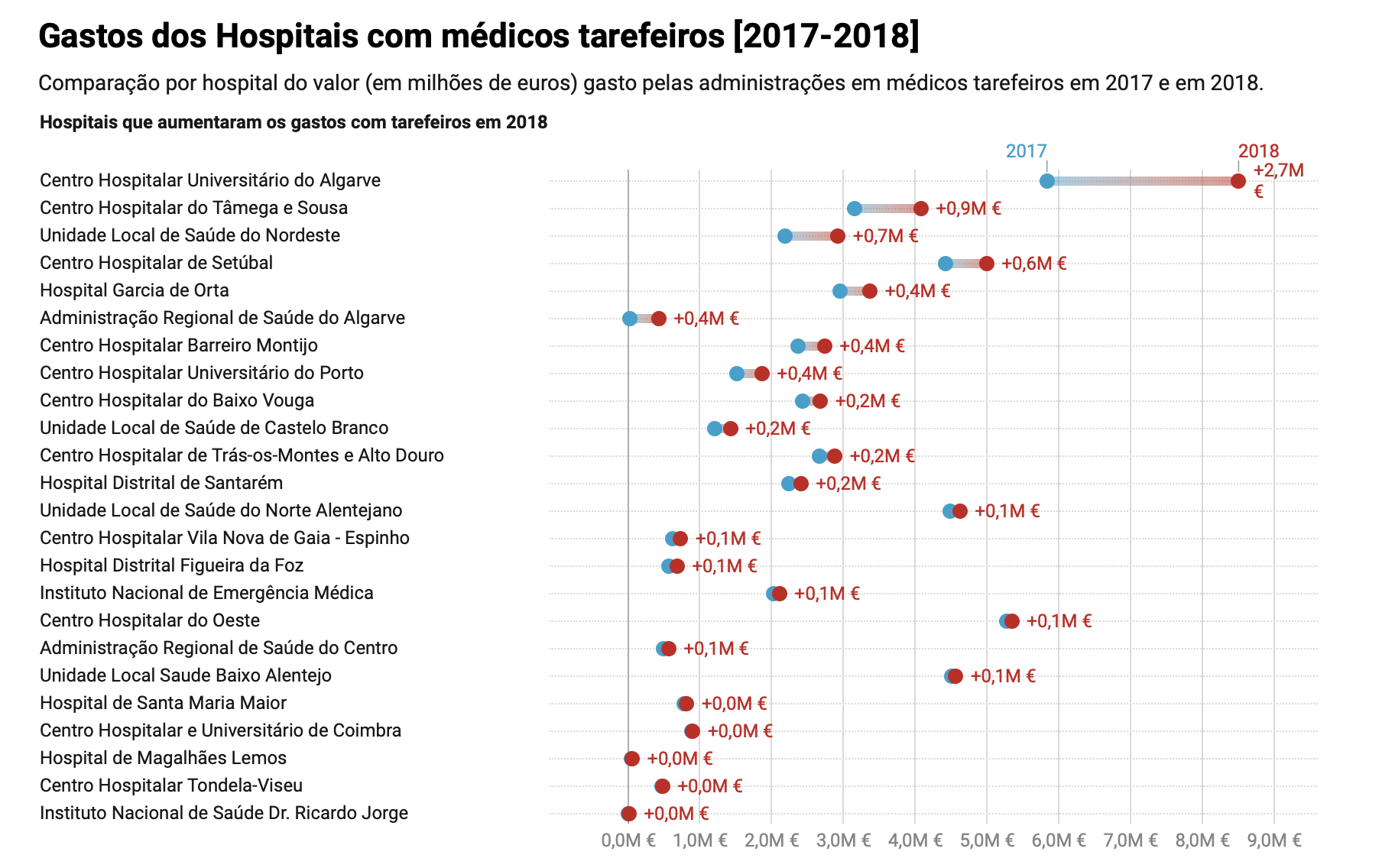
Last year, Inês Rocha and Rui Barros from ‘Rádio Renascença’ analyzed large amounts of data concerning temporarily hired doctors in public hospitals, available in a Government website dedicated to the national health service. What I liked about it was the fact that they gathered the main conclusions of the (big) investigation in an article in which each subheading redirects us to a more in-depth article on that particular subject. It’s called ‘Seven thing we learned about temporarily hired doctors in the national health service’: https://rr.sapo.pt/2019/06/19/pais/sete-coisas-que-aprendemos-sobre-os-medicos-tarefeiros-no-sns/especial/154922/

The seven main conclusions concerned public spending, average worked hours, selection/hiring process, effectiveness, profit for companies that sell temporary work and errors/lack of information in the data available (I also did a small investigation as a college assignment about a different subject using data from the same website and concluded the exact same thing – errors, numbers that don’t add up, lack of data in some cases, etc.).

They used the data as a starting point, analyzing thoroughly not only numbers but thousands of work contracts. With their conclusions, they confronted politicians and hospital administrations. They also talked to doctors in this situation and crossed the data with their testimonies, trying to understand how the doctors in which many emergency rooms rely on to stay open are selected and payed for. They also described how overall expense with these hirings rose despite the fall of the number of doctors hired in these conditions, and contradicting the belief/discourse that this solution is cheaper to the national health system and showing that the companies that sell temporary work have been increasing their profit (the State actually pays a lot more to a temporary doctor than other doctors, and above the limit stipulated in the law). In sum, they showed how the Government’s solution to the lack of doctors in some hospitals and regions is not a sustainable one.

They built some graphics, although they didn't rely heavily on them (just a few, and, in my opinion, the absolutely necessary ones - sometimes journalists overdo in the graphics/infographics department) the one showing the evolution in cost with these doctors is the one I find the most interesting. A ‘time series’ kind of graphic, but with a configuration I personally had never seen and found very well conceived (see image attached).

Also, I think it was great that they explained exactly how they used the data: how they found it, organized, analyzed it, and even the tools they used! And everything is available in a portal ‘Rádio Renascença’ created for the data they use in their stories. 

Attachment time series graphic - evolution of cost. in time.png

VIZ

by Deleted user -

For me this story from Bloomberg see the link below is the good exemple of data visualization. I don't which tool they used but the VIZ is very interactive. 


https://www.bloomberg.com/graphics/2015-dangerous-jobs/

VIZ

by Deleted user -

For me this story from Bloomberg see the link below is the good exemple of data visualization. I don't which tool they used but the VIZ is very interactive. 


https://www.bloomberg.com/graphics/2015-dangerous-jobs/

VIZ

by Deleted user -

For me this story from Bloomberg see the link below is the good exemple of data visualization. I don't which tool they used but the VIZ is very interactive. 


https://www.bloomberg.com/graphics/2015-dangerous-jobs/

Worldwide update

by Deleted user -

It is no secret that the Corona virus is vastly spreading as each day goes by. The link that I found (https://www.ecdc.europa.eu/en/geographical-distribution-2019-ncov-cases) is not a story, rather it provides data elements such as histograms,tables and geographic distributions. These forms of data provide updated information of the COVID-19 cases, from their worldwide spread to the number of cases and deaths within the countries impacted. 

Economic support against violence

by Deleted user -


Quita Estado apoyos de justicia a la mujer
https://refor.ma/Of-bah3eG
(Eliminates State economic support against violence for women).
In this note, reporter shows how a local program has decreased the money for the victims of violence.
It share the last five years of program behavior and the number of people affected, and the number of investigations where a woman reported violence,too.
In the same way, the reportage shows the number of investigation folders that are served by the judges.
I think, it was a good way to reflex all the “doors” about a problem.

Enviado desde mi iPhone

Which Democrats Are Leading the 2020 Presidential Race?

by Deleted user -

With so many presidential candidates in the Democratic primary, all kinds of debates and detailed research data is emerging predicting who will make the final selection.  Article below talks about how Bernie Sanders is leading using polling data and charted trends.

https://www.nytimes.com/interactive/2020/us/elections/democratic-polls.html

In a graph with Candidate polling average, individual polls are shown when the mouse hovers on the candidate polling average.


Q1

by Deleted user -

https://www.nytimes.com/2020/02/29/world/coronavirus-news.html?0p19G=0038


Data is included in this rolling coverage of the caronavirus, with a map included breaking down cases by country worldwide. Helps visualise statistics of cases, showing which countries have affected people and how many. Geographical context of the story is provided by the map showing locations of all affected. Map is colour coded for easy understanding of data. Reveals "86,583 coronavirus cases recorded globally Saturday in a database maintained by Johns Hopkins University, fewer than 6,800." So while the reporter didn't gather data information themselves, they verified it through an academic and reliable body.


Climate Change Opinions

by Deleted user -

Climate Change Rises as a Public Priority. But It’s More Partisan Than Ever.

https://www.nytimes.com/interactive/2020/02/20/climate/climate-change-polls.html

Within this story, the reporter used data from the Pew Research Center in a line chart, bar chart and histogram to demonstrate how support for climate change is partisan. The charts provide a clear and distinctive view of the differences in public opinion among Republicans and Democrats on climate. Additionally, the reporter noted the gap in opinion within the data which helped the reader immediately understand the chart’s relevance. I think the histogram was extremely effective because it compared climate change to numerous other policy issues and showed the different percentages of support between the two parties. Overall, these data elements complemented the story and illustrated its key elements.


991 people killed by police in the past year

by Deleted user -

"991 people have been shot and killed by police in the past year"
https://www.washingtonpost.com/graphics/investigations/police-shootings-database/

This Washington Post story continues to follow up on the publication's coverage of gun violence and police shootings. In 2015, The Post started logging every fatal shooting by an on-duty police officer in the United States. This story was using the numbers to look at the last year. It is an impactful number and holds police departments accountable. It is interactive, uses names to put faces to the victims, shows with data the rise in occurrence and shows how black Americans are killed at a much higher rate than white Americans. Powerful story. 


Employment Growth In Trump-voting Counties

by Deleted user -


https://www.nytimes.com/interactive/2019/06/05/upshot/employment-surged-in-trump-counties-does-he-deserve-credit.html

I really like this article because it's a follow-up on a lot of the post-2016 analyses that showed counties that voted for Donald Trump in the 2016 election were worse off economically (I've seen it measured in terms of the percentage they contributed to GDP, GDP growth and employment). This particular article shows that in those Trump-voting counties employment grew by 1.6 percent in 2018 in 10 percent of counties that favored Trump the most in 2016.  

The analysis seems pretty simple if you can find the BLS data (employment numbers by county by year). Though they didn't add personal stories there is so much added context in the article. 

I hope they do a follow-up piece when new data is available. 

ProPublica Illinois tracking the number of children who have stayed in psychiatric hospitals past their release dates

by Deleted user -

Hundreds of Illinois Children Languish in Psychiatric Hospitals After They’re Cleared For Release


This ProPublica story was eye-opening in highlighting Illinois' inability to move children out of psychiatric hospitals when the state should, causing hundreds of children to for weeks and even months too long in isolating environments. The infographic placed within the middle of the story is very specific, using coloring to display how many children on each day between July 2015-December 2017 were being held past release dates. On the worst day(s), 41 children were held beyond medical necessity. The infographic allows the reader to track any patterns occurring over time. You can also see that while 2017 fared better than 2015 and 2016, October and November 2017 still involved a shocking number of overstays. I appreciate this data visualization because its specificity allows the reader to drawn her own conclusions, depending on how she digs into the numbers.


This infographic provides context for an article that already provides devastating statistics on how children are affected when they spend so much time in facilities. Psychiatric facilities are meant for short term stays—kids are supposed to be released quickly to a different type of program that allows for more educational instruction, more typical day-to-day activities, and less waiting. And these releases are supposed to happen on time. Letting kids languish in isolating facilities is detrimental to their social and emotional health and development. The graphic underscores the failure of the Illinois system to get kids where they need to be, when they need to be there. 


"On average, more than one in five days spent in a psychiatric hospital, the records indicated, were not medically necessary,' Duaa Eldeib writes. Distilled into a sentence, that statistic is a lot to take in. In an infographic, it's even more overwhelming for the reader, sharpening my sense that the system needs reform.

Misleading graphs

by Deleted user -

Here is an example from a Norwegian newspaper.  https://journalisten.no/a-magasinet-aftenposten-statistikk/trine-eilertsen-beklager-misbruk-av-statistikk-i-a-magasinet/398871  To show how negative the development has been, the newspaper has made some graphs where the y-axis is cropped so that e.g. an increase of 0.3 percent in consultations with GPs from 2017 to 2018, looks like an explosion,

The Deep Sea by Neal Agarwal

by Deleted user -

https://neal.fun/deep-sea/


The story is titled The Deep Sea "made with love by Neal Agarwal", and reveals the different types of animals that exist on the seabed, according to the depth meters. Data does not tell a story, data is the story. I consider that it a story, but made with a lot of art.


1.How they use the data in the story:

1.1.To add context.

1.2. Search for characters.

1.3 Responsibility to the government.

1.4. Make the story more interactive.

1.5.Other way ...

Aliro J. Leal

@AlirioJLeal1

The negotiations in the Odebrecht scandal

by Deleted user -

In this course, I was presented to the Quinto Elemento Lab and, for me, they already are one of the best examples of investigative journalism and of how use data elements (and their visualization) in favor of the story.

As a Brazilian and following closely the Odebrecht scandal, that originated here but it extend to many parts of the world, a history that really got my attention was "Mexico rejects 'fast track' for justice by Odebrecht" (in the link: https://quintoelab.org/project/mexico-rechaza-via-rapida-justicia-odebrecht )

It is a very complete report about the Mexico situation in the scandal, where the data is used in the text, but also in infographics that make easier to understand the information, since there is a lot it.

(Un)sustainable fashion

by Aline Flor -

This set of infographics is part of a multimedia project about the (un)sustainability of fashion, divided into 4 sections. Data was used in two different ways: in the three text sections, data was refered to contextualize information; the fourth part (the set of infographics) was the visualization of some of the data refered in the texts and many more indicators

https://www.publico.pt/2019/11/29/infografia/pegada-roupa-391

In the texts, data was not used in a investigative way - it did not reveal something that has been hidden before. Data was taken from public reports, many of them from activist organizations, that gave context to the reporting. 

The infographics (the 4th part of the project) was determinant to show - to really visualize - the dimention of this globalized issue. Fashion is an industry that involves many actors through different countries, with huge ambiental, social and even human rights impact. The data aggregated in the 4th part made it easier to see, for example, the production and consumption cycle of the clothes, the huge amount of different materials produced, the water consumption and pollution effects and CO2 emissions, and the gendered and racist nature of work exploration.

DISCUSSION ON THE KILLINGS OF JOURNALISTS GLOBALLY

by Deleted user -

https://www.nuj.org.uk/news/ifj-mourns-49-killed-journalists-in-2019/

The above link is a story that was published by the International Federation of Journalists (IFJ) recording the numbers of Journalist who died in the line of duty in 2019.

The IFJ listed 18 countries where journalist were killed since the start of the year: including Africa (9); Asia Pacific (12); Europe (2); Latin America (18); and the Middle East and Arab world (8). The Federation also recorded six work-related accidental deaths in Tanzania (5) and the United States (1).

IFJ President, Younes Mjahed said The death toll is the lowest since 2000, when 37 journalists and media staff were killed, but the causes of the loss of life during 2019 remain largely the same .


Since my country Nigeria was mentioned,I took out time to research more,over 19 journalists were harassed, assaulted, brutalised, arrested and detained in 2019, a reporter was killed in the country.Meaning that the Nigeria government is not doing enough to protect the lives of an average Nigeria Journalist.

The use of numbers(data) made the story of more interest.

Investigation into a deadly police station

by Deleted user -

http://fingfx.thomsonreuters.com/gfx/rngs/PHILIPPINES-DRUGS/01006028044/index.html

This data-driven Reuters story, published in late 2017, investigated the deadliest police station in Quezon City, Philippines. This is part of the series on Philippine president Rodrigo Duterte’s drug war that won a Pulitzer Prize in 2018.

The special report titled “The boys from Davao” looked into the drug squad that racked up the highest number of kills in Quezon City. The police officers were from Davao, the hometown of Duterte.

The story used a map to show where the police killings in Quezon City occurred and to emphasize that the Station 6, where the Davao boys were based, was the deadliest in the city in the brutal campaign’s first year.

The story used a bar graph to show the police officers who took parts in deadly operations and how many deaths occurred when they were involved in the ops. 

It also had a chart showing which Davao Boys were present at operations in which alleged drug users and pushers were killed.


Dying Homeless

by Julia Gregory -

https://www.thebureauinvestigates.com/stories/2018-04-23/dying-homeless


No official body was putting together the stats of how many people die living in the streets of the UK.


They do now - thanks to this project by the team at the Bureau.


They used FOI, trawled local media reports, spoke to doctors in the seaside town of Brighton who were compiling their own list & put together 200s of stories.

They tweeted out #makethemcount #dyng homeless stories & collaborated with newsrooms in the UK. 


They even worked with the government’s ONS - national statistics agency - who got on board . The 2 groups won a National  Statistical Society award for this.


This week ONS published the latest stats. This will mean , perhaps, better provision for health care & housing support. 500 people’s lives are better documented and maybe some deaths will be prevented.  

Forensic Mapping

by Deleted user -

This is not a new story, but I am amazed with how data  and metadata can aide and add more depth and impact to journalism. Today's technology really adds value to reporting or journalism as a whole. 


 Malachy Browne's use of forensic mapping to verify a chemical attack was indeed very helpful in proving that the attack was staged.

https://www.nytimes.com/2017/05/01/insider/the-times-uses-forensic-mapping-to-verify-a-syrian-chemical-attack.html

Data journalism

by Deleted user -

The article presented by the newspaper El País on February 1, 2020 about Brexit. My attention is drawn to the breakdown it makes, by presenting figures for the approval of Brexit and the consequences it brings to the EU and the United Kingdom.


The article begins by presenting us with a tour from the referendum held on June 23, 2016, evidencing by means of figures the opinion of citizens regarding the abandonment of the United Kingdom to the EU. Then he shows us the consequences of leaving the United Kingdom to the EU with figures on issues such as; population and territory, commerce and tourism, defense and institutions. In each of these topics they are supported with statistics and figures. Very dynamic that facilitate the reading of the article.


I think that the article is quite dynamic in its graphics and presents the information in a very simple way. But it would gregaría a little more graphics that will delve deeper into the subject.


I attach the link:  


https://elpais.com/internacional/2020/01/31/actualidad/1580494832_099752.html


Let's Do The Numbers... NY Stock Exchange Story

by Deleted user -

I don't think you can do a story about the worst day on the Exchange since 2008 without a number of numbers.

https://www.nytimes.com/2020/02/28/business/stock-market-today-coronavirus.html?action=click&module=Spotlight&pgtype=Homepage

I do, however, wonder how 'it is known' (to use a Game of Thrones line) that the downturn is caused by fears about the corona virus. I often wish stories like this one would spend a little more time telling me what (it's assumed) everyone knows.

Analyzing Information Requests

by Deleted user -
In a recent story from Agência Pública, the usage of data itself is the subject of the investigation. Called "Bolsonaro's government accuses citzens of 'fishing' data by denying requests of public information" (Governo Bolsonaro acusa cidadão de "pescarem" dados ao negar pedidos de informação pública), the story analyzes data related to requests of public information, pointing out that de number of denied request have increase quintupled between from 2018 to 2019, in a response to what the government calls "fishing practices" from the citzens, even though the request does not fall in the definition, according to experts. It's and interesting and, above else, relevant usage of data to hold the government accontable to their acts.

Vendata-Venezuela

by Briceida Morales -
https://vendata.org/site/


Vendata is an association that aims to produce the mayor of open data collection with public information of Venezuela, through the collection, processing and transformation of closed data to open formats

Rap data

by Deleted user -

I've done a couple of projects where I built a database of every rap song mentioning a certain term.

The first of these was a timeline I created with a graphic design friend of every hip hop song a rapper dedicated to their mother. She did some awesome flowery illustrations of rappers and we made a playlist embedded in the site.

For the second, I created a database of every rap song mentioning Cal Ripken for the Baltimore Sun. We embedded sound clips and made infographics showing how the trend of namedropping cal Ripken rose and fell over the years as well as a map showing how references were coming from all over the nation.

Both of these projects were time-consuming but SUPER fun. Seeing my data work come to life through illustrations felt like a home run (pun intended).

Environmental infractions in the Amazon

by Rodrigo Nunes Lois -


I chose this recent story from Agência Pública, about environmental infractions committed by companies and economic groups investigated or mentioned in the famous "Car Wash" corruption case. 


https://apublica.org/2020/02/os-rastros-da-lava-jato-na-amazonia/


Pública did a big investigation showing that these companies committed infractions totaling R$ 600 million in the Legal Amazon, a region that involves nine states in the country. 

They used data to hold the companie accountable, show the amount of money in the infractions and the licenses distributed, and also how the federal government helped these companies (through financial aid). 


I think the story lacks of intercation. It would be nice to have a map to point out where in Brazil (in the Legal Amazon) were these environmental infractions.

Why your smartphone is causing you 'text neck' syndrome

by Deleted user -

Even this piece have been published more than a year ago I think it is a good example of use of data in an innovative/interesting way. Why your smartphone is causing you 'text neck' syndrome published in South China Morning Post shows (literally) how the extensive use of smartphones is affecting people. It shows the users the results of data analysis mostly through simple graphics and videos. The used interface is clean and easy to navigate. The team did a great job organizing the information and presenting it in a simple way. To gather data the team (Pablo Robles, Marcelo Duhalde and Darren Long) spent several days researching (and also recording) around Hong Kong. So their main data comes from in-field observations. They also use data from medical and academic reports. Other plus pint is the interactivity of the story, because it includes animated elements (anatomic illustrations) for the users to explore. The best example of this interactivity is a tool one that was "created for readers to press to see how much weight is being added to their neck when they text", in words of one of the project's members. 


Here is the link

https://multimedia.scmp.com/lifestyle/article/2183329/text-neck/index.html


Data Visualization of palm oil database is to investigate

by Deleted user -

Here’s a good example from WRI’s data visualization using Google earth imagery about palm oil mill database directly from companies in the palm supply chain that journalist can dig into more investigation as well as help the audiences to read sources about the circle of palm oil demand and its risks towards climate damage.  

https://data.globalforestwatch.org/datasets/ed8d5951b2a4482a9e62c4fe0bc23b5f_27?geometry=166.744%2C-51.172%2C-78.999%2C53.337

Betrayed investigation series by Chicago Tribune

by Deleted user -

BETRAYED

Chicago schools fail to protect students from sexual abuse and assault, leaving lasting damage


http://graphics.chicagotribune.com/chicago-public-schools-sexual-abuse/


Series investigated how students were raped, sexually abused by teachers, coaches and other support staff.  


They began with a series of quick hit statements with a map of the city of Chicago that began to populate

At Simeon Career Academy, a young track star was raped 40 times by a coach.

At Black Magnet Elementary, a substitute teacher sent a 14-year-old girl obscene texts and kissed her.

At Taft High School, a student reported that a security guard and track coach groped her during practice.

Over a decade, police investigated more than 520 cases of juvenile sexual assault and abuse in Chicago’s public schools.

Hundreds of students were harmed, the Tribune found. No area of the city was spared. (With that statement red dots fill the map.


START OF STORY:

They were top athletes and honor-roll students, children struggling to read and teenagers seeking guidance.

But then they became prey, among the many students raped or sexually abused during the last decade by trusted adults working in the Chicago Public Schools as district officials repeated obvious child-protection mistakes.

Their lives were upended, their futures clouded and their pain unacknowledged as a districtwide problem was kept under wraps. A Tribune analysis indicates that hundreds of students were harmed.

Drawing on police data, public and confidential records, and interviews with teens and young adults who spoke out, a Tribune investigation broke through the silence and secrecy surrounding these cases and found that:

When students summoned the courage to disclose abuse, teachers and principals failed to alert child welfare investigators or police despite the state’s mandated reporter law.

A high school student being interrogated

Questioned again and again

Reporting a teacher's kiss and touch turned into an ordeal for a 14-year-old freshman


Even in cases where school employees acted swiftly, they subjected young victims to repeated interrogations, inflicting more psychological pain and defying basic principles intended to preserve the integrity of an investigation.

Ineffective background checks exposed students to educators with criminal convictions and arrests for sex crimes against children. And CPS failed to disclose to other districts that past employees had resigned after investigators found credible evidence of abuse and harassment.

Whether the sexual attacks were brutal rapes, frightening verbal come-ons or “creepy,” groping touches, the students often felt betrayed by school officials and wounded for years.


The data gave context to who this was happening to, why it was happening and who needed to be held accountable. 


They also created a searchable database:

Search the crime data

Enter a public school’s name to see if the Chicago Tribune identified a Chicago police investigation of sexual assault or abuse involving a child inside that building from 2008 through 2017. Reporters confirmed more than 500 such cases. Schools with no confirmed reports will not appear.


Mortgage redlining

by Deleted user -

Housing discrimination in its many forms was ever-present in the region where I grew up. One form is mortgage redlining. I really liked this Reveal data investigation https://www.revealnews.org/article/for-people-of-color-banks-are-shutting-the-door-to-homeownership/

It was a year-long effort based on a government database of over 30 million records of mortgage applications. The journalists could see prospective borrowers’ race, income, debt ratios and location of the home. Their analysis showed minority applicants are denied at more than twice the rate of white borrowers. They explained that banks keep credit scores secret as well as the guidelines they use to generate those scores, then banks say the scores are the reason for disparity. The authors make a strong case that lenders are routinely breaking federal law. 

The data was mapped, allowing me to look at some of my old neighborhoods, which as the story suggests, are gentrifying and almost all mortgages go to white people. Upsetting!

Bank regulators are fine with the disparity and even loosening the rules. This story could help legislators fix loopholes and make lending more transparent and more fair. 

Prisons v. Schools

by Deleted user -
https://www.texastribune.org/2016/07/14/texas-spending-prison-and-jails-higher-any-other-s/


This article by the Texas Tribune looks at the rate of money spent on prison and jails in Texas compared to schools. The data acquired from the U.S. Department of Education shows the percentage of increased funding over time for jails versus school and puts in perspective the sharp contrast in how the state prioritizes its spending every year. Unfortunately, there are no visualizations in this story which I think would make it more interactive for a reader. 

In this case, data was used both as context to show the big picture as well as anecdotal to show particular instances of disparaging spending between both. 

NYC neighborhoods that contributed to presidential candidates

by Deleted user -

A cool data story I heard on the radio lately was about what neighborhoods in New York City gave the most money to each candidate. The source is this Gothamist  piece that visualizes the data underlying the story: https://gothamist.com/news/2020-money-race-chelsea-boosts-buttigieg-biden-takes-ues.

It sparked my interest because while New York is not a battleground state in the primary, this reporting illuminates the financial influence it can have on an election (which is just as important if not more so in the competition to be the candidate). It's illuminating and telling of New York's culture which neighborhoods rallied behind which candidate, and the numbers themselves are revealing about how much momentum each candidate has.

The reporter was then able to use that data to interview people and get their reactions to why a certain candidate was popular in their neighborhoods, further contextualizing the piece and providing a local hook to a national story.


Pew Research--a good source for initial information

by Laurie Sefton -

I chose this article from Pew Research, "Most Americans don’t see Democratic candidates as very religious", as it's timely and gives a number of avenues for further investigation--especially as the table with the drill-down numbers indicates some group/candidate pairings may vary quieta bit from the overall numbers.

Pew Research can be a good place to start if you need background data, or to see how much of the research leading to an investigation has already been performed. Pew also provides datasets for analysis.

When data shows you something is missing...

by Deleted user -

This is an example of how data can prompt a story. In this case, the data that exists doesn't make the story-- it's the data that's missing.

In this investigation, reporters requested data on the number of complaints against livestock operations. In North Carolina, only 33 complaints were counted, while other states that do not have the same level of livestock production counted thousands of complaints. That told the reporters there was something going on. They thought the env. department must have been miscounting or withholding data...

https://thefern.org/2019/08/for-years-complaints-about-north-carolinas-hog-pollution-vanished-in-state-bureaucracy/

Counties that voted for Trump and imports.

by Deleted user -

I found a story that made a direct connection between the counties that imported the most foreign goods and the size of the Trump vote.  They broke down the numbers and then included a shaded map of the UIS, where the more darkly shaded counties voted at a higher percentage for Trump.  The map really supported the main points made in the article.  It was not interactive and did not hold anyone to account, but it still backed up the raw numbers presented.


https://www.washingtonpost.com/news/monkey-cage/wp/2016/12/02/trump-won-where-import-shocks-from-china-and-mexico-were-strongest/

Twelve Million Phones, One Dataset, Zero Privacy

by Deleted user -

Hi everyone!


I would like to share a story by Stuart A. Thompson and Charlie Warzel about an investigative look into mobile tracking in the US.

LINK: https://www.nytimes.com/interactive/2019/12/19/opinion/location-tracking-cell-phone.html

The reporters used a massive data set consisting of billions of rows that logged phone pings with a geometric data. They then used this data to tell an exciting story about how tracking works, how "easily" it can be done and that it is almost impossible to avoid (apart not having any electronic device on you). I appreciate the different interpretations of the same data and how it can be used to track and identify even a specific person, given that you have enough information on them. Also, the visualizations are simple but very useful, in my opinion - conveying the message well while directly showing what the journalists want you to see.      


Cheers,

Andrew


Using data for comparison

by Deleted user -

This is a work I've done some years ago, using murder registers in São Paulo, Brazil, to compar with rates of other countries. I found a big gap in São Paulo, where there is neighboorhoods with european rates and other with really high rates.


http://temas.folha.uol.com.br/mapa-da-morte/introducao/mapa-da-morte-em-sp-vai-da-suecia-ate-o-mexico-locais-dos-crimes-se-repetem.shtml

M4; Question 1 ; Discussion Forum 4

by Deleted user -

The story that interest me could be found in this link; www.ripplesnigeria.com/investigation. It’s on ‘Enugu Libraries in ruins despite budgetary allocations’. This story was done with supports from MacArthur foundation and International Centre for investigative reporting.

The team used Data, bar chat to be precise, in this story appropriately. It shows the big picture as in budgetary allocations in 3 years 2016 – 2108 for rehabilitation of public libraries in Enugu State Southeast Nigeria. It gives context to the story in that it shows recurring budgeted projects, indicative of massive corruption by budgeting authorities, making it possible to hold government accountable for all the budgetary allocations.


Reuters investigates former NSA who spy on Americans for UAE

by gregory anderson -

The link to this January 30th, 2019 story is right here: http://reuters.com/investigates/special-report/usa-spying-raven/

[I must work on my ability to search out stories as my skills are pallid and weak in comparison to all the great stories my fellow students have been providing.]

The graphics for this story of USA mercenary spies include a map to place UAE amid its neighbors, scrolling sub-titles, side-by-side Purple and Black Briefing summary with respective colors for folder image and heading, and links to other related stories. It also included static images of Contract Spy Stroud, a computer with Edward Snowden's image [he'd been hired just months before he leaked National Secrets], of Ft. Meade NSA building, a skyline view with text referring to the New UAE National Electronic Security Authority.

I found the opening scroll sub-titles to be distracting, interspersed quotes unnecessary, static images uninformative, and the overall effect for me as a reader is that it is a gimmick.

I did find the graphic of the Villa (converted mansion as base of operations) with the changing highlights to match the steps 1-6 of the outline of actions to be intriguing, as well as on the verge of being helpful. But it didn't actually add any essential emphasis or awareness to me of the actions or intent of Americans spying on Americans for foreign nationals.


Luanda Leaks - reporting with data

by Deleted user -

I bring the Luanda Leaks investigation, an investigation into corruption and illicit enrichment by Isabel dos Santos, daughter of the former president of Angola.

The investigation began with a series of data provided to journalists by a Portuguese hacker. From then on, a group of journalists from all over the world began to work with the data provided and to look for links between the data they received. In the investigation, the journalists investigated properties of Isabel dos Santos, records of ghost companies in Dubai, used in corruption schemes in Luanda through alleged consultancy services offered to the company Sonangol, Angola's largest public company. In addition, journalists investigated bank records, discovered fraudulent schemes in Angolan banks that ended in cash did not impose on a Portuguese bank where Isabel dos Santos is a shareholder.I think that Luanda Leaks is one of the largest records of reports in Africa with countless data, documents.

You can see the link bellow:


Out-of-county patients

by Deleted user -

The story I chose isn't very recent, but it is one that pertains to my city. There is a public hospital in Dallas that accepts out-of-county patients. The reporter was able to obtain data that shows that Dallas County taxpayers were paying for more and more out-of-county patients per year, which allegedly irked the president of the hospital. From what I understand, this information can be easily obtained through a FOIA request since it's a public hospital. From there it's just a matter of parsing through the data to understand what you're looking at. 


https://www.dallasnews.com/news/2017/06/29/dallas-county-taxpayers-foot-the-bill-as-parkland-treats-suburban-counties-uninsured-residents/

Climate change in the U.S.

by Deleted user -

https://www.washingtonpost.com/graphics/2019/national/climate-environment/climate-change-america/

This was the first story in an excellent recent series by The Washington Post, examining locations around the world where local temperatures have already risen more than 2 degrees Celsius since the preindustrial era. (According to the terms of the Paris climate agreement, world nations are working to keep global temperatures from rising more than 2C.)  

For this story, the reporters analyzed NOAA data at the state and county level from the years 1895 to 2018, calculating annual mean temperature trends. In this way, they determined which counties across the country have already warmed by at least 2C. The story includes a national map, and an interactive component that allows readers to search the list of counties and see how much each has warmed. 

The story goes on to look at specific climate impacts in some of the fastest-warming states in the nation, identified by the data. It includes not only interviews with climate scientists, but characters from each location the reporters visited -- real people affected by the consequences of the ongoing warming.  

Investigation about the deaths of Hurricane Maria

by Deleted user -

This is an amazing job journalists from CPI, Quartz and AP did. 

After Hurricane Maria devastated Puerto Rico in 2017 Hurricane Maria devastated Puerto Rico, the government insisted that only a  few dozen people had died. With no reliable official death toll,  the journalists teamed up to build a database of victims that list them by name and includes demographic details, such as age, place of residence, and in most cases, cause of death.

http://periodismoinvestigativo.com/2018/09/the-deaths-of-hurricane-maria/

Maternal Mortality

by Paro Pain -

Do private hospitals in India perform an unnecessary number of C-section operations in order to make more money? It’s a common worry among Indian families, but until recently there was no official data to back up their concerns.

Then data journalists working at How India Lives, a three-year-old startup whose mission is to make public data more easily accessible, stumbled across a database India’s central health ministry had been maintaining. The story here at  https://www.who.int/reproductivehealth/publications/maternal_perinatal_health/cs-statement/en/ wasn’t looking at C-sections specifically; it was tracking pregnant women and newborns for a study on how to reduce infant and maternal mortality rates. But when How India Lives journalists dug into the dataset, they found that the numbers supported what many Indians had considered common knowledge: the number of C-sections conducted at private hospitals was almost three times as high as the number conducted at government-run, public facilities.


Use of data

by Deleted user -

https://www.nytimes.com/interactive/2017/05/14/upshot/if-americans-can-find-north-korea-on-a-map-theyre-more-likely-to-prefer-diplomacy.html

This is not a recent story, but it's a good one with maps and data used to show how many people are able to locate North Korea on an unlabeled map. The data added context to the story and showed the diversity in people's backgrounds and opinions and how that contributed to their ability to locate North Korea on the map.

NYT: Michael Bloomberg's Billions

by Deleted user -

I really liked the story about Michael Bloomberg's finances the NYT did just recently. 

https://www.nytimes.com/interactive/2020/02/15/us/politics/michael-bloomberg-spending.html


They reported how Bloomberg upped his political and charitable donations in the last years and can now count on allies all across the countries. The data and visualisation they show underscores their reporting as it lets the user move through different years and see how more and more donations pop up all across the country (including the amounts, which keep growing). 

They also used data to show what issues Bloomberg has spent the most on and to compare spending to the behavior of other candidates. 

Not only is the data extremely helpful to get a deeper understanding of the story, it also adds value because of its visuals and the interactive way it is presented. 

China Pasos de gigante

by Deleted user -

Today I could title  this article from Financial Times /2016  "The Black Room Vs China Expansion"

https://ig.ft.com/sites/special-reports/one-belt-one-road/?mhq5j=e3

On my opinion: the content has on place the scroll  > visual map connection.  Optimum job.

 I will change the colour of the single lined-routes to make understandable the type of project running across countries and set some meddle location names. 

Q1

by Thomas Cieslewicz -

https://www.faz.net/aktuell/wirtschaft/breiter-kursverfall-an-den-weltboersen-16654914.html


Data journalism appears to play only a minor role in the German media. So I'm glad I found anything at all.


The corona virus has economic consequences. This is how the text describes the slump on stock exchanges worldwide. He gives examples of the correction of business goals of some American companies as well as a statement from Donald Trump to Corona. All of this is not supported graphically


  The development of the German stock index is visualized in an interactive graphic. The second interactive graphic has nothing to do with the ordinary content. It shows the number of confirmed illnesses, recoveries and deaths from the virus worldwide. One could benevolently call this additional information.

data elements in story

by Deleted user -

https://www.theguardian.com/us-news/datablog/2020/feb/27/2020-us-census-black-people-mistakes-count


I saw this story on The Guardian website about how the US Census undercounts people of color. The initial bar graph has drawings of pencils and erasers. The eraser symbolizes how minorities are undercounted and the pencils show when they are counted twice. The graphic caught my eye because of the pencils and erasers used for undercounting and overcounting. The graphic has a pencil and eraser for all the people who were counted by the census. The graphic is labeled "Who Gets Miscounted In The Census." The data that is used came from the census bureau. 

Mental health care access in Brazil

by Deleted user -

Here's a very good example of a hard using data reporting >>> https://www.nexojornal.com.br/grafico/2020/01/27/Como-é-o-acesso-à-saúde-mental-nos-municípios-brasileiros

In this reporting, the reporters collected many informations about the Brazilian health care system. Analyzing city by city, they showed in the graphics of what locations people are needy of mental care access and where they are not. In this particular reporting, the data weren't used to find characters, but were used both to contextualize the reader about the whole situation (about 300 cities in Brazil do not have psychologists ans almost 3.000 do not have psychiatrists) and to verify government procedures. There are also 10 different graphics, including charts and maps that make the reporting more interactive and easy understanding.

US primary election

by Deleted user -

Link: https://www.nytimes.com/interactive/2020/us/elections/delegate-count-primary-results.html


NY Times is doing an interesting continuous story with data. This one, while not investigative, helps break down how exactly primary delegates work. I also like that it's not one-and-done. It's mean to be updated as the primary elections roll on. They also went a little deeper by including the 2016 results for comparison. That will not only keep people coming back to the story to see what's changed, but also makes the elections easier to understand.  

Coronavirus impact as of 2/27

by Deleted user -

Like many others, I've found that many of the most recent examples of data journalism deal with coronavirus. This article is from the BBC and was published this morning, February 27th. With a story like the coronavirus it is important to recognize that the data is constantly changing as more cases are detected and the virus continues to be studied. 

The authors of this article took an informative approach and used multiple visual aids such as maps, bar graphs, and line graphs. There is a lot of information being introduced daily to the public regarding the spread of the virus, however, this was one of the most informative and thorough that I have read.

The information broke down the impact of the virus down into multiple areas including but not limited to: the impact in China, the impact in Northern Italy, the impact in Iran, the impact on South Korea, the impact of all countries, worldwide comparison to similar outbreaks such as SARS, daily death tolls in China, and how the virus spread within China after the first cases were reported in Wuhan. 

NYT story on how U.S. guns fuel Jamaican homicide crisis

by Deleted user -

In August of last year, the New York Times ran a story about how U.S. guns end up in other nations in Latin America and the Caribbean, and how often they are used to commit crimes and/or homicides. Link here:
https://www.nytimes.com/2019/08/25/world/americas/one-handgun-9-murders-how-american-firearms-cause-carnage-abroad.html

When reading the story, I was captivated by how the data in the story was weaved so seamlessly into the narrative, and how the figures provided revealed how often, and how quickly, U.S. manufactured firearms end up in Jamaica. 

For starters, the story was able to trace back the origin of a U.S.-made gun that was used in 9 killings in Jamaica. The gun was named Briana by Jamaican police, which was used in the story and almost gave life to the firearm, as if a human character. 

Excerpt:

"With few clues to identify her, the police named her Briana. They knew only her country of origin — the United States — where she had been virtually untraceable since 1991. She was a phantom, the eighth-most-wanted killer on an island with no shortage of murder, suffering one of the highest homicide rates in the world. And she was only one of thousands.

Briana, serial number 245PN70462, was a 9-millimeter Browning handgun."
--

Throughout the story, data and statistics elucidate the connection between U.S. guns and murders in other countries. Additional data also shows the reader how a gun purchased in 1991 by a farmer in North Carolina ended up in the hands of a Jamaican gangster named Hawk Eye:

"Drawing on court documents, case files, dozens of interviews and confidential data from law enforcement officials in both countries, The Times traced a single gun — Briana — to nine different homicides in Clarendon, a largely rural area of Jamaica where violence has spiked in recent years.

Purchased in 1991 by a farmer in Greenville, N.C., the Browning vanished from the public record for nearly 24 years — until it suddenly started wreaking havoc in Jamaica.

More than 20 years after being sold in North Carolina, the handgun became one of the most lethal in Jamaica, the tool of a one-eyed gangster named Hawk Eye."

There is ample gun-related data throughout the story, which also examines gun policy and laws in both the U.S. and Jamaica, and explains -- by following the path of one gun -- the links between homicides in other countries and excessive gun production in the U.S.

Today, looking back at the story for the first time in a few months, I do think there is an opportunity for an interactive chart or graphic, perhaps that follows the path of the gun in the story, Briana. The story itself is riveting and the photos are excellent, though perhaps an interactive element could have provided an even more engaging read. 

2020 US presidential election

by Deleted user -

The New York Times published a story today about the obstacles the Democratic Party have to overcome to connect with voters in battleground states. Here is the link: https://www.nytimes.com/interactive/2020/02/27/upshot/democrats-may-need-to-break-out-of-the-whole-foods-bubble.html

It's a data-driven article, so it had to make a very good use of data visualization. In my opinion it succeeds with plenty of maps and sheets, plus good analysis.

Maybe they could give the readers a chance to check data from their own precints or electoral districts. However I imagine the workload in creating that content would make it almost impossible. Could they use a bit of programming to solve the issue? I'm not so sure.

Open database maps shootings in Rio de Janeiro

by Deleted user -
One platform that has contributed a lot to press reporting urban violence here in Brazil (mainly in Rio de Janeiro) is the Fogo Cruzado (https://fogocruzado.org.br/). Collaborative and integrated with the cell phone, it allows information about shootings and shots in Rio de Janeiro to be quickly made available on the Internet, which facilitates the work of the media. (which often does not move to risky areas, for example). With the data from the platform, Jornal Extra was able to point out recently, for example, that despite the number of confrontations with firearms in the city have decreased, the lethality of these confrontations has increased expressively. (https://extra.globo.com/casos-de-policia/sao-goncalo-ja-registrou-89-baleados-50-mortes-por-arma-de-fogo-so-em-2020-rv1-1-24254996.html)

Do you drink pesticides?

by Deleted user -

https://portrasdoalimento.info/agrotoxico-na-agua/

This article is a collab between "Repórter Brasil", "Public Eye"and "Agência Pública de Jornalismo Investigativo". They used data to show us what kind of pesticides are in potable water in a lot of cities in Brazil. Datas are scraped from governament with a Information Acess Law. If you want to know what kind of water do you drink, click on the map, or write the city name. All datas are there. 

Boomtown, Flood Town

by Deleted user -

Hi everyone, this isn't a recent example, but I remember this really helping me visualize the extent of the flood risk to my family in the Houston suburbs after the Labor Day floods and Hurricane Harvey and how development puts them at continued risk. This was by the good folks at the Texas Tribune and Propublica. 

https://houston.texastribune.org/boomtown-floodtown/?_ga=2.229516956.1240252171.1582823417-122058066.1571694376

The Guardian Australia's The Killing Times

by Deleted user -

In Australia, mainstream society can often be very ignorant or find it very easy to ignore the fact that the country is still a colony state and that the First Nations people were and continue to be treated badly. History education seems to be a bit of a hit and miss situation - the levels of knowledge vary widely. 

The Guardian found data on all the locations of massacres of Indigenous Australians and mapped them all. 

It drove the point home that almost everywhere you turn, there was a murder of someone who had a claim to the land. And that almost every date in the calendar was a day of death and trauma for Indigenous Australians. 

It showed how little regard settlers had for Indigenous Australians, it reminded people that this was a massive amount of trauma and genocide not often discussed in education, not often taught well and not ofteh thought about and quite often dismissed because people want to think more romantically about their past history and that there was a government in power willing to support a narrative that erased or didn't pay attention to all of this. 

I think it went a huge way to changing people's attitudes and educating people. 

It was primarily a map with quotes from people and historical accounts and a lot of context explaining it all. 


LINK: https://www.theguardian.com/australia-news/series/the-killing-times

Violence in Brazil

by Deleted user -

I enjoyed this an ambitious data project that involved a partnership between G1 media group, the Center for the Study of Violence and the Brazilian Forum on Public Security. They recorded and investigated the 1,195 violent deaths - homicide, femicide, police shootings, deaths in robberies and suicide - that took place over a week in Brazil. Some 230 journalists then worked to tell the stories of the people behind the statistics in this "death epidemic":

https://g1.globo.com/monitor-da-violencia/noticia/uma-semana-de-mortes-o-retrato-da-violencia-no-brasil.ghtml

The information is presented in a number of different ways. A video contains snapshots of some of the dead with a map (also available separately) that is updated as murders are reported. The photos of many of the dead were collected and presented, and there are a number of explainer articles that break down the deaths.

Auge del libro Digital - Digital Publishing

by Deleted user -

This is a published story on digital publishing (new editorial formats that reactivate the Spanish publishing industry) in Spain that includes data elements.

https://digitalinnovation.atavist.com/auge-del-libro-digital

The story shares links to the public statistics sources available online that were used. It provides charts, mapping visialization which is interactive, quiz and polls that reinforce the interactive content, etc.


Reuters news agency investigated the issue of the American police using electric stun guns

by Deleted user -

https://www.reuters.com/investigates/special-report/usa-taser-911/

Reuters news agency investigated the issue of the American police using electric stun guns, and used the numbers, the numbers of the injured, and the victims who died due to the police use of this weapon, and Reuters used the data in its investigation by monitoring the number of victims and the percentage of the manufacturer's sales and areas of use, as Reuters raised  Accountability of the government and police force to limit the use of these weapons and the excessive use of violence by the police

M4; Question 1; Discussion Forum 4.

by Deleted user -

The story that interest me could be found in this link; www.ripplesnigeria.com/investigation. It’s on ‘Enugu Libraries in ruins despite budgetary allocations’. This story was done with supports from MacArthur foundation and International Centre for investigative reporting.

The team used Data, bar chat to be precise, in this story appropriately. It shows the big picture as in budgetary allocations in 3 years 2016 – 2108 for rehabilitation of public libraries in Enugu State Southeast Nigeria. It gives context to the story in that it shows recurring budgeted projects, indicative of massive corruption by budgeting authorities, making it possible to hold government accountable for all the budgetary allocations.


China reveals what the moon's hidden face is made of

by Deleted user -

https://elpais.com/elpais/2020/02/25/ciencia/1582651238_235155.html

The ‘Yutu-2’ obtains the most accurate radar images of the lunar interior to date

By NUÑO DOMÍNGUEZ

Madrid 27 FEB 2020 - 11:43 CET


Data on the internal composition of the moon are shown and how the visible and unseen face is constructed 

Context data are shown to explain the situation in which the moon remains in both movements.

There are no interactive elements, but abundant data is offered that justify and endorse the information.

Simple Bar Chart

by Deleted user -

Here's a data story that uses two bar charts to shows how likely Asian Americans are to fill out the Census. The story contains a bar chart that compares that likelihood with other racial/ethnic groups. It also shows another bar graph on racial/ethnic groups that are concerned that the census would be used against them.

https://www.pri.org/stories/2019-05-21/asian-americans-could-be-group-most-affected-census-citizenship-question

I chose this story because:

1) Because I'm new to data viz, this seems like the type of chart that I can start using in my daily stories 

2) The charts gave context by comparing how different groups would fill out the Census

Organ trade investigation

by Deleted user -

The investigation has some data lack , it relied on the statement of the Egyptian official sources to obtain statistics on the figures related to the transplantation of organs and donors, and in my opinion it was not sufficient.  

Where data should be obtained from the Yemeni and the official Syrian side as well. The investigation focused on Yemeni refugees more than the Syrians, making the investigation unbalanced. 

The report completely omitted any any female references. It also didn't suggest any solutions, not even asked the authorities about their progress to stop or fight this phenomenon. 

Recently published investigative story on corruption in Kyrgyzstan

by Deleted user -

Hello everyone,

Here is the link below that I would like to share with you.

The report is about corruption in Kyrgyzstan. The story was investigated by OCCRP, Kloop, and Radio Free Europe/Radio

https://kloop.kg/blog/2019/11/21/sovmestnye-investitsii-v-dubae-svyaz-semej-matraimovyh-i-abdukadyr/

best,

Yermek

RECENTLY PUBLISHED STORY WITH DATA

by Deleted user -

This is a bbc story that gives the current trend on coronavirus .

bbc.com/news/world-asia-china

RECENTLY PUBLISHED STORY WITH DATA

by Deleted user -

This is a bbc story that gives the current trend on coronavirus .

bbc.com/news/world-asia-china