This is a bbc story that gives the current trend on coronavirus .
bbc.com/news/world-asia-china
Choose a recently published story that interests you that includes data elements. Share the link here and discuss how the reporter or team used data in the story. Did they use data add context, find characters, hold the government accountable, make the story more interactive, or in some other way?
Instructions:
Please provide your response below to the forum question by clicking on "Add a New Discussion Topic" or respond to an existing discussion thread below by entering the discussion and then respond by clicking reply beneath the post.
If you are receiving email notifications from the forums to your inbox, please open any email notification in your inbox and scroll down the message. You will have an option to unsubscribe at the bottom of the message.
Each time you create a post or create a discussion thread be sure to click on the drop down menu below the text box and choose to NOT be subscribed to the forum to not receive emails related to your post/comment/thread.
This is a bbc story that gives the current trend on coronavirus .
bbc.com/news/world-asia-china
This is a bbc story that gives the current trend on coronavirus .
bbc.com/news/world-asia-china
This is a bbc story that gives the current trend on coronavirus .
bbc.com/news/world-asia-china
This is a bbc story that gives the current trend on coronavirus .
bbc.com/news/world-asia-china
This is a bbc story that gives the current trend on coronavirus .
bbc.com/news/world-asia-china
This is a bbc story that gives the current trend on coronavirus .
bbc.com/news/world-asia-china
This is a bbc story that gives the current trend on coronavirus .
bbc.com/news/world-asia-china
This is a bbc story that gives the current trend on coronavirus .
bbc.com/news/world-asia-china
This is a bbc story that gives the current trend on coronavirus .
bbc.com/news/world-asia-china
This is a bbc story that gives the current trend on coronavirus .
bbc.com/news/world-asia-china
This is a bbc story that gives the current trend on coronavirus .
bbc.com/news/world-asia-china
This is a bbc story that gives the current trend on coronavirus .
bbc.com/news/world-asia-china
This is a bbc story that gives the current trend on corona virus
bbc.com/news/world-asia-china
Good day,
The article is well written and provides a good timeline of the virus.
Data was used sparingly and appropriately in the piece to make points. The numbers back up the analysis objectively.
I think that a visual timeline and a infographic would have made the data more accessible to the reader.
AS well it might have reduced the length of the article. It’s a question I have been pondering.
I don’t have the patience to scroll down eight to ten screens to read the entre article.
Are these articles read from top to bottom? Are they skimmed? Are they printed and read?
Regards,
Caterina
Efectococuyo.com is a website to publish reports and articles of investigate journalism. orThey made a especial report about the labor diaspora in the banking sector in Venezuela. How the labor force diminished in the last tree years. They used data to add context for the stadistics that showed the numbers of employees that the nationals banks lost them in june of 2018 and 2019. They used the data from the National Superintendence of Banks -SUDEBAN-and at the end of the story they published two charts, one of them interactive, to show the banks that lost more employees and the customer service infraestructure reduction .
Here is the link for the all story:
https://efectococuyo.com/economia/banca-nacional-perdio-4-206-empleados-durante-el-ano-2019/
Hello to everyone,
Thank you Malan for helping to make Data journalism simple to understand and helpful. Your course was a huge eye opener
Personally i loved the story on Migration flow in West and central Africa. I admire how they used maps and easy graphs to reveal the total number of migrants living in the area. Even more, i easily relate with migration as I come from Africa
Injustice Watch does great work with data. They investigate issues pertaining primarily to the criminal justice system in Illinois, and even more specifically & frequently in Chicago. This leads to several large projects with linked articles, and they're very good and tracking systemic problems within a system. At the top of the page, there is a link in the header called "Projects." There is some great work there. In every major project, they highlight several individuals to detail specific stories, while using data to verify that individual stories are samples of many stories.
https://www.injusticewatch.org/series/police-abuse-no-consequences/
https://migration.iom.int/sites/all/themes/fmp/pages/data-story/index.html
THIS IS A STORY ON MIGRATION FLOW IN WEST AND CENTRAL AFRICA, with maps, and graphs, they were able to tell the total number of migrants living in the west and central Africa. They also mapped out which regions they came from.
https://www.nytimes.com/2020/02/19/upshot/rich-city-poor-city-population-growth.html
The analysis of the data is the story - the reporters looked at a dataset about wealth change over a period of time in different areas, and found a new angle by grouping the metropolitan areas by their wealth, instead of some other variable like location or another factor variable. This analysis was enriched a little by some visualisations that first paint a picture of change in wealth over time for the 5 richest cities, and then show in greater detail how the change looks for different areas within the top 250.
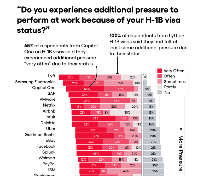
I really appreciated the way information was laid out in the bar graph in this story I came across in One Zero, which is about discrimination against tech workers on visas.
The story uses lots of data, but this example was especially good. It does precisely what a bar graph should do according to our reading this week.
The short text labels above the graph are particularly handy, serving as a short example to explain what I'm looking at.
This visualization gives context to the story. An otherwise dry piece is made more engaging by visualizing the elements of the purchase and sale prices of homes—important indicators of wealth.
Well vizualized but shocking content:
https://digitalpresent.tagesspiegel.de/alle-rechtsextremen-gewalttaten-seit-2010
Here in Brazil we have the LAI (Lei do Acesso à Informação) that help us investigate the government. This is from a former teacher of mine that used the data to see how much the government spent in publicity the last year.
This is a good way to use simple data to put some pressure in the government.
http://livre.jor.br/governo-gastou-em-media-r-205-mil-em-publicidade-por-dia-neste-ano/
This Financial Times story about two female filmmakers includes data visualization to paint the big picture. The graphic shows that while there are over 40% female actors in leading roles, the percentage of women behind scenes is still way behind that of men, especially among directors. It is a good example of combining individual stories with the overall background.
https://www.ft.com/content/8954396c-5405-11ea-a1ef-da1721a0541e
My country has for over 10 years been plagued by Boko Haram insurgency, as a result, there has been an increasing number of Internally Displaced People who now live in camps provided by NGO and government agencies. For me to get accurate and objective information, I usually rely on the Internal Displacement Monitoring Centre report.
They usually use data and infographics presentations to simplify complex and cumbersome information. They are always my go-to for tracking the current state of IDPs in North-East Nigeria.
Below is a link to a report on the current state of IDP in Nigeria’
https://www.internal-displacement.org/countries/nigeria
The information provided here most time differ for the false report put forward by the government and this gives room for civil society groups and the media to shine the spotlight on government activities, asking tough questions.
I am interested in a publication and how this coronavirus topic was presented by https://cuidateplus.marca.com/enfermedades/infecciosas/coronavirus.html
CIPER, an investigative reporting organization in Chile, has frequently investigated issues related to the Pinochet dictatorship. (https://ciperchile.cl/2016/12/05/el-verdadero-valor-de-la-fortuna-que-acumulo-pinochet/)
hi all!
I hope it is okey to share a story from a friend! :)
This article written from someone I know and who is really great at data visualisation. It was a big success. It got quoted by the media in several countries even without doing media outreach. The reason this happened is because the data is good and can be used in multiple ways. By creating a pattern to analyse which is the healthiest city and adding several capitals around the world, it allowed people to play around with the data and create their own story focused on their own country.
What I like about this article is how he created his own data in a very creative and informative way.
https://www.treated.com/blog/europes-healthiest-capital-city
In this incredible special report by the Agência Pública (brazilian investigative agency), an exclusive survey was made based on data from the Fundação Nacional do Índio - Funai (indigenous insitute of the goverment) and the National Mining Agency (ANM). Pública (a independent collective of journalists) reveals who will be the natural and legal persons benefited with the PL 191/2020 (bill) of President Jair Bolsonaro, who seeks to open the Brazilian Indigenous Lands for exploitation. In addition, it reveals the increase in the number of mining processes in the Amazon in 2019. This collective also used to check fake news and make a lot of good reports against the goverment corruption.
https://apublica.org/2020/02/a-mineracao-em-terra-indigena-com-nome-sobrenome-e-cnpj/
There's a really good website from Argentina called Chequeado. They use data to do factchecking of fake news and things that politicians said, for example. They also complement that info with different sources. It's a really cool tool:
It's not exactly a story, nor is it very recent; but it seems to me a beautiful example, as a mexican, of what a lot of data can do if translated into a good visualization.
The expert who did this GIF turned to the national statistics institute to get data from registered taco shops in the country and map it out: https://twitter.com/datavizero/status/1190798529309986816?s=20
The map of femicides in Mexico uses geo data along with information regarding the crimes committed by year from 2016 on, information on the victims and the case itself.
https://www.google.com/maps/d/u/0/viewer?mid=174IjBzP-fl_6wpRHg5pkGSj2egE
I share a page that conducts investigative journalism: https://www.gastopublico.org/informes-del-observatorio/en-que-se-gasta-el-presupuesto-del-mies?fbclid=IwAR3-JC2FyQfMwH6Oc40SThoHNJ67B6orLaBQfgwu-hgM8XdMjnMMXXD3

In that news they turned to official documents, interviews and presented context.I remember when this story was published, folks think they know how lobbying works but the copy and paste feature used in bills across the country was so impactful.
https://datajournalismawards.org/projects/copy-paste-legislate-we-looked-for-legislation-that-was-written-by-special-interests-we-found-it-in-all-50-states/
I read a story this morning about university poll results of likely voters in the Feb. 29 South Carolina Democratic Presidential Primary.
https://www.winthrop.edu/winthroppoll/current-findings.aspx
The narrative was fine, but the story had lots of data,
which is expected. What was disappointing were the charts. They were very basic
two column tables that look like they were made in a text document. There were no design elements and some of the charts did not have a header for each column. The most
salient data was not even put into charts. Bar charts would have been ideal to compare candidate poll numbers. Voter preferences by race
could have been better represented. The poor design of the charts took away from the
credibility of the data.
There was an interesting chart I was looking at recently in the Washington Post:
The writer was talking about the difference in perception in the cost of living or "to thrive" in life between regular working Americans and economists. The line chart was pretty simple. It outlined the increase in male annual income, but it also showed the increases in the costs of college, healthcare, housing, and vehicle. Because the graph was color-coded, you can immediately see that the cost of healthcare increased much more than the other categories.
The writer used the data to provide context but was able to also show how much more people were paying for healthcare vs other categories. It was simple and easy to understand.
https://thenationonlineng.net/sex-for-marks-and-the-complicity-of-bbc-africa/
Above is the link of a story that used data element to tell the story. Alot of illustration, anecdote etc
The story exposes ills of some male lecturers that harass female students to trade marks in exchange of sex
The story identified some characters and call for government to be responsible in addressing such manace in the society.
The story combined illustration and alot of interaction to tell the narrative
In many Universities and colleges in Nigeria. Transacting trade sex for Mark is a serious issue
*******Hi, before I dig in, I just want to warn everybody that this post and the links in the post discuss material that may be triggering to some (as it mentions child abuse and has testimony from victims). Please proceed with caution.*******
The New York Times published an investigation into child sexual exploitation last week. In the radio version, they discuss how they built a program to find images of exploitation that came up in generic search engine searches, run them against an existing database of images, and figure out how the instances in their data compare to national law enforcement statistics.
They uncovered a troubling pattern by which sexually-explicit images of children are continually found, despite the fact that the creators of search engines (including Microsoft) have built technology to help the FBI and others find this information on the internet. The story uses data to unwind the tangled web of responsibility. And in the second episode, the Times digs into the implications for victims.
Costa Rican daily La Nacion uses data elements to illustrate their reports. One example is this one https://www.nacion.com/el-pais/educacion/embarazo-adolescente-aumenta-en-las-aulas-de-once/CWRXW3DUAJGX3NBHIHY4KMDYV4/story/ where they include statistics by county to show how much pregnancy among adolescents has increased in the last eight years.
Using these tools are important because if someone has not time to read the entire article just by checking the chart can get the idea the newspaper is talking about. It definitely facilitates the reading process.
San Francisco Chronicle won the 2019 ONA award for their coverage of the Campfire wildfires in Paradise ... my journalism students were especially drawn to the Interactive map created by the SFC newsroom -- the California Fire Tracker -- that lets people see past fire seasons ...
I'm a big fan of everything The Upshot does. Here's a link to a recent piece on the US Federal Budget.
They took the budgets from fiscal 2016 and 2020, and divided each item by the US population to get a rough sense of what the government spends per person, and how that spending has changed over the course of this administration. They also sized each number on the page proportionately, so you can see at a glance what the biggest budget items are.
It's a fascinating way to really see where our tax money goes. For example, it only costs about $7 per person to pay the salaries of everyone in Congress. $11 per person for the National Park Service. $23 per person for the federal prison system. $2,260 per person for defense spending.
The site Chequeado.com builded a organiglam of all the relations between law officers en federal justice in Argentina: https://chequeado.com/justiciapedia/
This piece in ProPublica on Machine Bias.
https://www.propublica.org/article/machine-bias-risk-assessments-in-criminal-sentencing
Their charts show how software that was supposed to predict criminal behavior turned out to be biased toward African Americans. They showed this by comparing African American risk assessment scores with those of whites. White defendants were skewed toward lower-risk categories. Black defendants were not. The charts provided visual context for the story's main point.A data story that really blew me away recently is from the New York Times: One Nation, Tracked
Within it, NYT uses a database of cell phone records and interactive mapping technology to successful track the phones of people across the nation on a national, regional, and individual basis. One thing that's really crazy is how easily the cell phone data can be traced to individuals working in secure locations like the Pentagon for example.
As the NYT explains: "Each piece of information in this file represents the precise location of a single smartphone over a period of several months in 2016 and 2017. The data was provided to Times Opinion by sources who asked to remain anonymous because they were not authorized to share it and could face severe penalties for doing so. The sources of the information said they had grown alarmed about how it might be abused and urgently wanted to inform the public and lawmakers."
One of the maps used here that is particularly telling starts as a view of cell phone pings from Central Park, but then goes to one individual's cell phone. Next, you see all the places that individual phone has pinged, revealing quickly the locations that phone has been over and over and over, representing commutes to work and times coming home that phone has done with the phone user carrying it.
Characters from this data were found by the times and explained about in the story, including government officials, tech company workers, and even abuse survivors and I think it is a good accountability story, though it is worrying to find that this surveillance is occurring in the name of advertisements and the government has not kept up. Ultimately, I hope this story leads to gov't action.
I coordinate a project in a university in Mexico, where students investigate different subjects using the freedom of information act.
A few months ago, one of them asked the authorities about the reconstruction progress of churchs that were damaged in the 2017 earthquakes.
The information she gattered served as an indicatator of the progress more than a year after the earthquakes, as a form of accountability for the government.
She used pie charts to represent the information, and make it easier to understand for the reader.
This NYTimes piece reports on a Marshall Project analysis showing U.S. crime rates don’t differ in areas with higher or lower populations of undocumented immigrants. https://www.nytimes.com/2019/05/13/upshot/illegal-immigration-crime-rates-research.html
This research and story help debunk a popular and harmful myth in this country, one that insists based on scant evidence that undocumented immigrants bring high crime rates with them.
the data and visuals are the articles. and one can see just how 'red' or 'blue' a state actually is, or isn't. for example. the norhtern counties of NY are very red in a state that's widely considered blue.
Below is one of the examples of basic data visualization we made in our edition.
It is a map that shows which Japanese prefectures were affected by coronavirus. Also in this material there’s a cool infografic explaining basic rules one need to follow not to get sick.
https://jp.sputniknews.com/japan/202002217137133/
We update this information every time new data appears. It is taken from official daily updates on the number of peopled infected with coronavirus in different places in Japan.
This map doesn’t reflect how many people are infected in each prefecture, just the geography.
I found this one on the Coronavirus in China and how it has spread in the last couple of weeks.
https://www.bbc.com/news/world-51235105
- The choropleth maps show the spread from February 4-24, 2019 i like this map and visualisation because it also includes BBC Research in conjunction with the China National Health Commission. this means, it's possible the BBC is also monitoring and documenting reported cases as the days go by. Thereby not solely relying on the authorities. This is explained in the 'Finding Data for Your Stories' video (Building your own from paper)
- The chats also show comparisons between coronavirus and other disease outbreaks.
A very nice visualisation that helps the reader better understand the spread of the virus.
I picked a BBC expose on its website on the 24th of November 2019 where it says a leaked documents shows how China's systematic brainwashing of hundreds of thousands of Muslims in a network of high-security prison camps. The Chinese government has consistently claimed the camps in the far western Xinjiang region offer voluntary education and training. But official documents, seen by BBC Panorama, show how inmates are locked up, indoctrinated and punished.
The reporters collected data themselves and measured all the pockets of jeans in store. It's a pretty simple and straightforward story in terms of narrative, but it is extremely effective. There is an element of interactivity, since the viewer can pick items to fit into pockets.
Old but gold, from 2017.
The project "Crime in Context" by the non-profit organization The Marshall Project dealt with the question that was much discussed in the US election campaign: Is the crime rate rising or falling in the United States? The Marshall Project itself collected data from a total of 40 years and from almost 70 of the largest police departments in the country and evaluated them using complex statistical methods.
Users can have this displayed graphically on the project page for all cities and for various offenses. It also shows in which cities crime actually increased and where it fell. The site enables US citizens to classify the sometimes contradicting statements made by politicians on the subject.
Here is a report recently published by The New York Times on the number of flights cancelled due to the coronavirus within China and leaving to other countries.
There are a series of graphs and visualizations that enrich and complement the data included in the text, make the statistics collected clearer to the audience and help make a better idea of the impact of the virus in global economy.
You can read The New York Times´s report here.
https://www.healthline.com/health/hiv-aids/facts-statistics-infographic
i choose this article because i personally love being informed in general, specially when it comes to human health. and in this article it is shown that they have used numbers, percentages , and samples to describe and help others understand how severe and dangerous this disease is.
I chose "The Aftermath of a YouTube Apology" by The Pudding's Arjun Kakkar and Russell Goldenberg.
I am a huge fan of The Pudding's work as their stories are always clean and clear in a responsive design.
Laid out on a white background, the story begins by identifying a phenomenon/rat's tail which is the number of YouTubers embroiled in controversies, making headlines and having to submit apology videos for their part in the mayhem. The simple left-right navigation menu is lacks the usually daunting options synonymous with data visualization and costing the publisher the reader's attention.
The team at The Pudding, researched and share with the reader other instances in which YouTube apologies have been mentioned to establish the reason why the topic might be of interest to the reader. In developing it's hypothesis, The Pudding shares some of the questions it posed in developing the article whilst using a mixture of text, images and videos to support the article.
The story identifies it's sources of data and the nature of content it was looking for and proceeds to identify the apologisers by controversy type (insensitive video, racist comments and unclassified) and in unison, appearing like a bar chart. As opposed to using the usual bar chart fill colour, the height is presented as a list of names fitting that category.
The articles identifies prominent YouTuber's associated with video apologies and they expand on their hypothesis in an effort to identify if the controversies made an impact on their following- visually. The story allows readers to verify The Pudding's classification of the impact the apologies made by sharing a
I choose this particular story for many reasons: first it is from a known source which is: BBC. Second it talks about technology which is shifting, shaping, and forming our lives. Third it combines reporting, journalism, with a technological topic which are playing major parts in our lives.
One of the current topics is the situation with the coronavirus outbreak in China. All the world's media are writing about it. The main information - the number of illnesses, distribution (there is a site where you can monitor the situation online), symptoms. All these data have been visualized by the media
https://www.aljazeera.com/news/2020/01/coronavirus-symptoms-vaccines-risks-200122194509687.html, https://www.bbc.com/news/health-51048366
I loved this project from El Universal in México. I think they did an awesome job with the data and making it accesible to the readers. This was an awesome delivery of numbers and stories.
https://zonas-de-silencio.eluniversal.com.mx