Map of mortgage approvals by race

por Usuário excluído -

The map that went along with the series on mortgage redlining by Reveal was excellent.

https://www.revealnews.org/article/for-people-of-color-banks-are-shutting-the-door-to-homeownership/  See sidebar link.

I was able to see an analysis of large data sets for a big metro are and zoom in on neighborhoods I am familiar with. One can see that in some neighborhoods traditionally majority-minority, that nearly all new mortgages are going to white households. 

An enterprising journalist could use this data to start up another piece on bank-enabled gentrification in a particular part of the country starting with this national data set, add in historic home values, etc.

Twelve Million Phones, One Dataset, Zero Privacy 2

por Usuário excluído -

Hi everyone!

So, here's the set of articles and visualizations from the story about phone tracking I talked about in my other post in Module 4.

Link: https://www.nytimes.com/interactive/2019/12/19/opinion/location-tracking-cell-phone.html


What they did best? I think that conveying the message they wanted to tell is definitely one of the main features of these visualizations. Even though the data were quite precise collections of mobile pings with geological data attached to them, this exact precision is toned down to dots on a map and creating lines to connect them to create presumed paths. There is beauty in simplicity and that's the key here. These visualizations won't give you exact coordinates or latitude to work with yourself, but as an average reader, you usually do not need it. They show you what the data represent and how it can be used to track someone, you, officials, everyone. The visuals themselves are nice and uncluttered in terms of complexity, but they are sometimes cluttered in terms of data-points displayed. Overall, I think it's one of the best visualization on mobile tracking in terms of its content and presentation.        


Cheers,

Andrew

Reuters timeline on migrants and Libya

por Usuário excluído -

I found this timeline in a Reuters investigation very helpful:


https://www.reuters.com/investigates/special-report/migration/#story/28


It gave dates and headlines on what was happening in Libya. Then it provided links to stories, which you can click on if you wanted more info. If not, you can still read in chronological order what was happening and when, and how and why Gaddafi's fall led to mass chaos for migrants and Europe later on.


Anything that is simple to read is best for me. I love it if you can click on a link for more because not everyone wants to read that extra information but it's also important that it's there. 

Coronavirus map

por Usuário excluído -

In this visualization (https://www.bbc.com/portuguese/internacional-51718755), released by the BBC, the map shows different circle sizes to show confirmed coronavirus cases per country. It allows the reader to notice where the worse scenarios are. The visualization achieves "the overall goal to communicate the message". It is also direct when doing this. I think, however, that using a single colour to frame the situation was not the best choice here. "Contrast color or increase saturation to highlight certain parts of the graphic", as suggested  in “Deconstructing Data Viz” reading as a possibility would have a much more compelling effect, in my opinion, to reinforce the different status of the spread of the virus among the countries. The infographic title is enough clear, but is not impactful. 


WSJ explains oil storage crisis

por Usuário excluído -

This is a recent example from the WSJ: https://www.wsj.com/articles/storage-crisis-worsens-for-glut-of-crude-caused-by-coronavirus-11587755805?mod=hp_lead_pos4

I chose it because it's a story I probably would have clicked out of fairly quickly had it not included the three data visualisations. They are not particularly innovative, but do the job described in the reading of instantly telling the story with a simple graph, which you can look at in more detail if you wish. 

The third visualiation, which is a mapping of tankers that are currently in limbo due to the plummeting demand for crude and refined products, is captivating. 

Open Data Portal

por Usuário excluído -

Do you know if there is an open data portal in Bolivia or how could I get official information in countries that don´t have any? Which journalism organizations or NGO’s you recommend?

VA benefits mapping

por Usuário excluído -

I love this story because there are several different data visualizations utilized that can convey different parts of the story. I like the image at the top because it shows the different hot spots, and where resources are most stretched. I love the line graphs because they take the data and provide real numbers. While it's nice to see the hot spots, it is a better resource to have real numbers to go off of. I think that's why Reveal decided to include both models. 


https://www.revealnews.org/article/va-struggling-with-promise-to-end-long-benefits-waits-this-year/

Latino Education Rates

por Usuário excluído -

Living in areas that have prominent Latino populations, I have often befriended so many who tell me that they are the first in their family to go to college. That led me to find this study from 2016.

https://www.pewresearch.org/fact-tank/2016/07/28/5-facts-about-latinos-and-education/

This article uses time-series data charts to show how serious change can be noted during the decrease in education. It also pairs a comparison but by putting the data on a horizontal axis and using percentages. This is a very influential visual as well due to the color usage you can see the drastic change between 2-year and 4-year education numbers. 

coronavirus visualisation

por Usuário excluído -


Australia has been extremely fortunate in the containment of the virus so far - the hotspots have been contained to very precise geographic and urban areas with high numbers of travelers.


the ABC has provided extensive coverage since the outbreak began. With the closing of most state borders as well as international borders it has created some interesting data sets.


The reason i chose this is because i like the elements of interactivity to the graphics - it allows the reader to choose how they engage with the article.


Things i would change - would be to allow more interactiviety. I would like to see more comparison charts within the article.


https://www.abc.net.au/news/2020-03-17/coronavirus-cases-data-reveals-how-covid-19-spreads-in-australia/12060704

The many shades of caste inequality in india

por Usuário excluído -

https://www.livemint.com/Politics/ino3tfMYVsd6VVGUdWXB8H/The-many-shades-of-caste-inequality-in-India.html


In this story the different elements of data put together convey the larger story. A Mint analysis of a number of socio-economic indicators suggest that while caste continues to remain an important fault line in India’s economy and polity, there are huge variations in the socio-economic status and clout of different ‘backward’ classes and caste groups.

Data

por Usuário excluído -

The New York Times has compiled coronavirus cases by county. I think its a great idea for newsrooms to create pages like this for important information, like covid cases or party districting, to use as a reference point for other stories. Reporters on other stories can easily link back to it, and it would certainly get lots of audience attention as well. https://www.nytimes.com/article/coronavirus-county-data-us.html

COVID 19 map

por Joseph Solis -


https://www.google.com/covid19-map/?hl=es-EC


Google created a map to track COVID-19 cases reported around the world. It uses color with different levels of darkness to highlight countries with the most number of cases. Interactive tools such as a hovering capability allows you to see more information on the specific country. 


I think color was used successfully because it does not overwhelm the reader since it only uses blue in different shades. You also have a dropdown menu to filter information by country and a timeline towards the end of the page that shows the cases in the past months.

Emotions in times of crisis

por Usuário excluído -

https://www.infodata.ilsole24ore.com/2020/04/19/covid-19-la-mappa-delle-emozioni-degli-italiani/

It is an article published on April 19 on general emotions related to the global pandemic. I think it is very interesting because the data are present but readable within the table, which in my opinion thanks to the use of size, colors and keywords is more than understandable even to people not in the industry. 

The composition is simple, ranging from negative to positive, passing also through the half-neutral told simply with orange. Unfortunately, the graphic is static, I think an interactive graphic could give more information and a more complete overview, even if the minimalist and well distributed design makes the storytelling clear and the storytelling is more than understandable at a quick glance. The only thing that upsets me is the relationship with the text, I think a bit more in-depth investigation was necessary, so that the emotions that are fundamental to trace at this time could be told more, maybe with photos or videos or more information than the databases used. 

Terror attack occurrences in Kenya

por Usuário excluído -

https://twitter.com/i/status/1089544146958852098

I found this data visualization by research company Odipodev on terror attacks in Kenya very interesting. Since 2011, Kenya has faced 321 terror attacks; that is a new attack every nine days.

To show the distribution of 29 of the deadliest attacks while countering the narrative around terror attacks as a rare event, they employ the use of dot points and timelines. To enhance the presentation, I might have opted for line charts as well to help better display the severity of each of the attacks and maybe geographical maps to show what areas in the country are more prone to attacks.  

The magic of colors...

por Usuário excluído -

This was an investigation that I made about the use of Adderall at the Arecibo Campus of the University of Puerto Rico. I graphed some of the data that I found so users could understand it better. For example, I prepared this one: https://www.pulsoestudiantil.com/wp-content/uploads/2019/06/ESCUHADO_MEDIOS-INFOGRAFICA-UPRA-750x750.jpg. I think a tried t show the data in the best way possible. But now that I took this course, indeed, I think I should use in that moment some similar colors.  


Coronavirus and work situation

por Usuário excluído -

This article by La Vanguardia offers an examination of the workers situation during this crisis. I think they used very good and appropiate graphics (only 3) but they could have complemented the article with information about work fields or industries that are growing with the crisis.

https://www.lavanguardia.com/economia/20200407/48376032939/oit-empleo-paro-covid-19-coronavirus-pandemia-crisis.html

Donald Trump Tax Schemes interactive

por Usuário excluído -

https://www.nytimes.com/interactive/2018/10/02/us/politics/donald-trump-tax-schemes-fred-trump.html

This interactive article uses many different elements of data journalism to chronicle the tax schemes used by Fred Trump to transfer money to his family and to avoid paying taxes. The video about an eighth of the way down shows an animated map of New York and highlights individual properties that Fred Trump transferred to Donald. The geographic storytelling helps deliver information, and gives readers and viewers a deeper context.

Discussion Forum 4: Deconstructing Data

por Timothy Gachanga -
Public views of the coronavirus's impact on the US.

https://www.people-press.org/2020/03/26/public-views-of-the-coronaviruss-impact-on-the-u-s/

The visualizations are very comprehensive and self-explanatory.

Changing Nature of Middle Class Jobs

por Usuário excluído -

I found this data viz tool (published in 2015 in the NYT online version) that tracks how the type of jobs that pay middle-class wages has shifted between 1980 to 2012 in the United States (LINK)  

This graph uses both lines and colors to convey its information. Lines depict numeric shifts across the 32 year period, while colors (red = blue; women=red) shows the gender breakdown in these numeric shifts. 

This graph is both visually striking and ambitious in its attempt to simultaneously convey both numeric shifts (growth versus decline in a specific labor market) and gender breakdowns with respect to each labor market. Admittedly it took me some time to digest just how I was supposed to read the infographic --, particularly what the colors in between blue and red were attempting to convey. But, all in all, a great resource! 


Statistics on the number of Infected COVID-19 cases in Ghana.

por Usuário excluído -

https://ghanahealthservice.org/covid19/

The Ghana Health service by this data updates Ghanaians on the number of infected cases in Ghana. 

Looking at the first chart (pie chart), one realises that from the cases reported, there are more males (52) than females ( 42%).

In the third chart, the pie chart shows the history of travel of all infected persons.  Interestingly,  more of the COVID-19 cases (66.6%) are people who have no history of travel and this is alarming. What this then tells us is that, people are not following the cautionary measures being put out by the ministry to help protect  themselves from contracting the virus and this is alarming.

Why Cops Shoot

por Usuário excluído -

This story project was started by one of my former professors Ben Montgomery. The project is why cops shoot: https://projects.tampabay.com/projects/2017/investigations/florida-police-shootings/


The project worked with multiple people on their staff. The data visualization was not made by my professor, but they took the information he found through all his research to make an interactive map with a database that shows all the shootings considered in the 2009 to 2014 period. The information not only describes common details of each cases, but also locations, days they occurred, and who was shot from gender to race.

https://projects.tampabay.com/projects/2017/investigations/florida-police-shootings/database/


These elements convey how widespread police shootings are in Florida, as well as the commonalities among all these shootings.

The other portion of the project focuses on how if someone is black, then they are more likely to be shot. It uses data visualization to connect viewers to the subject more through only allowing them to see parts of the information at a time.

https://projects.tampabay.com/projects/2017/investigations/florida-police-shootings/if-youre-black/

I highly recommend viewing this project as I think it does a great job in informing people in a compelling way.

Brazil's Violence Monitor

por Usuário excluído -


Hi, everyone!

G1 is the biggest online newspaper from Brazil. It has a great project with Universidade de São Paulo (USP): the Violence Monitor, which is a joint of data organized through graphics for people to unsderstand what are the most dangerous regions in the country and also the most usal crimes in them. 


Here's the link for it: https://g1.globo.com/monitor-da-violencia/

Currency devaluation

por Usuário excluído -

The data visualization exempla that I will evaluate is this about Currency Devaluation from Nexo Jornal: https://www.nexojornal.com.br/grafico/2020/03/16/A-desvaloriza%C3%A7%C3%A3o-de-outras-moedas-frente-ao-d%C3%B3lar-em-2020

In this report the journalists used graphics to show how brazilian real have been devalued than another currencies from G20.  What they did best was the first chart, it shows all the currencies and they devalution compare to the dolar, but I think they could used more interativity and subtitles to explain better what the graphics show.

Interactive Visualization Berliner Morgenpost

por Usuário excluído -

https://interaktiv.morgenpost.de/kandidaten-bundestagswahl-2017/

The data at hand was gathered before the national elections in Germany in 2017 and sums up all the candidates, their parties, their professions, their genders, ages and places of birth.

It hence aims at comparing candidates and showing their composition. The visualization corresponds to the graphs recommended for showing composition and comparison in the data viz guide. A stacked bar chart, pie charts and different sized circles representing percentages.

It is an interactive visualization. You click yourself through the different categories, hence one does not lose oversight and only views one graphic at a time. The colours of the political parties are always visible as dots. Moving the curser across the dots (each dot represents one candidate) you'll see the name and information of the candidate.

There lies much data and much information in the visualization. I think it managed to reduce the complexity for viewers at first glance. You immediately understand what information is shown and can decide (by clicking further) to see more info about the composition.

BBC's Coronavirus in Numbers

por Usuário excluído -

The BBC's breakdown of how COVID-19 at pandemic stage shows simply the comparison between countries, the change over time and geographical distribution. It also keeps things relative to the most severely affected nations.

https://www.bbc.co.uk/news/world-51235105

Spread of Corona in Germany

por Usuário excluído -

Apparently, I am not the first one referring to the Corona coverage. In Germany, there is a great visualisation by Zeit Online. They combine a map to show where cases are identified with a histogram, showing the development within the last couple of weeks. It is an amazing tool to show how fast the virus spreads and how difficult it is to track its origins. https://www.zeit.de/wissen/gesundheit/2020-03/coronavirus-ausbreitung-zeitverlauf-landkreise-staedte-karte

Maybe Zeit Online did it. If not, I would suggest to turn the graphic into a GIF which could be easily shared through social media to attract readers to the article. 

Data for data’s sake

por Usuário excluído -
Sometimes stories don’t need a data visualization (or formerly an infographic) - they’re using it as decoration more than part of the story. This has some good links to dedicated data/explainer journalism. Not necessarily investigative reporting but still, helpful for journalists when creating a story from facts/numbers/polls. 


Data adds context and evidence 

However it evolves, explainer journalism is emblematic of a growing desire among readers for more depth and context in news analysis. For consumers at large, it taps into a wider trend of seeking a better understanding of how the world works –

https://www.stylus.com/znyflf


Rapes

por Usuário excluído -

In this story about sexual violence in Brazilian health services, the data are visualized through illustrations and an information table that discriminates the types of violence mentioned and the states where they occurred. It is a very interesting resource that helps the reader to have an overview of the subject treated. Link: https://theintercept.com/2019/04/28/estupros-servicos-saude/

"Why your smartphone is causing you ‘text neck’ syndrome"

por Usuário excluído -

I thoroughly enjoyed this South China Morning Post visualization: https://multimedia.scmp.com/lifestyle/article/2183329/text-neck/index.html?src=moreGraphics. It creatively presents a lot of science-based information using animation, charts, video, and audio and is quite entertaining. The visualization also provides steps that smartphone users can take to avoid “text neck” syndrome in a friendly tone.


Data Viz

por naOmi richardson -

I found some data visualization data on that that the Pew Research Center created by Paul Taylor and published in April 2014 to show the changing demographics of what he termed The Next America.  The focus majority vs minority and aging.  The story is that the American population is becoming majority non-white and “a record share is going gray.”   The interactive line chart shows the shift from 1960 to 2060 for example for the shift in the demographics by race and ethnicity.  Overall the line charts used to visually convey the stories are simple and clear but the bar charts require a little more concentration to fully grasp the story that they convey.  https://www.pewresearch.org/next-america/#The-Age-Race-Voting-Gaps


Data viz

por Usuário excluído -

I really liked this one from Reuters https://graphics.reuters.com/ENVIRONMENT-PLASTIC/0100B275155/index.html

It does a great job at presenting how big is our plastic problem, offering a few landmarks as a reference; thus, it's addressing the issue of people having a hard time relating to environmental issues, even if they can expressed quantitatively (as in the case of plastic).

I also enjoy the evolution of the visualization, linking the passage of time to the amount of plastics, and that everything was not piled into one frame for the reader to dig out.

As a negative - but maybe I'm not that pacient with graphics, I found the graph at the bottom a bit too convoluted for my taste; it's a nice visual, but I don't see anything coming out in particular as urgent, which I would have liked in this case.


Johns Hopkins COVID-19

por Usuário excluído -

Since it was mentioned in the optional video, I figured I would mention it here. I haven't read through the forum posts to see if anyone else referenced it as well. 

As far as the Deconstructing Data Viz reading goes, the Johns Hopkins COVID-19 visualization hs many of the elements talked about in the document. 

Link for their dashboard here:
https://www.arcgis.com/apps/opsdashboard/index.html#/bda7594740fd40299423467b48e9ecf6

With the help of the University's Systems Science and Engineering Co-Director Lauren Gardner during a briefing on Capitol Hill, I was able to understand the dashboard for the most part. Video of that can be found here:
https://www.c-span.org/video/?470092-1/johns-hopkins-university-coronavirus-briefing&fbclid=IwAR357GDN7VLUzgXD6EdZ46xoCm6f0vMK6yTlR05fn4pKp5it541y242cnOA

Comparisons: The resource does this well, via a line chart, when it comes to comparing mainland China to the rest of the world. What is interesting in the graph is the way they present the confirmed case vs the recovered cases. In the above-referenced video, Gardner explains the significance of that comparison.

Time-series: Again, the same mentioned line chart shows the number of cases over time, and you can compare early to current cases. An additional bar graph is provided to show new cases per day as well as newly recovered people, allowing you to compare them. 

Geographical: This is the best part of the resource. I have yet to see any other source present it so well. It also uses ArcGIS. What it doesn't do well, depending on the zoom level, is how much landmass is affected. I don't know if that's because of the changing size of the dots or what. I am still trying to figure out how to accurately point something like that, without embellishing or downplaying data such as this. If you look at the map one way, it looks like entire states are affected, when in reality, only a small part of a state is. 

Static or interactive: The resource has both. Again, the improvement to the interactive part, I mentioned above. Static parts are presented in a particular order (highest to lowest affected), which is good.

Design: I love the differentiating colors. I can't think of anything to improve it. 

Overall, what the data doesn't show well, is the local level when it comes to geographical. It was mentioned in one of the course videos, one has to be careful when using geographical data and the misrepresentation of location. The dashboard only gives counties (for the U.S.) and plots it as such. Some counties can be huge. This isn't advantageous to local reporting. Additional info would be needed from other local resources to track affected people down. 

I am somewhat new to data visualization and I hope I didn't confuse anyone and touched on what I should have. Thanks for the great course BTW. 


Illustrating autism spectrum

por Usuário excluído -

I found this post on a Facebook site that supports people with autism.  It brings up many points made in "Deconstructing Data Viz."  It points out that a simple horizontal bar chart does a poor job of illustrating a "spectrum" that is more like varying amounts of multiple symptoms than a simple "less severe" to "more severe" gradation.  The circle charts that the author created are like pie charts, but with each "slice" of pie further divided into gradually increased size layers.  The author further uses color to designate other variables.  One downside to this chart is a lack of sources or authentication, other than the author's opinion and experience.  But it is a great example of how one kind of chart can be more effective than another.

  https://levianta.tumblr.com/post/190670355403/messy-thing-just-to-get-my-thoughts-down?fbclid=IwAR19oWfpaDE5oGqJdUxPi1UdkQaldLDljBqsDUIfofJMi8bve_idMeVA7Ws

Mapping frontier massacres in Australia

por Usuário excluído -

Hi Everyone,

Last year, Guardian Australia published a striking work called, "The Killing Times", which mapped frontier massacres in Australia between 1788 and 1930.

Here is the link: https://www.theguardian.com/australia-news/ng-interactive/2019/mar/04/massacre-map-australia-the-killing-times-frontier-wars

The project was collaborative, using data from the University of Newcastle's Colonial Frontier Massacres Project team, while working with the Center for 21st Century Humanities and the Melbourne University Centre for Advancing Journalism

The subject matter is important because Australia is the only country not to have signed a treaty with its Indigenous people (see: https://www.abc.net.au/news/2019-10-10/fact-check3a-is-australia-the-only-first-world-nation-with-a-c/11583706 ).

The work is important because it contributes to truth-telling about Australian history, which did not begin with the "discovery" of our island continent by Europeans a few centuries ago.

It rates well on most of the criteria suggested in the "Deconstructing Data Viz" article.

 The main map (https://c21ch.newcastle.edu.au/colonialmassacres/map.php ) shows that deaths of Indigenous people overwhelmed the number of pioneers settlers, that massacres were spread widely across Australia and they occurred until well into the 20th century.

The data was pieced together from numerous sources, with contemporary newspaper reports often being denied or downplayed (see: https://c21ch.newcastle.edu.au/colonialmassacres/sources.php ) 

Furthermore, the data has been interrogated.

The visualization is clear and readable, producing a powerful message.

However, the controversial subject matter means the team who worked on this project have also done much explaining the methodology (see the Introduction: https://c21ch.newcastle.edu.au/colonialmassacres/introduction.php )

The map has features that show chronological order and geographic distribution and allows the viewer to click on individual massacres.

I think this is useful because a viewer can see what happened in their local area. For example, there are many places across Australia that are named Skull Creek, indicating a past massacre (see: https://www.theguardian.com/australia-news/2018/mar/17/so-many-australian-place-names-honour-murderous-white-men-and-their-violent-acts ).

The design makes good use of colour and historical depictions without using images of individuals.

Importantly, the authors stress it an ongoing project and the information is subject to change as more research is conducted and new collaborations are made.

But I found the timeline to be somewhat clunky, with the sources annotation on the right hand margin written from the top down.

Overall, the map communicates a clear message, uncomfortable as it may be to many white Australians.

Mark Skulley


'Coronavirus map: Tracking cases in the U.S. and around the world'

por Alexandros Georgiadis -

The story I discuss is March 8's 'Coronavirus map: Tracking cases in the U.S. and around the world - The Washington Post' (https://www.washingtonpost.com/world/2020/01/22/mapping-spread-new-coronavirus/), by Washington Post Staff. It's about the hot topic of the past month and a half, especially since CoronaVirus Covid-19 entered the USA in January 30 and the first death there, in February 29.
Interestingly, these facts are not a part of this article!

The story does provide visuals of the cases and deaths in a table and  geo charts with markers (cases only) with very basic interactivity for the USA, worldwide and China.
There is also a static line chart for Confirmed Cases in China and the resto fo the world and a comparison tableamong other outbrakes, including SARS and Ebola, detailing Transmission Type, Vaccine Availability and numbers of Cases and Deaths.

While the visuals are clear and comprehensive, I would expect the article to include a timeline of the initial cases and their origins for each State, the line chart to be interactive and include the USA separately and the USA map to include interactivity that would allow the viewer to visualize the full day-to-day development (this would take no additional space).

Thankfully, the story does provide its ddata sources and additional relevant reading resources.

The Impact of Rising Sea Levels on Property Values

por Usuário excluído -

I was impressed by a recent op ed in the Boston Globe that mapped the impact a six foot rise in sea level would have on the value of properties in towns along the Massachusetts coast. The study was done by researchers at Cornell and the New York Port Authority. The visualization and story does a a good job, in my opinion, of drawing attention to threat that the loss of coastal properties will have on the ability of many coastal towns to pay for the services they provides residents, from schools to police. Many of these towns have little commercial development and rely on homeowners to pay their bills. Moreover, many recent developments intended to increase town revenues have been located on parcels highly vulnerable to rising seas.


A color coded mapa, what also included the dollar value vulnerable properties, was a perfect means of communicating the numerical findings of the report and their relationship to the affected geographies. Here's a link to the story:

https://www.bostonglobe.com/2020/03/05/opinion/fiscal-challenges-climate-change/

New York Times on Las Vegas Massacre

por Usuário excluído -

I was hosting a radio talk show in Vegas on October 1, 2017. It was a morning show, so I was asleep by 10pm. When I woke up at 5am, my kids and I gawked over the news that 52 people were killed while we were sleeping (it would rise to 58). And I had to talk about it on the air.

I'm proud of the work we did that day, but a small public radio station was no match for the data capacities of the New York Times. It was this video (linked) that made me interested in doing investigative data work. I have been working with data my entire career - using spreadsheets and sometimes databases - but I had not realized the sheer number of tools and imaginative storytelling techniques had grown up around me. This video is simply stunning. And it is an example of what journalists can get from crowdsourcing.

Roughly 20,000 people were at the Route 91 Harvest festival that night. Many were taking videos - as we do at events. When the shooting started, many of those videos turned horrific. The Times put out a call for people to share their videos. Then they took 30 of them and created a timeline of the events, in video form.

The video starts out with quick cuts of still pictures of people in panic. The speed of the cuts and content of the pictures conveys the madness of the moment.

The Times editors lined up the sound of gunfire in the videos, then used the hour, minute and second data from the videos to figure out when the shooting started and the patterns of shooting. What they found is that there were 12 bursts of gunfire in the roughly 10 minutes the shooter was active before killing himself as the police burst through the door of his hotel room, across the street from the outdoor festival.

Between each burst, there were lulls, allowing people to escape. This gave us a sense of how many rifles he had, how much ammunition he had, and whether or not the rifles were all working. Also, listening to the rapidity of the gunfire allowed investigators to ascertain that he was using an enhancer - in this case a bump stock - to increase his firing speed.

I've rewatched the first minute of the video so that I could write this, but honestly, I can't watch the rest. Hearing the stories as I did covering it was enough. But it is a fascinating video, which I watched eagerly when it came out, and I was still ensconced in trying to collect info and not feel anything.

A website I'm working on

por Usuário excluído -

Not a journalistic example yet, but I recently started editing a website of an academic reasearch about the education on a specific region of Brazil.

The project started long before I became part of it, and when I did, I noticed they used Tableau to show their data.

While we have some pretty good graffics, I'm suggesting changes in some of them. One is the following, that only shows the numbers and map, but not any bars:

https://sites.google.com/view/cerradoscentronortebrasil/a-caracteriza%C3%A7%C3%A3o?authuser=0

I believe some of them aren't very clean too. But within some time we should be able to fix this.

Legislative performance by deputy of the CDMX

por Usuário excluído -

On the online page of the Mexico City Congress, in the area of stenographic version: https://www.congresocdmx.gob.mx/versiones-estenograficas-del-segundo-ano-de-ejercicio-primer-receso/ , you can locate the legislative work of the 66 deputies that compose it, making a meticulous analysis of participation, assistance, raised to tribune to present points of agreement and initiatives of Law, or other issues. With that data, a spreadsheet is constructed that will give us the general context that will allow us to build a story that in many cases nobody has seen, for example, determine the legislative performance of each local deputy. Already with that data, a report is written and to make the publication more attractive, it is sought to visualize it by means of good bar graphs so that the reader of the final document is more attractive to the reader.


En la página en línea del Congreso de la Ciudad de México, en el área de versione estenográficas: https://www.congresocdmx.gob.mx/versiones-estenograficas-del-segundo-ano-de-ejercicio-primer-receso/, se puede ubicar el trabajo legislativo de los 66 diputados que lo componen, haciendo un meticuloso análisis de la participación, asistencias, subidas a tribuna para presentar puntos de acuerdo e iniciativas de Ley, u otros temas. Con esos datos, se construye una hoja de cálculo que nos dará el contexto general que nos permitirá construir una historia que en muchos casos nadie ha visto, por ejemplo, determinar el rendimiento legislativo de cada diputado local. Ya con esos datos, se redacta un reportaje y para hacer más atractiva la publicación se busca visualizarlo mediante buenos gráficos de barras para que hagan más atractivo al lector la lectura del documento final.

Data visualization

por Usuário excluído -


https://www.npr.org/sections/thesalt/2014/04/03/298333482/farmers-need-to-get-climate-smart-to-prep-for-whats-ahead

The story on climate change and food security applied a data visualization using line and bar charts to show how climate change has impacted on price movementa for key crops traded globally between 1990 and 2010. Using bar charts aptly illustrated how crop yields have declined as a result of climate change and the people who are most affected by the phenomena. I think data on the poor uptake of adaptation approches by farmers could have been visualised with a bar or line chart than text with graphics which do not intepret data. It will be best to understand how many farmers are adapting to climate change using which approaches and over what period, for example.

The Death Toll of the PH's War on Drugs

por Usuário excluído -

https://news.abs-cbn.com/focus/07/12/16/war-on-drugs-death-toll-rising

The data are good, have been counterchecked and verified with various sources.  They use various types of data visualization--there is a half-pie chart to show the number of victims killed with their alleged killers, there are different types of bar graphs, and there is also geomapping.

There is an interactive version of this page that works just as well but I couldn't find it now. 

Corona Virus Data

por Usuário excluído -

https://www.cdc.gov/coronavirus/2019-ncov/cases-in-us.html

This CDC page presents the spread of the coronavirus in several ways. 

There are several charts showing the numbers.

There is an interactive map of the US showing the cases in each state, with detail from hovering over the state in question. This gives a good visualization of where the most cases are.

There is also an interactive map of which states are currently testing for the virus and which are not. 


mortality rates

por Usuário excluído -

This story has excellent visualized data that did a great job in telling the story of mortality rates and causes of death in the U.S. over the decades.


https://projects.fivethirtyeight.com/mortality-rates-united-states/self-harm/#1985


Sources for Charts and Diagrams

por Usuário excluído -

“The Globalist” has put together some great Charts and Graphs about the various World Powers of today. Also, the Pew Research Center offers some great Diagrams into various issues confronting our World.

Because coronavirus is a large, current topic, I have attached the charts and graphs from “The Globalist” on this particular issue:

https://www.theglobalist.com/china-coronavirus-sars-pandemic-global-health/

Another interesting article was concerning American knowledge of the Holocaust.

That link is also attached below:

https://www.pewforum.org/2020/01/22/what-americans-know-about-the-holocaust/ 

What both of these articles did well was they used graphs to engage their audience to continue scrolling through the information. Especially, when reading the Holocaust article; the charts gave more clarity to points being made and connected the reader to a better understanding of what information was being conveyed.

Revista Piaui's Session

por Usuário excluído -
I used that example in the other forum of this module, but I think it's suitable here too:


In Brazil we have a highest quality magazine called "Piauí". They have a session on website to publish data storys to compare differents social classes ("Igualdades" is "Equality"). 

So, recently they published "Quem ganha mais no serviço público" to compare what professions have the best wages on public service. Actually, Brazil's public service is in an attack situation. So, this story is very relevant in the national context.

I like the format because they used bar chart and dot plot with design to make it atractive and clear. 

https://piaui.folha.uol.com.br/quem-ganha-mais-no-servico-publico/ 


“A Plateful of Plastic - Visualizing the amount of plastic we eat" - Thomson Reuters

por Usuário excluído -

Link: https://graphics.reuters.com/ENVIRONMENT-PLASTIC/0100B4TF2MQ/index.html


“A Plateful of Plastic - Visualizing the amount of plastic we eat", by Simon Scarr, from Thomson Reuters, is, for me, a perfect example of clarity and readability in data visualization.

I hesitated to choose this data visualization because its author is also the author of “Deconstructing Data Viz”, the recommended reading for discussion in this forum. But the data visualization “A Plateful of Plastic - Visualizing the amount of plastic we eat” illustrates so well the message that Simon Scarr writes in the article “Deconstructing Data Viz”, that I decided to choose this original, clear, creative and informative data visualization. 


This data visualization from Thomson Reuters is about the amount of microscopic pieces of plastic that most people ingest throughout their lives and do not know. The revelations are from a recent study by WWF International that concluded that “people could be ingesting the equivalent of a credit card of plastic a week”. 

Through pertinent data, clean and fresh design and a direct and explanatory narrative, this data visualization made the subject uncomplicated and made it understandable. 

This data visualization made it possible for us to visualize the amount of microplastic that we ingest over the course of our lives by representing a certain amount at the size of a certain object. For example, 5 grams of microplastic is, according to the WWF International study, the amount that is eaten every week by each person. This amount of 5 grams of plastic is represented on the data visualization with a spoon full of microplastic. Another example, every year, people eat 250 grams of plastic, this amount is represented on the data visualization with a plate full of microplastic.

On this data visualization there are no graphics (as we understand them). But the visualization elements, such as the spoon, the plate, the bowl of cereals or a standard life buoy that weighs 2.5 kilograms of microplastic, originally used in this data visualization fulfill the functions of a graph. They allow to relate or compare each other and allow a relationship between the time (one week, 6 months, one year, 10 years. 79 years) with the quantity (grams, kg) of microplastic that people consume during that time. 

“A Plateful of Plastic - Visualizing the amount of plastic we eat” evidences the indications of the article “Deconstructing Data Viz”, by Simon Scarr. The clean and well-sourced data (WWF International) gives us the news. That is, the amount of plastic we eat during our lives.

The comparison of values is another indication of Simon Scarr that appears in this data visualization. The author explains that a microplastic is the size of a sesame seed. On this data visualization, the author does not compare using a conventional chart, but through the visual elements already mentioned that visually express the data and facilitate its understanding. 

Also, in this data visualization it’s possible to see change over time. And, in my opinion, if this data visualization were interactive it would make information not easy to digest.
The Federal Reserve lowered the rated because of the Coronavirus

por Usuário excluído -

https://www.bbc.com/news/business-51726954


The use of a line chart in this article shows us how the benchmark rate in the Federal Reserve is lowered due to the Coronavirus outbreak. By using data visualization it will be easier to understand for the reader. 

BBC Chart on COVID19 Death Rates in China

por Silvia Meave -

Hello everyone! I'm working again with the  Coronavirus: World in 'uncharted territory' story. I think the chart on Death rates in China is very clear, but it would be too much better if it may overlap data by genre. For instance: Are more women in their 70s with cardiovascular issue those who get sick, so they're in risk or, are men in their 80s with diabetes issues who may become a fatality? The chart may be enriched with data from all around the world, not only from China.

Feminicides in Mexico

por Daniel Higa Alquicira -
https://feminicidiosmx.crowdmap.com/main


This is an interactive map of feminicides in Mexico. It is interesting given the context of violence that is maintained in the country and especially because of the increase in attacks against women, something that has caused much concern and outrage in various sectors of society.

Data viz: New York Times on North Korean missiles

por Usuário excluído -

The article "This missile could reach California. But Can North Korea use it with a nuclear weapon?" from 2017 uses visualizations and diagrams of missiles and their reach: https://www.nytimes.com/interactive/2017/08/22/world/asia/north-korea-nuclear-weapons.html

The first thing that came to my mind while reading this piece: It is very clean and smart in its design and its content. All the visualizations the NYT uses refer to the main question in the headline. The visualizations are simple and plain which make them - in my opinion - more appealing to look at as the topic itself is very technical. 

NYT's women marathoners piece

por Usuário excluído -

I loved this Times piece exploring why women marathoners are getting faster. All the charts — bar, scatterplot — brought to life the survey results, anecdotes and racing association data. They could have been way more visually pleasing, though. Why all gray? 

https://www.nytimes.com/interactive/2020/02/28/sports/womens-olympic-marathon-trials.html?referringSource=articleShare&fbclid=IwAR2hNG-9oIcJ9WN680GzpgGvHo9WHz0dfak9XQr6hQqAPtp-SG6fscsqb7E


Project "Unprotected, despite everything"

por Nestor Llobet Mendez -

The project "Unprotected, despite everything" is tackling gender violence in Catalonia. I am sorry that the content is in catalan but it is a good example.
The journalists used a great variety of tools to explain the collected data. They use text, interviews, video, audio, and different type of charts. They explained where is the data coming, what is lacking and try to reason why.
The information on the project tackles the social aspects of gender violence. It talks about the victims and the hurdles they face. And it talks about the g,overnment, what they are doing, what they are not doing and what they could do more.
The design it is clear and neat, except when they mix charts and text one over the other. It would be better if the text did not overlap on the chart.

Website of the project: http://desprotegides.cat/

Guardian US - Gay rights in the US, state by state

por Usuário excluído -
Although this data-viz is quite old (2012) , I think it's one of the best I've ever seen. 


https://www.theguardian.com/world/interactive/2012/may/08/gay-rights-united-states

It conveys the topic just with a look, but at the same time it is multilayered in the analysis. The more you want to know the more you can discover. Colours not only are beautiful but also they are meaningful, because of course it reminds you those of the gay flag! 


How Epidemics like Covid-19 end

por Usuário excluído -

Hi everyone,


https://www.washingtonpost.com/graphics/2020/health/coronavirus-how-epidemics-spread-and-end/?fbclid=IwAR237Ph2gxVWzc8FtPY2erYHhv6j8I2DkEUJS0u78pQ0KKbqFKkCBPg5-GQ

This story by the Washington Post, explaining how infections like the coronavirus ends, was easy and fascinating to read. First or all the story is not too wordy, yet it provides all the information that a reader might need to know. 

The simple approach to explaining such a complex, biomedical subject as the coronavirus epidemic is appealing, and makes the reader want to read further. The reader is not intimidated by too many words.

Caritas Kontaktladen - Annual Report uses images to represent numbers- powerful!

por Usuário excluído -

I love how the data for this report was represented using the images of the objects or people impacted. It was for an organization that organizes support for those living on the street or who don't have stable living situation and possibly also deal with drug abuse issues. Your mind doesn't have to turn words into images to then connect them with numbers, the design does that for you. Powerful.

https://www.behance.net/gallery/6011863/Caritas-Kontaktladen-Annual-Report

Reduce Reuse Refocus

por Usuário excluído -

"Reduce Reuse Refocus: A Recycling Guide for Northeast Ohio"

Andrew Meyer, the editor of WKSU, an Ohio NPR station, said everything about the need for data visualization in their series on recycling in his opening paragraph:

"We heard it from you time and again. 'Why can't I find one place where I can get what I need to know about recycling in my city, my village, my township?' We looked. We couldn't find one either. As part of our series, Reduce Reuse Refocus, we decided to build one for you. Once we started building it, we realized why it hadn't been done before.  It wasn't easy. You see, every place is just a little bit different."

I was also impressed with the teamwork they used to gather and assemble this guide as part of their multi-part reporting series on recycling:

"We decided to bring it all together in one spot online, but that took some real teamwork. We started in the Fall of 2019 with a group of data volunteers, all working together to track down the information. They checked websites and followed up with phone calls. With the beginning of 2020, we added several interns from the newsroom in helping to find the data we needed. At the same time, the newsroom had been researching and experimenting with data visualization tools to determine the best one to connect with you. Once we did, there was the final challenge of making it work."

This interactive map is packed with data - the reporting team certainly did their homework.  However, it is a bit sensitive to use and jumps around a lot, making for a somewhat frustrating although ultimately useful experience. 


Coronavirus map: how Covid-19 is spreading across the world

por Usuário excluído -

An article appeared in the Guardian about mapping of Corona virus:

Coronavirus map: how Covid-19 is spreading across the world

https://www.theguardian.com/world/ng-interactive/2020/feb/26/coronavirus-map-how-covid-19-is-spreading-across-the-world

1. Mapping of the virus from Jan 22 to Mar 1 with plotting on world map  with 9 maps showing distribution.

2. Bar graph starting from zero going up to 3000 deaths due to Corona Virus.  

3. Another bar graph showing confirmed cases of the virus.

4. Still another showing recovered from the virus.

The first mapping worked well.  It showed how the virus spread from continent to continent and also showed concentration.  I feel the bar graphs could have been combined.  

Voter turnout in SC

por Usuário excluído -
This Washington Post story looks at voter turnout in South Carolina's primary election. The data viz is a set of maps that breaks down the increase or decrease in voter turnout by precinct. The thumbnail of the map made me click on the story because it seemed interesting, but once I was looking at it, I wasn't sure what I was seeing, or what it meant. In the article, they point out that white voters in higher income brackets helped Joe Biden win the primary, but that's not clear in the maps. The clusters of arrows help show where turnout increased, but I think color could have helped make the maps more clear. A bar chart to divide voters by income bracket may have also helped illustrate the story where the maps could not.

https://www.washingtonpost.com/politics/2020/03/01/south-carolinas-turnout-makes-bidens-win-even-more-impressive/?arc404=true

The Good and the Useless

por Usuário excluído -

here's an example of overboard :) 

http://echeloninsights.com/wp-content/uploads/2014/12/theyearinnews20141.png

OK, I admin I googled some of the best to find this. Has a basic bar graph, but I love the use of the interactive timeline that shows what the YouTube obsessive was watching

https://www.nytimes.com/interactive/2019/06/08/technology/youtube-radical.html

However, it would have been so much better if they didn't then just use pull quotes for the other embedded graphics that block them out and instead actually link to a popup that played the video: although that would have then given you the potential to fall into the rabbit hole and not finish the article.


Data Visualization of CONVID-19

por Usuário excluído -

Data visualization is a powerful tool in investigative journalism. It adds beauty to a story and also gives vivid and detail description of the story. 

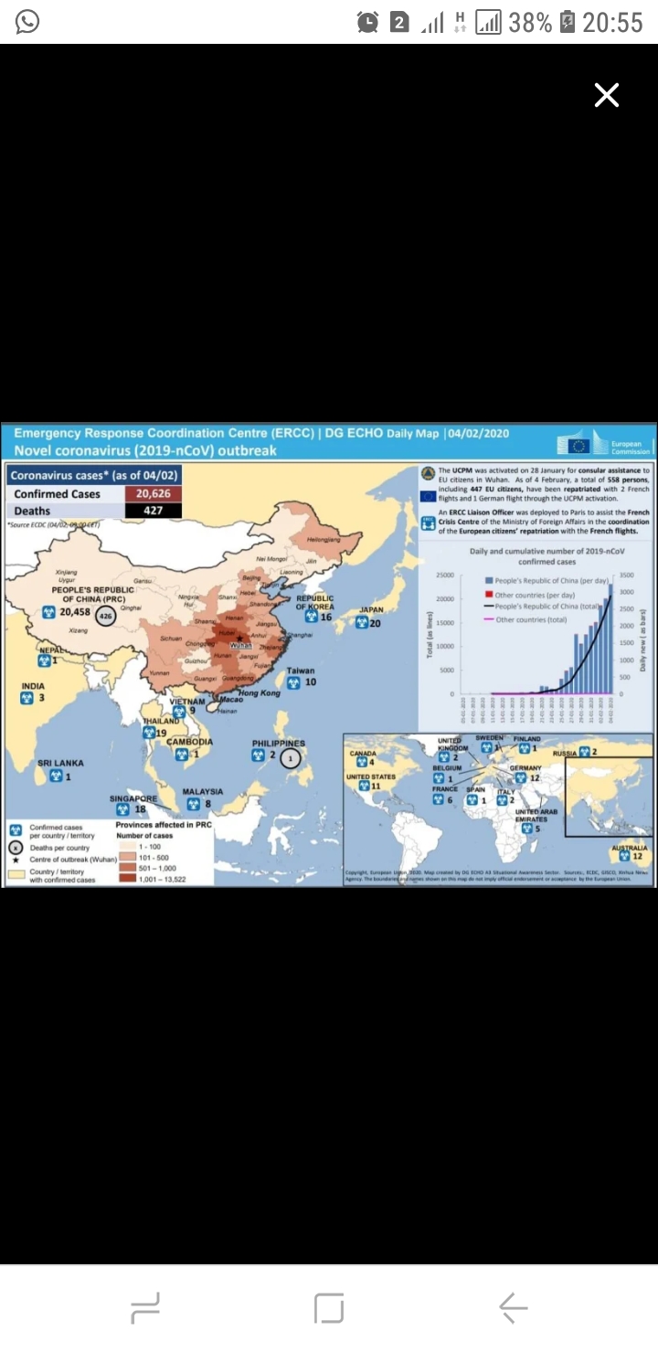
From the visual, it can be realized that the outbreak of convid -19 is represented using data. The data is the map of affected countries having this dreadful disease.

Using the Deconstructing data viz as a framework, the attached data has the following features. 

Comparison, Distribution, Geographical representation of data and lastly has design. 

In comparison, the chart has a line graph tracing times in changes of reporting. The reported case from 11-01-2020 and 04-02-2020 varies in that the former had least reported cases in China as compared to the latter. 

With the distribution, it has a histogram because the data set is large. Cases of convid is examined across the globe. 

Geographically, the map gives a clear reportage of cases with the disease. The map is a choropleth, meaning it uses differences in colour of countries to visualize the information. 

Lastly, design. The colours used in the chart blend harmoniously. Information retrieval is not difficult. It also makes interacting with the chart easy.  It is devoid of over-embellishment and unnecessary artwork. 

On a whole the chart is a great masterpiece. Nonetheless it lacks pie chart in the distribution giving a percentage of the alarming rate the disease is increasing  to alert people on the dreadfulness of the disease. 

It was a good job. 

Thank you. 


Anexo Screenshot_20200301-205545.jpg

Ed Hawkins uses colour to show global warming

por Dirk Lotze -

Frankfurter Allgemeine Zeitung has a piece about Graphics by Ed Hawkins:

https://www.faz.net/aktuell/wissen/ed-hawkins-veranschaulicht-klimawandel-in-simpler-grafik-16252529.html

He uses colour effectively to show global warming - first in a simple way for different places, then in a more complex diagram across continents. The design is simple, it only shows what is necessary to bring the point across.

The story develops alongside the graphics.

M4:Q2

por Usuário excluído -
https://www.theguardian.com/us-news/ng-interactive/2017/dec/20/bussed-out-america-moves-homeless-people-country-study


I find this article to be a perfect example of data visuals supporting a journalistic article.

M4:Q2

por Usuário excluído -
https://www.theguardian.com/us-news/ng-interactive/2017/dec/20/bussed-out-america-moves-homeless-people-country-study


I find this article to be a perfect example of data visuals supporting a journalistic article.

How epidemics like covid-19 end (and how to end them faster)

por Usuário excluído -
Hi,
I found this graphic in the Washington Post:

https://www.washingtonpost.com/graphics/2020/health/coronavirus-how-epidemics-spread-and-end/

It shows and compares different diseases spreading (COVID-19, Measles, Ebola) by number of infected, dead and recovered along the days.
The graphic is dynamic but not interactive. It plays and stops by itself but the different diseases and remedies are shown if the user scrolls down. Then a textbox with information shows the context of the graphic to be shown.
So it is a combination, mainly comparison and time series, of different ways of showing the data.
I would have kept the historical data on the side of the chart because it shows the data dynamically along with the dynamic graphic, I think it loses context. They should have kept at least the data of at least 3 different moments during the evolution of the disease or remediation.

NYT data visualization as part of primary election coverage

por Usuário excluído -

I've found the NYT's data visualizations helpful in depicting how candidates have fared throughout different states in the Democratic presidential primary.

The latest example is from the Times' coverage of the South Carolina primary, where Joe Biden received the most votes in every county in the state. In some ways, seeing the Times' data visualization colored entirely purple (for Biden) makes the point even stronger than stating in an article that "Biden won the most votes in every county."

https://www.nytimes.com/interactive/2020/02/29/us/elections/results-south-carolina-primary-election.html

Local elections in France

por Usuário excluído -

https://www.francetvinfo.fr/elections/sondages/carte-municipales-2020-ce-que-disent-les-derniers-sondages-a-paris-lyon-marseille-et-dans-les-grandes-villes_3845171.html#xtor=CS2-765-%5Bautres%5D-

This map, elaborate by Flourish, has two essential elements: a search bar where you can write the name of the municipality and to watch the vote intention pour candidate, party.

The other element is showed in a map, where you can chose a circle or color to visualize the information from each municipality.

It easy, provide us the essential information.

Maybe, the map could be considerate to include the names of municipality for people who don’t know French geography.

ProPublica story on child deaths in the US

por Usuário excluído -

Nobody Knows How Many Kids Die From Maltreatment and Abuse in the U.S.


I remember when Jessica Huseman tweeted about this story. She and Hilary Fung worked on it for seven years—seven years—outside of the scope of their regular jobs. Plowing through emotionally devastating data in order to tell a story. It was one of those moments where I was knocked back by the sheer power of journalism. 


The map included in the story gives context to how each state in the US responded to when Huseman and Fung asked for child death records. It's a simple but telling geographical map, a chloropleth map that uses differences in color to visualize info. The colors used provide nice symbolism. The cool calming blue is used for states that provided the reporters with all required information (maybe the only color that would've been better for this is green); the warning note of yellow is for states that provided some of the information, and takes over most of the map; and the five red states provided little or none of the required info. Making those states red is a really nice subtle way to invoke anger and indignation in the reader and help us see that withholding this information is wrong on the states' part. I think the only thing that could've been done better would be to make this map interactive. Make hovering over it allow the reader to see more about what the state actually provided.


And then, of course, there's devastation in the huge amount of data at the bottom of the article. Huseman and Fung give us the full scope of child deaths organized by state and include the cause of death, with links to sources. It's actually overwhelming to have that much data at your fingertips so I can't imagine how Huseman and Fung felt while collecting it. It's not a criticism though. It just allows for the reader to see more of the situation, if she wants. 

slavery

por Usuário excluído -

http://revistagalileu.globo.com/Revista/Common/0,,EMI333998-17805,00-RAIO+X+DO+TRABALHO+ESCRAVO.html


This map show the locations where the slavery work persists in Brazil. It needs to be actualized because the map was made in 2013. The most interesting part of the work is that it relates slavery with deforestation.


Publica

por João Pedro Malar Massa -

This piece from the brazilian Agência Publica talks about mining in the Amazon Rainforest and in territories occupied by native groups.

It uses the bar chart and a line chart to make comparisons and show a timeline. It also uses maps to give informations. In my opinion, I would improve the piece using more multimedia content, like audio or video.


Link: https://apublica.org/2020/02/a-mineracao-em-terra-indigena-com-nome-sobrenome-e-cnpj/

Data Viz

por Usuário excluído -

This article and data viz, which is based on the John Hopkins data, is useful but I think it could improve by giving the data some context. So for instance,  I think the graph describing total deaths compared to other countries is useful because it immediately shows how many more have died in China compared to other parts of the world but it could be easily misinterpreted as well to mean it was wore in China (when we don't know that yet because it has peaked in China but not around the world yet) so without giving it context like the rate of deaths and without being reminded that it began spreading to other parts of the world much later compared to when it first appeared in China, the data could lose it's relevance. I would love to compare China, South Korea or Italy for example, where there are outbreaks, and compare the rate of deaths or contagion (so they'd have to begin at different points in time). I find the map really interesting and obviously makes you question the reasons for spreading (community to community or host country contact etc). I think because most people don't know how viruses are spread, me included, some of this information by JHU doesn't mean what you'd expect it to mean. I think the visualizations need context to explain how viruses are spread compared to others (for instance some researchers found this virus spread twice as fast as the flu.)

https://www.buzzfeednews.com/article/peteraldhous/coronavirus-updating-charts-maps

M4: Q2

por Usuário excluído -

An interactive dashboard by John Hopkins showing the spread of the coronavirus in real-time is an excellent use of data visualization and often referenced because of its clarity and useless information.

Its interactive feature is effective. The geographical bubble map highlights important data. Overall, the dataviz does a great job of focusing  on the most important information, such as the viruses spread from Mainland China to South Korea, Italy, Iran and other parts of the world. 

The real-time data makes this visualization especially important.

Species of Birds declined the most in 25 years - Data viz

por DR SACHIN BATRA -

This is the story by The Hindu newspaper/web site dated 19th February 2020

Which species of the birds have declined the most over the last 25 years?

https://www.thehindu.com/data/data-which-species-of-birds-have-declined-the-most-over-the-last-25-years/article30859234.ece

The good thing was that intensive research was applied of 25 years span time and interactive data presentation is created through Flourish visualization as mentioned in the Module 4.2 Data viz - Showing the Story.

But if the color lines were presented with the pictures of the mentioned birds or some other form, the first sight could create immediate meaning to the reader. The other observation is that the story is not covering, Why the species are declining? which concludes that investigation in not applied to complete the same.

That reasons either poaching, loosing habitat, climate or disease or other threat should be investigated/outlined for a meaningful story. 

As the news is about 5Ws and 1H. So Why and How are unanswered in this story. If the opportunity comes to us we may use TimelineJS tool to combine chart with photographs/sketches for meaningful storytelling.

Bar chart of undercount of black people in US Census

por Usuário excluído -

I found this bar chart in The Guardian very attractive when I first saw it (because it’s clear and playful) but when I had a better look, I missed a lot of information. I want to know which exact percents we’re talking about, how many people that means and maybe even some more information about the undercount in different States of America. Also it would have added great value if the journalist had visualised data on what this undercount means. So how many dollars do certain communities risk to loose, and how exactly does this it influence the political representation?

https://www.theguardian.com/us-news/datablog/2020/feb/27/2020-us-census-black-people-mistakes-count

Cost of care in your area BBC

por Julia Gregory -

https://www.bbc.co.uk/news/health-37307856


This is a basic interactive - enter your town or post code (zip code) to find out what it costs for care if your council pays or you have to pay privately.


It is clear & not over packed with stats - there are some pie charts and some comparisons plus text explaining the story.

There are no case studies to humanise it, or a map showing the national picture, though.

Q2

por Usuário excluído -

https://www.bbc.com/news/world-australia-50951043


Within this story is a timelapse map of bushfire detections/hotspots from Nov 1 2019 to Jan 31 2020. It shows how many fires were detected in Australia via an interactive, moveable map that can be zoomed in on, and shows the spreading of fires over the period of three months. The map was made with Carto by NASA firms. The map allows for a visualisation of the disaster affected areas, without introducing statistics for the audience to get bogged down in. The map is a great way to visualise the fires as it is a primarily geographical story, and visuals drive home how much land was burnt. With more data the map could have been made to show day by day rather than week by week, but otherwise it tells the story of the bushfire damage in a concise and visual way.


South Carolina Primary Results

por Usuário excluído -


https://www.nytimes.com/interactive/2020/02/29/us/elections/results-south-carolina-primary-election.html


The visualizations within The New York Times elections reporting for the South Carolina primary have an effective design layout which makes the data clearer for readers. For example, the South Carolina map is clean and simple. Color coding based on candidates is easy to understand and the data visualization is not over bombarded with numbers. The interactivity of the data map is not intimidating or distracting for the reader as well. The map could be improved based on when it displays the “size of lead data.” This different visualization compared to “by leader” has multiple bubbles illustrating how big a lead was in different counties. I felt that this demonstration was not as visually pleasing and more confusing than the other map. I think it would have been better to split up the maps between big and smaller leads. If this occurred, the meaning of the data would be more distinct and digestible for the readers.


Global Air Pollution

por Usuário excluído -

https://www.nytimes.com/interactive/2019/12/02/climate/air-pollution-compare-ar-ul.html


So this is a very advanced data visualization, and it's so good! It allows you to compare air quality in your city to other cities, including the most polluted ones. There is a scale at the top of the page that shows how much particulate pollution is in the air you breathe, and in the background a graphic of floating dots representing particles. As you scroll down to cities with worse air quality the floating dots increase so it gives the reader a better understanding of the density of these particles that are in the air. 


The dataset is good because there is high contrast. For example, I compared Seattle (where I live and where there is growing concern about air pollution) to New Dehli, a place with some of the worst air pollution in the world, so the contrast is very obvious. 


I think they could have added some additional chart types as well like a simple bar graph to compare cities. 


In this visualization I think the interactivity really adds value because you can select your city, think about the air on its worst air quality day, and then imagine what it must be like in some of the worst polluted cities, most of which are in Asia. 

Ten graphics to understand how Andalusia has evolved in the last 40 years

por Usuário excluído -

https://www.rtve.es/noticias/20200228/diez-graficos-para-entender-como-evolucionado-andalucia-ultimos-40-anos/2004782.shtml


The information issued is clear and accurate data. But it would have been convenient to apply other designs for the information since the repetitive ones could also affect the continuity of the reader.

RESTRICTIONS ON RELIGION/Pew Research Center

por Usuário excluído -

See the Data:

SOURCE: https://www.pewforum.org/interactives/restrictions-on-religion-among-the-worlds-25-most-populous-countries-2016/


Restrictions on religion among the 25 most populous countries in the world


Among the 25 most populous countries, Egypt, Russia, India, Indonesia and Turkey have the most restrictions on religion, while Japan, Brazil, the Philippines and the Dem. The representative of Congo and the USA. UU. They have the least amount of restrictions.


By submitting this work to the scheme of what is expected to be found in a data, according to Deconstructing Data Viz (By Simon Scarr, Thomson Reuter), which establishes three basic principles: first, the data has to be clean. Second, it has to be complete and, above all, it has to be well structured (well-sourced).

Meeting in the analyzed data:

1. That it is clean, very clean I would say, with colors ranging from red to almost completely degrading, the strongest color corresponding to countries that have the most restrictions on religion.

2.It is interactive and takes a time range in the horizontal bar that goes from 207-2016, where the reader can inquire about the change during this time.

3. The degree of restriction is established in a vertical bar that goes from “low” and reaches “very high” in the religous restrictions.

4. The type of graph used is that of points that go from minor to major as they are more related to the restriction of religion. The bigger, the more restriction.

WHAT TO IMPROVE:

In particular, I would have used a very vivid color to determine the most restrictive countries in terms of religion.

@AlirioJLeal1

DATA VIZ

por Usuário excluído -

The data visualization of this article although it presents some interesting data, presents it in a very disorderly and dispersed way. I think that the colors they use are not big differentials at the moment and make a reading of the figures.


For me always a data viz, it must be very explanatory and clear. The collected data would have been presented not only by means of maps, it would also have made use of data bars, with strong colors in the information that I intend to highlight.


I attach the data viz link


https://www.arcadiadata.com/blog/brexit-insights-from-data-visualization/


Otto and Marie Neurath and the "transformer"

por Usuário excluído -

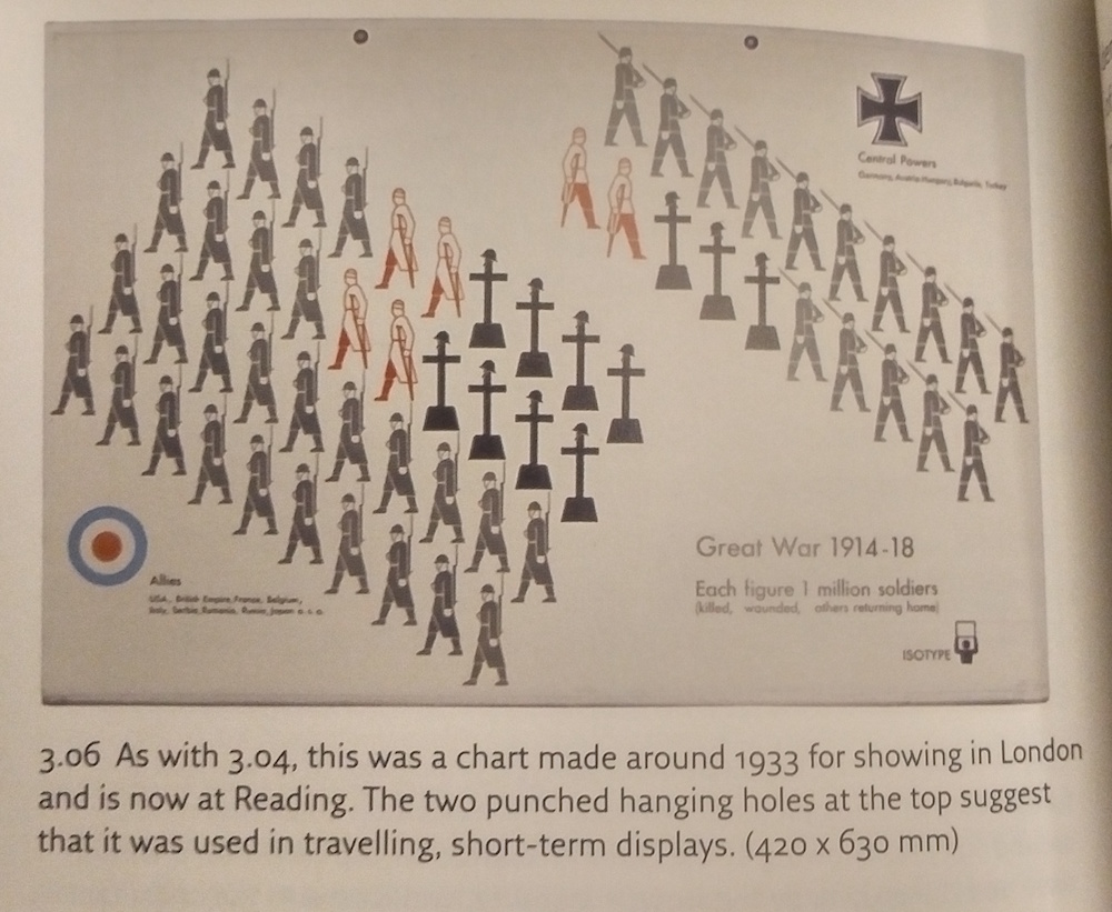
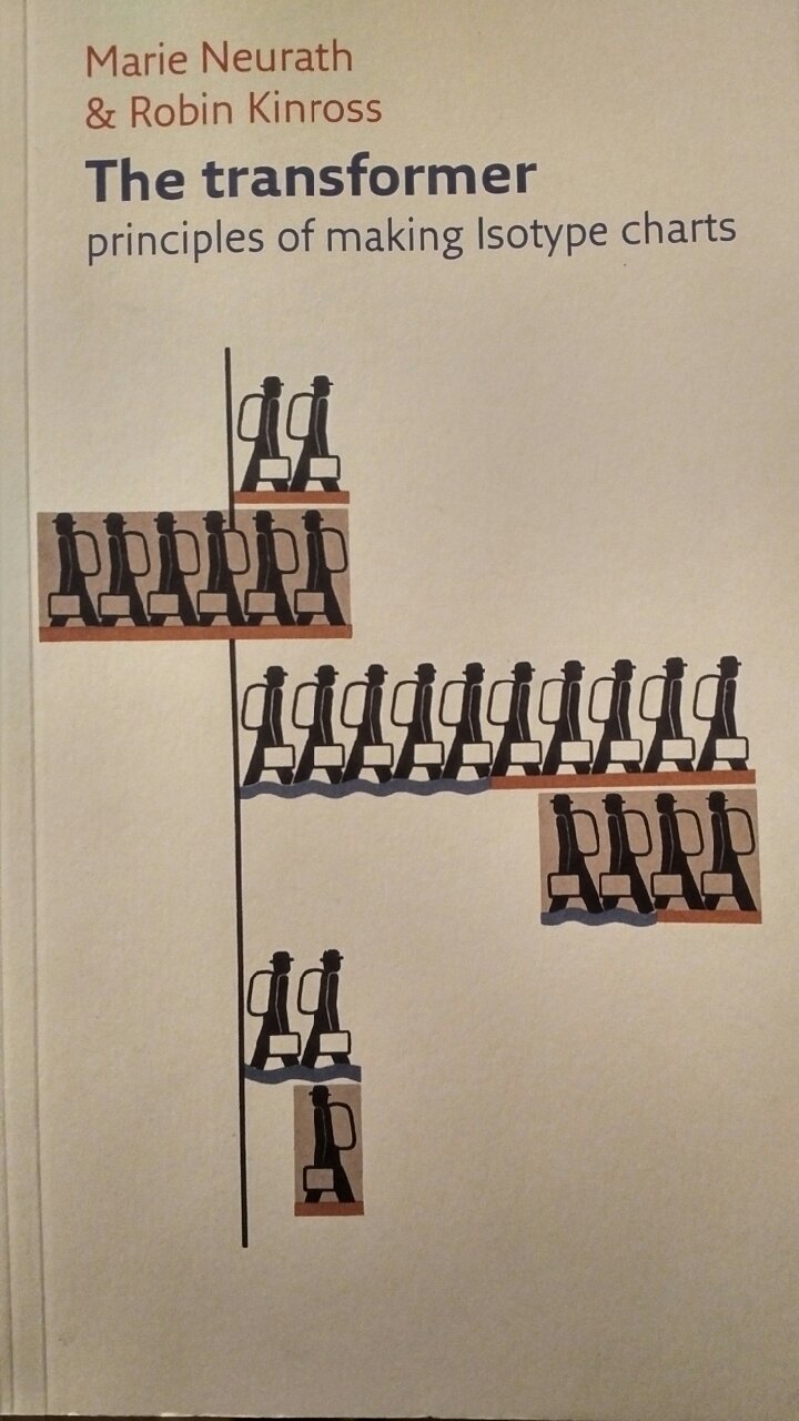
If I may go retro, I came across the concept of Isotype charts a few years ago ago and I think it's useful to look back nearly a century to early data graphics. "The Transformer" (Hyphen Press, London, 2007) looks at the work of Otto Neurath and his associates and later wife, Marie. The basic concept was putting information into visual form. Though they weren't approaching the idea from the perspective of journalism, it is directly applicable. 


"From the data given in words and figures a way has to be found to extract the essential facts and put them into picture form. It is the responsibility of the 'transformer' to understand the data, to get all necessary information from the expert, to decide what is worth transmitting to the public, how to make it understandable, how to link it with general knowledge or with information already given in other charts. In this sense, the transformer is the trustee of the public." - Marie Neurath

Anexo IMG_20200229_2100521.jpg
Anexo IMG_20200229_2126157.jpg

Brasil needs to take class about vizualizing data on news

por Usuário excluído -

I think that this is a good example to show that my country needs remodeling its ways of journalism's making. There was a huge mistake at the government's admission tests, which ruined more than 5 thousand students's opportunity to get to a University! This new could rich and impact more people if there were more graphics pleasing to the eye than only text. We now live in a society that consumes everything in a fast way, so it requires more dynamics than a huge massive text.

https://www.bbc.com/portuguese/brasil-51334141

Effects of COVID 19 on Global Market

por Usuário excluído -

https://ihsmarkit.com/research-analysis/impact-of-covid19-on-the-chinese-and-global-economy.html

Since December,2019 when the WHO announced the outbreak of the Coronavirus also known as COVID 19.The effect have been deadly on the global market.

The link above gave a data visualization showing the difference between when SARs broke out 2003.The impact of COVID-19 outbreak on the global economy could be more severe than the impacts of the other major outbreaks in recent history e.g.: SARS (2002-2003), MERS-CoV (2012 -), A/H1N1 (2009-2010) or Ebola (2013-2016). For many reasons - the origin of the COVID-19 should be compared to SARS pandemics which originated from the Chinese Guangdong.


Report about the absence of Brazilian congressmen in the Legislative House

por Usuário excluído -

Hello, guys!

After take the class of data visualization, I found an easy example (as a first step for the ones who are enter in this data world), but that I believe that is a good one: It is the report "Congressmen have 2,118 absences discounted from their salaries in 2019" ( https://www.poder360.com.br/congresso/deputados-tem-2-118-faltas-descontadas-dos-salarios-em-2019/ - it is in Portuguese. Sorry!)

In order to explain why there were so many absences and, specially, who committed them, the journalist chose to do two simple bar charts: 

- one ranking the parties that had more absent congressmen (and, therefore, had more discount in the payments)

               * in this one, it has like a "bonus" graphic that shows the evolution of the discounts between 2017 and 2019. The thing here is that they chose to continue to use a bar chart instead of a line one, more common when times are compared. 

- another pointing who were these congressmen. 

With bars and without complication, it is easy to see the numbers and understand equivalence. As put in the "Deconstructing Data Viz", the data is "clean and complete". 

For me the report could be beyond and did a more investigative work, as showing the reasons given to the absences (this data just was given for the congressmen that wanted to give a response) . But the fact is the it fulfilled what was proposed.