Comparing PISA results

by Aline Flor -
This is a set of infographics about the Portuguese results of PISA examinations, that assess reading, science and math skills of students (sorry, it is not an investigative piece)

https://www.publico.pt/2019/12/03/infografia/preparar-jovens-392

I immediately recalled Simon Scarr examples of how to use color and highlignts when I saw the big graph that compares every country - the solution to use a darker tone to highlight the Portuguese results over time and the blue rectangles, with numbers and a line linking each other, that highlight differently the evolution of OECD average. 

The set of graphic that tries to show how Portuguese pupils are in comparison to OECD average looks a bit confusing, with six look-alike graphics. Line charts are indeed the right choice for time series, but since there are different levels of information involved, they could have tried to convey the information in a more complex, perhaps single visualization. The same thing for the last set of graphics: nine lookalike pie charts (ok choice) that could perhaps be bundled in one or few bar charts.

Data visualization

by Deleted user -

https://projects.fivethirtyeight.com/mortality-rates-united-states/self-harm/#1985


This story has excellent visualized data that did a great job in telling the story of mortality rates and causes of death in the U.S. over the decades. The histograms and time series helped in understanding the numbers and comparing between states and counties. However, the best data visualization in the story is the interactive map. The reader can chose the year and cause of death, then hover over any county in the U.S. and see the rate of mortality in that county and compare it with the overall rate in the state and the U.S.

Very visual in an unusual form

by Deleted user -

Not charts and graphs, here, but drawings of people in this December 2019 story.

https://www.nytimes.com/interactive/2019/12/22/us/los-angeles-homeless-black-residents.html

It does a great job of making the numbers clear, for example two side-by-side illustrations of 15 out of 200 black Angelinos being homeless, next to 2 out of 200 other sorts of Angelinos. The contrast is stark.

Photos of tents on the street make it clear that we can see the homelessness. Maps showing changing demographics explain the whys behind what's happening now. Snaps of the one individual who is the example in the story, his homes (a house he grew up in, a car he and his dog lived out of) keep it personal. All the elements focus on the goal of making the situation a very real, almost felt experience backed up by solid data.

Not everything visible

by Deleted user -

The chart linked below shows us a relationship between the coronavirus outbreak and China's revenue. The problem of any data visualization lays on the that the image is a reduction of the fact depicted. The chart informs us about many variables, like timeline and Google Trends [that are really worthy], but isn't enough to give us the big picture.


https://insight.factset.com/hs-fs/hubfs/1)Insight/2020/02.2020/02.19.2020_Coronavirus/Coronavirus%20Market%20Impact%20-%20China%20Revenue.png?width=1493&name=Coronavirus%20Market%20Impact%20-%20China%20Revenue.png

Good combination of data, design and narrative storytelling.

by Deleted user -

The SCMP’s data viz that tells well explained ‘Covid-19’ is the simple and interesting one.

The story not only visualizes the infected victims in the world but also conveys the state acts in local Wuhan  and the Mainland including medical service and fatality rate and tourism side, building the narrative as chronological and intertwined cases. And the goal of the story to communicate the message is also clear.

https://multimedia.scmp.com/infographics/news/china/article/3047038/wuhan-virus/index.html


A tousand games for Cristiano Ronaldo

by Rodrigo Nunes Lois -


The portuguese football player Cristiano Ronaldo has reached the number of 1000 official games in his professional career. The website that I work for, Globoesporte.com, published a long data visualization about it. Here is the link:

https://interativos.globoesporte.globo.com/futebol/futebol-internacional/materia/cristiano-ronaldo-1000-jogos

The main data of this story were the 1000 games of Cristiano Ronaldo. 

In my opinion, the pie chart of the results of these games worked well. Also the bar chart of his numbers of goals during his career. Simple and effectively. 

But I think there could be some improvements:

- A time series that showed the number of games he played per year. 

- Putting the entire list of the games makes it too long, a tiring navegation.

- The could be some interaction in the part of the titles he won, showing when and with which club.

- The design could have been more elaborated.


ProPublica & Chicago Tribune investigation - Locking Children Up - Quiet Rooms

by Deleted user -


The Quiet Room

Children are being locked away, alone and terrified, in schools across Illinois. Often, it’s against the law.

https://features.propublica.org/illinois-seclusion-rooms/school-students-put-in-isolated-timeouts/

The map and visual database help people to understand exactly where incidents are happening.

The good: It shows a lack of reporting


U.S. DEPARTMENT OF EDUCATION DATA, 2015-16
0 seclusion incidents reported
0 students reported secluded

DISTRICT RECORDS, FALL 2017 THROUGH DEC. 6, 2018
282 isolated timeouts documented
26 minutes per timeout (median)
42% of timeouts did not follow a documented safety concern

Seclusion at School: Look Up Illinois Districts

All public school districts are required to report their use of seclusion to the U.S. Department of Education. Enter a district's name below to see how many incidents it reported for the 2015-16 school year, as well as to see more recent numbers based on an analysis of public records. Requests were sent to all districts that had reported secluding students previously.

Click on the map or search for a district

 
Detailed district data 
 
Federal data
Search


This report doesn't include Chicago. I do feel like readers want more or should be given a deeper explanation about that. 

Pew Research drills down and then drills down some more

by Laurie Sefton -

Pew Research recently published an analysis:  Trump Ratings Remain Low Around Globe, While Views of U.S. Stay Mostly Favorable.  As part of this, they provided data elements that were used to compare Trump vs Obama, how Trump is viewed across nations, how the numbers change as the political views of the respondents change, as well as a comparison of Trump's numbers vs Merkel, Macron, and Xi. They make use of comparative bar charts, line charts, scatter plots, and maps to present their data. 

At the end of the report, they provide information on how the data was collected and analyzed, as well as pointers to the datasets. This allows for further drill downs for the interested reader.

Workplace and performance of people, teams and organizations

by Deleted user -
Steelcase - Engagement and the Global Workplace Key findings to amplify the performance of people, teams and organizations 


Web version of the report with the 5 key findings.

LINK to website


For key finding 1, you can zoom in on some specific information. Or you can choose details like the country to see the results of one country in comparison with the average results. Gives a good impression of how a country scores compared with average. But the matrix with two dimensions doesn't seem better than a bar chart, because there are always 5 categories.


Figure for key finding 2 seems incomplete, only one dimension (engagement) but no data for the flexibility to make choices about where and how they work. 


For key finding 3, the order of the results is based on descending order of percentage while it seems more logical to compare pc to laptop and tablet and to compare landline phone to mobile phone as the description did. 


Key finding 5 is hard to understand without a clear explanation. There are two dimensions (engagement and satisfaction) and the circle seems an average score on these two dimensions. When you hover over the circle of the country you get specific information that is not part of the matrix but varies between the countries. Sometimes the percentage of high engagement is mentioned or sometimes the percentage of disengagement or another fact. Also, it is not clear what is meant by size or colour of the circle.  


LINK to Full report 


 Instead of the clickable figures, there are chapters for each country.

Tags:

The graph of the impact of Covid-19 in jetfuel market again

by Mery Mogollon -

Hi guys

One of my best history professors  in a master's degree in History of the Americas once spoke of the "relevance" of historical research.   A concept that we sometimes forget, although it is one of the main bases of journalism.  Sometimes what may seem important to us is not relevant.  

In my opinion, relevance is one of the things to take into account when we decide to start an ambitious and impacting project. Excuse me for a bit of a long introduction.

I'm going to take up the graph of the impact of  Covid-19 in  jet fuel market, which I use in the first question of Forum 4.

Infographic: Jet fuel cracks crash in Asia as airlines drastically cut back China routes amid COVID-19 outbreak http://www.spglobal.com/platts/en/market-insights/latest-news/oil/022620-infographic-coronavirus-jet-fuel-airlines-covid-19?

It is of great relevance in this moment to the general public and especially to the business sector around jet fuel and commercial aviation. 

I used the "Deconstructing Data Viz" guide to analyze it. 

1. The data is good and consistent. It requires specialized knowledge to identify this data and also geographical knowledge. China as we know it is a giant. Placing all that data and those elements on a single graph is an interesting job.  However, it may seem overwhelming, an aspect that is justified by the size of the country and the movement in airports in China.  It would be necessary to write  dozens paragraphs to explain what the graph says.

2. The main graph is complemented with bar charts for comparisons, which I think is an interesting resource to help clear up the doubts that the main graph could leave.

3. The composition in the form of a circle with all those lines and airplanes has its limitations.   But I understand gathering so much information in a small sphere was a big job. It's not easy when it comes to mega-data, as we've seen from the multiple readings.

4. The design  was not fully achieved. Making it simpler, less "beautiful" might help. 

I have some years in journalism and I continue to be surprised in a gratifying way every day as our profession continues to evolve, modernize and expand horizons.

Thanks to the instructors for sharing their knowledge of how to do things right

 Finally I share an interactive chart of the types of crude oil that exist in the world. It is very interesting. 

Interactive: Not all oil is equal – Platts Periodic Table of Oil

https://www.spglobal.com/platts/plattscontent/_assets/_files/downloads/crude_grades_periodic_table/crude_grades_periodic_table.html

Mery

Module 4 question 2

by Deleted user -

Published: August 20, 2010

Support for Same-Sex Marriage

Support for gay marriage has risen to 45 percent or more, according to national polls, and a CNN poll this month found that a narrow majority of Americans supported same-sex marriage. Estimates for each state, based on these national polls, show how support has risen across the country. Related Article » | Graphic Graphic: State-by-State Data »
play.png
     
1994
2010

2010 Assuming 50% support nationwide

map6.png

* In all of the time periods shown here, a statistical technique has been used to generate state estimates from national polls. Public opinion is estimated in small demographic categories within each state, and then these are averaged using census information to get state-level summaries. Estimates in 2010 are projected from 2008 state-level estimates using an aggregate national estimate of 45 percent (or 50 percent) support for gay marriage.

The New York Times | Send Feedback

Source: Andrew Gelman, Jeffrey Lax and Justin Phillips, Columbia University


This is an interactive map from the New York Times, that shows how the percentage of states has changed their opinion about same-sex marriage from 1994 to 2010. The map is interactive but the action didn't come across when I copied the map. When you hit the play button the percentage of states that approve of same-sex marriage changes until you get to 2010 when the percentage is at 50 percent. The time for which the graphic was made. There is a line chart at the bottom that is color-coded to show the percentage of individuals in each state which favor same-sex marriage.


M4; Question 2; Discussion Forum 4

by Deleted user -

The online Data visualization compares revenue or sales of jacket and socks over a one year period, using a table and line graph. The visualization does well in showing the difference in sales. While sale of socks remain constant with slight upward move in November and December, sale of jacket is more seasonal with two seeming peak seasons between January to April, and October to December; with low peaks from May to September.


Following Up with Coronavirus Numbers

by Deleted user -

This site uses data visualization in the most effective way as it is clear, concise, and to the point. There are no other elements distracting from the data. It is simple. It's also following an epidemic that we are currently going through and many people are interested in. It's laid out in the most effective format for people to follow up on the statistical information regarding the coronavirus. Charts are clear and visible with clear titles so people can navigate easily and within a minute or less you'll have all the information or data you'll need or were looking for.

https://www.worldometers.info/coronavirus/

School shootings in the US

by Deleted user -

https://www.nytimes.com/interactive/2018/02/15/us/school-shootings-sandy-hook-parkland.html?auth=login-smartlock

This story does a very good job at showing the reader the number of school shootings in a very easy and lucid way. It's so clear what the visual tells us: how many people died, how many were injured, and when the shooting happened. In a way, it's also haunting how frank the visual is by putting the data in our face like that. 

The India Justice Report

by Paro Pain -
 The India Justice Report ranks 18 large and 7 small states according to their capacity to deliver justice to all. It uses government data to assess the budgets, infrastructure, human resources, workloads, diversity and 5 year trends of police, prisons, judiciary and legal aid in each state, against its own declared standards. This first of its kind initiative was supported and facilitated by Tata Trusts in partnership with Centre for Social Justice, Common Cause, Commonwealth Human Rights Initiative, Daksh, TISS-Prayas and Vidhi Centre for Legal Policy.  https://www.tatatrusts.org/insights/survey-reports/India-justice-report-2019/index.html#visualization

Q2

by Thomas Cieslewicz -

https://gisanddata.maps.arcgis.com/apps/opsdashboard/index.html#/bda7594740fd40299423467b48e9ecf6


https://www.who.int/docs/default-source/coronaviruse/situation-reports/20200227-sitrep-38-covid-19.pdf?sfvrsn=47fdaf7_4


I chose two examples. First, an interactive web-based dashboard from Johns Hopkins University on the Corona Virus. Secondly  a WHO situation report on the same subject.

I think both are clear, self-explanatory and informative.

Mass Immigration

by Deleted user -

One of my favorite explanations of how mass immigration is causing problems in America. To improve it, they could elaborate on the negative effects.

https://www.youtube.com/watch?v=FlVMW7g5QBI

Visualizing Gun Deaths in America 2013-Feb 26th 2020

by Deleted user -

It seems like we never hear the end of gun death tragedies in the United States. We are exposed so much that, I believe, many of us have become immune, desensitized to the horror that takes place in our streets, schools, and workplaces daily. 

Here is an article from Vox that enables data visualization to convey the impact of gun deaths in the States, whether that be mass shootings, homicides, suicides, or accidents. This was published early this morning, February 27th, and I found it to be an extreme jolt of reality. The authors took data from 2013 until February 26th, 2020 and not only broke down the causes and locations of gun deaths but also compared the data and gun laws to that of other countries.

There isn't much text, as the information is mostly gained through data visualization which, I believe in this case,  is more powerful than words. It is hard to grasp the effect of guns in America but this layout does a good job. 

The authors also focused the data from 2013-present for an important reason: the Sandy Hook massacre, in which a gunman killed 26 people mostly school-aged children under 7, occurred on December 14th, 2012. In the days and weeks after this tragedy there was a shift from "thoughts and prayers" to "never again" but, as data shows, this senseless act did not trigger the response people were hoping for. Since Sandy Hook, there have been at least 2,387 mass shootings in the United States with at least 2,706 killed and 9,946 injured. The portrayal of data did a good job at pointing out how dire this situation is and that no matter how numb we are, we must make a change.  

Mass shootings since Sandy Hook

by Deleted user -

Here's an example of a beautiful visualization of a very sad story... Actually, that's a whole story told visually by a lot of graphics. It could be used several times when writing about new cases of mass shootings. I would say here's nothing to add - it's a perfect way to show the big picture of the country's situation:

https://www.arcgis.com/apps/opsdashboard/index.html#/bda7594740fd40299423467b48e9ecf6


Bar chart

by Deleted user -

https://www.nytimes.com/interactive/2020/us/elections/delegate-count-primary-results.html

I used this story for the last post too, but it combines data with visualization in several ways, which is important. It starts off with a bar graph of total delegate counts per candidate, which is simple and clean. It's not plain, however. It uses colors and pictures of the candidate's faces to draw readers in. I like the overall use of color in this story. I would probably have not thought to color code the results like they did. However, they could have picked colors that contrast a little more strongly for the 2016 winners column. 

Email clippings, interactive map, docs, photos, screengrab and a videos

by Deleted user -

Last year, the NYT ran an investigation on the U.S. Transportation Secretary, Elaine Chao, and potential conflicts of interest between her government position and her family's shipping company in China. The story is quite long and includes numerous ties and potential conflicts of interest between Chao, her government post, and her family's shipping business. 

In all honesty, had it not been for the multitude of visual and interactive data offered in the story -- email clippings, an interactive map of shipping routes with a rotating globe, a video, screengrabs -- I might not have made it all the way through the 4,000+ word story. The visual components, as well as the fascinating data presented in the shipping routes interactive chart, really highlighted the depths of the reporting and made the story's presentation memorable for me some 6+ months since reading it. 

Link: https://www.nytimes.com/2019/06/02/us/politics/elaine-chao-china.html

Unauthorized immigrants are more proficient in English

by Deleted user -

This data visualization is easy to read, they show bar and line graphs. As mentioned on the reading, the bar charts help understand statistics since they're easy to read while the line charts compare the difference on undocumented immigrants talking in English through a period of time, important since there are so many that grow up learning the language that gets to a point where the next generations don't learn Spanish at all.

https://www.pewresearch.org/fact-tank/2019/05/23/u-s-undocumented-immigrants-are-more-proficient-in-english-more-educated-than-a-decade-ago/


Visualizing clearance rates

by Deleted user -

Here's a data visualization by American Public Media's In the Dark podcast: https://www.apmreports.org/story/2016/10/18/in-the-dark-8

Season 1 of this podcast focused on the investigation of a child abduction in Minnesota and this episode in particular zoomed out to show what the investigating agency's track record was for solving crimes. Turns out it's not good! 

The reporters on this story used something like StoryMap JS to highlight some of the high-profile crimes that went unsolved over the years and where they occurred in relation to the child abduction that is the focus of the podcast. 

They used a line graph to show how the investigating agency's clearance rate has compared to others statewide over the years and on another line graph they showed how clearance rates went up or down depending on who was sheriff at the time.

This last visualization interested me the most because we in Texas also have sheriffs and these clearance rates can be hard for the average voter to find and digest so they can truly hold them accountable. 


Brazil´s crise

by Deleted user -


I really liked this BBC report (https://www.bbc.com/news/business-48386415) about Brazil´s economic crisis because on each graphic they showed how deep was the crisis and how little it changed at the begging of the new government.

Also, I think using different colors make the data more apprehensive for the reader what bossiness think its important to change.

Napoleon's Army in Russia.

by Deleted user -

Below is the link to a graphic showing the losses the French army racked up during the Russian campaign on 1812.  I think it works very well for a couple of reasons.  It is very simple and easy to follow.  It clearly outlines the army's losses over time.  The combination of the timeline format and easy to read graphics make it very effective.


https://www.nationalgeographic.org/thisday/jun24/napoleon-invades-russia/

The Massacre Map

by Deleted user -

I think the massacre map I mentioned in my answer for question one (https://www.theguardian.com/australia-news/series/the-killing-times) is an interesting data visualisation. 

It is an interactive map. 

I like the fact that it has a warning before people see the map so they have to click a button to proceed. This is because protocol dictates that we warn Indigenous people if they may see anything connected to dead ancestors or family members. So I like that they warned people beforehand. 

I also like that they used two shapes to distinguish between Indigenous people and Colonisers and that they also allowed you to filter it by perpertrator groups. That goes a long way to dispelling myths and rumours that more indigenous people attacked settlers than the other way around and it shows how much violence was carried out by the military, government and police and then settlers and stockmen who took the law into their own hands. It really busts the myths and ideas that all this violence was in reaction to dangers posed by indigenous people and that it was necessary.

It also allows added context when you hover each dot so you can see exact time, place, numbers and so on. 

What I don't like is that it isn't easy to quickly zoom in to a specific city or place. Zooming and scrolling can be done but it may have been faster to have preset maps of urban centers to switch to. 

I also think more information needs to be added but I do believe it is an ongoing project managed by a university team that verifies information.

Audiovisual data

by Deleted user -
This is not exactly a journalistic production, but the format used by "La vida en un gráfico" seems to me to be a very useful and interesting way to show the statistical evolution of a certain topic over time. Personally I have not seen something like that in any news, but I think it could be attached to a written article either on video or as a GIF, although it would be much more useful in an audiovisual journalistic work, in which to see a static image of a graphic for a long time results tedious.


https://youtu.be/sTlU7FklcGM

Spanish General Elections

by Deleted user -

The Spanish newspaper Cinco Dias - El Pais is one of the many spanish editor that uses data visualization and interactive content especially when commenting the results of general elections.

https://cincodias.elpais.com/tag/elecciones_generales/a

In this piece, the interactive part through one party only results could have been improved.

Data

by Deleted user -

OpenRefine is a free data wrangling tool that can be used to clean tabular data and connect it with knowledge bases, including Wikidata. It was previously developed by Google (under the name Google Refine) and has now transitioned to a community-supported project.

This page gathers OpenRefine recipes that can be useful to import datasets into Wikidata, or augment datasets with additional data extracted from Wikidata. Feel free to use the talk page to ask for help with the software. If you enjoy using this tool, you can spread the word with the {{User loves OpenRefine}} userbox.


The population in Spain grows again

by Deleted user -

The Spanish population grows again and exceeds 47 million for the first time since 2013

https://www.rtve.es/noticias/20190411/poblacion-espanola-vuelve-crecer-supera-47-millones-primera-vez-desde-2013/1921300.shtml

This report published on the website of Radio Televisión Española, is part of a text that served for a story on the Television network.

Bar and line charts appear.

How to improve it? There are data from each autonomous community and it would have been interesting to have placed a map of Spain and actively put that data.

Attachment 5134840.jpg

DATA VISUALIZATION ONLINE

by Deleted user -

theconversation.com/police gives trends in U.S deaths due to legal intervention among black and white.

The graphs outlines the rate of police homicide more black people killed than whites.

Another graph explains African American men are at high risk of being killed by police than white.

Viz of Covid-19

by Deleted user -

I'll take the same example here as a lot of different kind of graphs are used to show the spread of the corona virus covid-19: https://www.svt.se/datajournalistik/har-sprider-sig-coronaviruset/

Numbers in different colors show clearly the current scope of the situation. Maps show where the virus is spreading, line diagrams the development and stacks show the difference between different countries. Quite a simple but useful way to use data and visualizations.


Dolarzuela

by Deleted user -

Venezuela lives a severe economic crisis currently due to the hyperinflation an others factors. Efectocouyo.com plubished a article about how the american dollar is taking place in the southamerican country for commrcial transations above its own currency, the Bolivar. They used a chart to explain how the venezuelan people is using the dolar to pay any good or serice. They show the multi-currency envirioment conformed by bolivares, dollars, colombian pesos, euros and electronic wallet. 

 It is excellent way to explain the readers how is increasing the use of the american currency in our country. 


Here is the link: 

https://efectococuyo.com/economia/pagos-con-divisas-crecen-a-paso-de-vencedores/

Mental Health: Global Snapshot on Anxiety, Stress, Substance Use

by Deleted user -

I write about adolescence and youth a considerable amount and the eco-anxiety alone with teens feeling helpless and hopeless from adult missteps on policy and practices worldwide so it's worth investigating further

Though WHO had great info on ages 10-19 w/fact sheets: https://www.who.int/news-room/fact-sheets/detail/adolescent-mental-health I chose to focus on the larger "World Data" charts to deconstruct the data viz by topic to see how "at a glance" we could discern patterns...Bar graphs quickly depicted anxiety as being most prevalent but it would've been nice to have an age breakout generationally to improve and note patterns.

I liked the scatterplot use of color, size of dot and regional side menus to enhance and refine mental health disorders by gender and country: https://ourworldindata.org/mental-health

Interactives that allow people to engage/mouse over areas of interest always impart deeper dives with personal data I think, though they did a good job using basic color mapping globally to assign percentages of depression for example, too. In short, I think "Our World In Data.org" encompassed every map, plot, chart mechanism we studied in one fell swoop, so it was fun to take one over-arching topic and see it layered into different ways of imparting the info. Now can we do one specific to youth age 10-19? ;) 


Serial, Season 2

by Deleted user -

I really liked what Serial did with Season 2 as they tried to find ways to visually help the audience understand an experience the most of us couldn't relate to (being captured by the Taliban) or even getting a grip on the complexities of military structure and politics. 

Episode 8 has some particularly interesting interactive data charts: https://serialpodcast.org/season-two/8/hindsight-part-2


A visualisation from data assembled by the reporters in the first instance

by Andrew Garthwaite -

https://www.nytimes.com/interactive/2019/07/16/world/europe/notre-dame.html


This was a stunning piece about the Fire at the Notre Dame Cathedral. It looks like the visualisation team at the NYT threw everything at it but the kitchen sink, but this is a visualisation where the data is a timeline of moments sourced from reporting work done by journalists nailing down a series of events drawn from a confusing medley. The use of user-generated content was spectacular in capturing the sense that the world was watching, and the illustrations from the sketchbook of a firefighter are a nice touch.

Climate Change Visualisation

by Deleted user -

https://twitter.com/anttilip/status/1033342041474969601

This visualization of temperature anomalies from 1880 to 2017 from Antti Lipponen, a research scientist at the Finnish Meteorological Institute, is a fascinating window into the changes that the planet is currently undergoing.

It is compelling and conveys the point plainly without requiring technical knowledge to grasp its import.

Use of Data to Show Languages taught by Defense Language Institute

by Deleted user -

This piece, by my hometown weekly newspaper, used data analysis to better understand the languages taught at the Defense Language Institute, and how they might reflect shifts in foreign policy.

The graph showing the shift from Eastern European langauges (during the Cold War) to Middle Eastern languages (post-9/11) displays a clear shift in US defense priorities. Data visualization makes this comparison readily apparent. 


https://www.montereycountyweekly.com/news/cover/exclusive-data-from-the-pentagon-s-language-school-offers-insight/article_3e1cf8fa-37de-11ea-8637-f3432fc92073.html

World Poverty Clock and IOS Screen Time tools

by Deleted user -

Data nerds say “Data they say is the new bacon.” This demonstrates how imperative data is to any and everything. A good example of a data visualisation tool for me is the report data visualization tool deployed by the World Poverty Clock buy World Data lab.


It is a very interactive visualization tool which provides data on people in the world living in extreme poverty. The tool allows you to query a piece of information and provides you and answer - it is very interactive.


Also, the report on iPhone IOS (Screen time) activity monitor. It tells you how many hours you spend being productive, surfing on social media and entertainment. Deconstructing it will mean going into all the graph, charts and various forms of representations to best understand how my typical day is spent and on what do I spend the most time on my mobile device.


The tool goes as far as showing the apps I used the most after I pick up my device, what apps pops up the most notifications and my battery consumption percentage when my 4G LTE data is on or off.


The report provided daily or weekly by this tool helps me make informed decisions in the future. I normally would deliberately want to reduce my use of social media, the week or days when the percentage his higher thank productivity.

Postdata

by Deleted user -

I have a close connection with Cuba, a country that I love, respect and consider my second home in the world. I've been going there for many years, I've lived for a while and always want to go back. I follow everything that happens there daily and I know the Cuban idiosyncrasy pretty well. One of the most interesting sites in the context of data journalism that I follow closely is the http://www.postdata.club/index.html made by competent Cuban journalists and journalism professors who analyze the country's data impartially and with investigations detailed. They recently published a series that followed the debates around Constitutional Reform and I invite everyone to take a look at the texts and data (in Spanish). The team has already won some awards and the only thing I miss is more complete details from a gender perspective. In Cuba, this issue is much more advanced than in most countries (contrary to what many suppose). State policies serve women (parity, abortion, civil rights, protection) and also minorities such as LGBT people. However, as I have seen in my experience living on the island, even though the State has achieved this within the scope of public policies, it is society that still resists change. This was evident, for example, when the Assembly (Congress) proposed the inclusion of egalitarian marriage in the Constitution and the people, debating on the streets, rejected the proposal. So, I believe that the reports could have more graphics and details on this aspect, showing whether society's view is more from the male perspective than from the female perspective, for example.

Discussion 2

by Carlos Mercado Lagleyze -

I am convinced that semiotics is a very useful science when it is thoroughly known. Especially to be able to analyze the images, such as the photos of the presidents at a meeting. In this sense, I am interested in the photos of the presidents who meet for an agreement or summit meeting

Subject

by Deleted user -

They say a picture speaks a thousand words. Visual appeal is essential in today's world, some people don't believe things unless they see it. For example: a logo says it all in defining the company, in addition, it says and speaks automatically about the company operations, majors, success, or failure. 

Which Rappers Drop The Most Bling In Their Music Videos?

by Deleted user -

hi!

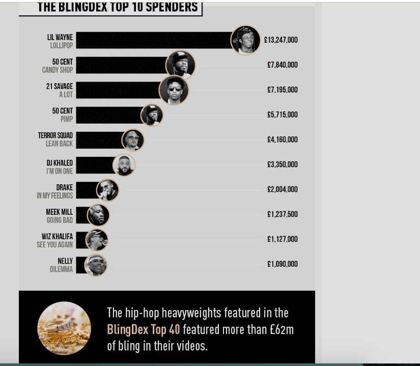
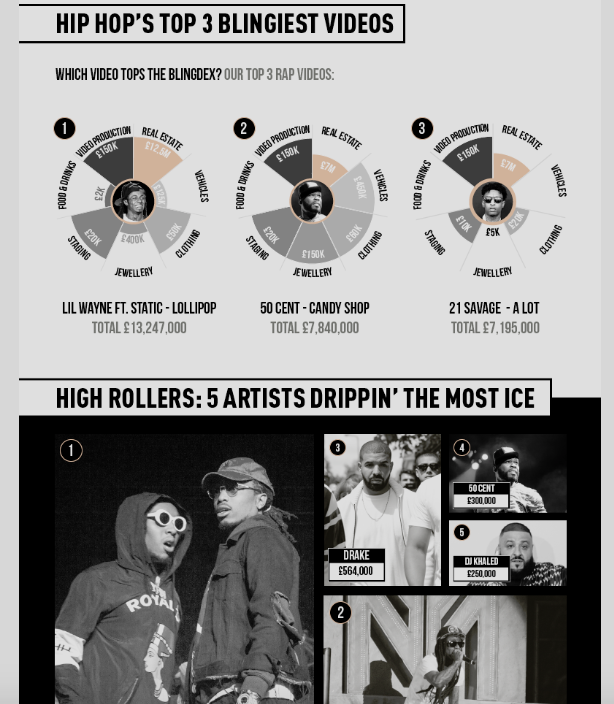
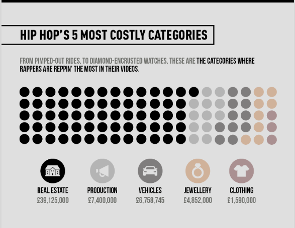
This is a data story I've found very creative, even if the subject does not interest me that much. It was created from scratch, the data was completely created with information available online mostly.

I like how the information is explained, first you have the data explained in text, then you have the main data results to answer the main questions, and after that, you have that information being broken in several subjects to get a deeper look at the subject.

The charts are very easy to read, the information is well displayed and you can read it as a story and understand where the data come from from top to bottom.

https://top40-charts.com/news.php?nid=148456&cat=

cheers!

Debora

Attachment Screenshot 2020-02-26 at 11.36.27.png
Attachment Screenshot 2020-02-26 at 11.37.08.png
Attachment Screenshot 2020-02-26 at 11.37.45.png

Stages of a relationship, distributed

by Deleted user -

This story compares married couples from the 1970s to 2010s to find patterns and trends. Very interesting to discover that still most people end up marrying each other after 10 years of living together ad how romanticism slowly disappears. 


The story considers the decades 1970s and 2010s, and the indicators go from First met, Romantic, Live Together and Married, across time spans of 1 month  up to 20 years to show using stats the different stages in which couples find themselves at different times in their relationship. 


https://flowingdata.com/2019/03/26/relationship-stages/

Gerrymandering

by Deleted user -

I really enjoyed this one about gerrymandering. The nationwide map in different colors was helpful to understand but I wish the headline was clearer about what should be in the graphic. I wish there was a way to scroll over the map and see how the districts should be and which ones are gerrymandered. That would be clearer. 


https://projects.fivethirtyeight.com/redistricting-maps/

Live Coronavirus Map

by Deleted user -

This live map and data of the coronavirus provides real time updates to a constantly evolving story of a fast-spreading virus. It breaks down the number of death, recoveries, infected, regions, ect.. in line graph, visual circle map, and data set form. These types of graphs can be crucial for reporting on a health concern that changes day by day

https://gisanddata.maps.arcgis.com/apps/opsdashboard/index.html#/bda7594740fd40299423467b48e9ecf6

Great charts make complex and voluminous data easier to digest

by Deleted user -

E&E News did a series of stories on a team of its reporters taking a 6,000-mile road trip in an electric vehicle to document how the switch from gas to electric transportation impacts the environment and economy. 

One story captured the road trip statistics for each leg, electric car compared with typical gas-fueled car, in an interactive chart allowing users to thumb through day by day, 

I know the Deconstructing Data Viz reading said "interactivity should only be used when absolutely necessary to convey important information to the reader." I think in this case it does. I would have been overwhelmed with the data in narrative form. This way I can advance to the legs of the trip I want to see.

In one another story in the series, the reporters compared the carbon (CO2) emissions of a gas-powered car and an electric car and showed how the emissions of an electric car change from state to state in a bar chart.  The chart makes the data easier to digest state by state and is color coded for easy delineation. The chart tells the story. 

Attachment EV CO2 emissions comparison.PNG
Attachment EV Road trip stats.PNG

M4: Question 2

by saleh altarawneh -

They say a picture speaks a thousand words. Visual appeal is essential in today's world, some people don't believe things unless they see it. For example: a logo says it all in defining the company, in addition, it says and speaks automatically about the company operations, majors, success, or failure. 

Data-driven investigation

by Deleted user -

Reuters’ series of reports on Philippine president Rodrigo Duterte’s war on drugs won the 2018 Pulitzer Prize for International Reporting.  The reports include several data-driven investigations.

One of them was a companion piece to “The Davao Boys,” which revealed that many members of an antidrug police squad at a police station in Quezon City in Metro Manila (“Station 6”), which recorded the most number of drug-related killings, came Duterte’s hometown in Davao City in southern Philippines.  Hence, the title, “The Davao Boys.”

The package (http://fingfx.thomsonreuters.com/gfx/rngs/PHILIPPINES-DRUGS/01006028044/index.html) of data visualizations consists of the following (in the order they appear), all of which were well executed and effective in telling different aspects of the story:

·       A locator map showing the six districts under the jurisdiction of Station 6

·       A dot distribution map that indicated where the killings occurred in Quezon City, with each circle marking a deadly incident.

·       A stacked bar showing the total number of killings to the entire City and comparing the 108 that Station 6 accounted for

·       Another dot distribution map, this time grouping the killings by police stations and their locations

·       A column bar comparing that compared the number of death vis-à-vis the number of police officers involved in the deaths

·       A timeline of police operations and participation of seven officers who were frequently present at these operations

·       An organizational chart that shows the relationship of Duterte, the national police chief, and other police officials to the Davao boys.  Profiles appear when the page is scrolled and the circle containing a name is highlighted.

·       What Reuters calls a “lexicon of terror,” which consists of words found in police reports on the deaths such as “buy bust” and “neutralize.” Again, when the page is scrolled, a term appears along with the percentage of reports where it is found.

Awesome.

Reuters 'Drowning in Plastic'

by Deleted user -

https://graphics.reuters.com/ENVIRONMENT-PLASTIC/0100B275155/index.html


Due to the massive spread of plastic waste all across the globe, Reuters wanted to use an eye-catching illustration in order to draw the viewer's attention on the dangers of using plastic bottles. And it does grab the attention when you first open their article; the first part of it that pops up is an animated counter of the number of bottle that have been sold to people all around the world within a minute.

I waited for one minute, until the counter stopped; and displayed that approximately one million plastic bottles have been sold to pedestrians. For the most part, I believe that this graphic/illustration was incredibly successful in terms of hooking the attention of the viewer to the main focus of the story. 

However, it somewhat failed in terms of credibility; the intensity of the illustration made it almost impossible for me to believe that such a statistic would verifiably be true. And so, I wouldn't have been able to tell if this was a legitimate issue until I saw it with my own eyes; or at least, until I scrolled down and read the first half of the story, even though it impacted me emotionally and attained my curiosity.

NY Times followers factory.

by Deleted user -

The news published by NY times have used amazing data elements to illustrated this story. Maps and interactive bars charts showed how how many follower one get if they pay the amount of money they pay. 

https://www.nytimes.com/interactive/2018/01/27/technology/social-media-bots.html?mtrref=qz.com&gwh=7AE4BEF0F6C018D34B38E4B433EF00E3&gwt=pay&assetType=REGIWALL


Another story about the snap of tourist spending around the world, which only a simple infographic design with the total number of money spend by tourists in the particular country.

https://howmuch.net/articles/worlds-top-tourist-destinations-money-spent

Deconstructing data visualization of Lassa Fever .... When we eat out way to death

by Deleted user -


I melt and was so cold when I read the story about Lassa Fever and .... When we eat out way to death


Sound scary, right?

Yes, but the entire story deconstruts the data visualization by conveying the story in contextual style. Full of narrative and creating a mental picture of how rodents which we leave with for years is spreading virus of death. 

Anecdote, illustration, statistics, of sick and dead were spelt out. 

We leave our food without covering them which ironically gave free access to rodents and in turn we careless consume such as easy way to death.


Attention of government failures. Poor hygiene etc in various locations/geography were also deconstructed.

Finally, a comparison was made with other diseases of similar magnitude like SARS and Coronavirus  to justify the illustration and contxual data

The story is on

https://m.guardian.ng/opinion/lassa-fever-and-other-plagues-when-we-eat-our-way-to-death/

Interactive map of California wildfires

by Deleted user -

The San Francisco Chronicle's interactive map "California Fire Tracker" (link below) provides information on wildfires across California. You can click on any of the flames to get details, and though Mr. Scarr said (rightly so) in his article we should "assume a reader won’t interact with the piece at all" I think the little flame icons spread across the state -- representing past (and current) wildfires larger than 500 acres or that have hurt/killed people and damaged buildings, will make some readers want to click on them for various reasons -- travel plans, updates, trends ...

https://projects.sfchronicle.com/trackers/california-fire-map/

Interactive graphic on gun deaths

by Deleted user -

FiveThirtyEight has an interactive graphic on Gun Deaths in America. You can check it out here: https://fivethirtyeight.com/features/gun-deaths/.  It looks at suicides, homicides, accidental deaths, etc... throughout the US.  You can filter the interactive graphic by cause, gender, age, and race. It was created by Ben Casselman, Matthew Conlen and Reuben Fischer-Baum. I found the graphic hard to navigate because it's mostly done in dots (with one dot equaling one gun death) so the dots that are colored in are compared to the ones that are not. I think it would've probably been easier for me to understand if a different method was chosen to display the information. 

Find a data visualization online and discuss how the elements convey parts of the story.

by Jessica Ramirez -

Find a data visualization online and discuss how the elements convey parts of the story. Use the course reading “Deconstructing Data Viz” as a framework to discuss what the visualization does well or what could be improved.


I came across this: 

https://neal.fun/printing-money/

It feels effective in that the top portion is a clear visual representation of salary, where you can include your own. 

But then they break out into other numbers below and it feels a bit overwhelming. I almost wanted it delineated somehow. I also wanted a better rhyme and reason between the second set of comparisons.

Data Visualisation

by Deleted user -

I picked a story entitled "30 % of employees left the Socialist Party in five years," by Mathilde DamgéPierre BreteauAgathe Dahyot et Léa Sanchez from Le Monde. 


The article uses a dashboard of all employees, which highlights groups of employees as you scroll down. I think it works well because the reader can see the overall picture/data while it's also possible to hover people and get their name and personal situation. Headshots of these people would have been a nice addition.

The Big Data of Big Hair

by Charmaine Chitate -

I chose  "The Big Data of Big Hair" by The Pudding's Elle O'Brien and Jan Diehm.

The story is kick-started by a

which is a summation of the written content below. It shares with the reader, the types of data sourced and the elements used. 

As the data series is over an 80 year timeline, the story makes use of a time series. The design is clean and mostly in black and white to avoid distracting the reader for example, from focusing on race and quality of images/photography. The time series used is responses and invites the reader to slide to a particular period and view the relational images showing the average hairstyle of that period.


Unless the reader is technically sound, the narrative supporting the story is a bit too technical. It would be great to view that text in a "How to.." section as opposed to the story itself. The font size is a little daunting and makes it seem like there's a lot to read and given the average attention span of a reader, they will switch pages. If the text was distributed into slides it would look less daunting and I am sure the pudding would be better. A good example is  "The Aftermath of a YouTube Apology" by  Arjun Kakkar and Russell Goldenberg.


Data Pt 2

by Deleted user -

 https://www.healthline.com/health/hiv-aids/facts-statistics-infographic 


as i mentioned before, the numbers and facts about certain illnesses for example the one mentioned in this article (HIV), helps other understand how dangerous, how severe such matter is, and how much care and cation people should take into consideration. 


personally i get convinced easily when there's quantitative Data and not just qualitative. because numbers and percentages help you reach an understanding and help you visualize the matter even more. what would help as well, is using images of actual cases. it may be too much for the eye to bare in the case of (HIV), how ever it is proof that this thing is serious and we should be way more careful about our health.

Visualization

by Deleted user -

They say a picture speaks a thousand words. Visual appeal is essential in today's world, some people don't believe things unless they see it. For example: a logo says it all in defining the company, in addition, it says and speaks automatically about the company operations, majors, success, or failure. 

coronavirus in China

by Deleted user -

Discussing the topic of coronavirus we can see that the media use such visualization tools as maps, graphics, time line, infographics. Thus visualizing the statistics of the sick, dead, recovered, geography of distribution, symptoms. https://www.bbc.com/news/health-51048366.

Close to home and easy to understand

by Deleted user -

Sometimes I find very difficult to understand data, but projects like this one makes so much easy to understand the information. I think they just got an award for this: https://www.usatoday.com/in-depth/news/investigations/2019/04/03/abortion-gun-laws-stand-your-ground-model-bills-conservatives-liberal-corporate-influence-lobbyists/3162173002/

The Arizona Republic also has a very good one on Phoenix Police officers involves shootings. Easy to read and understand.